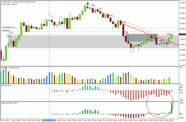
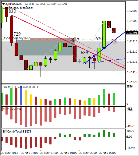
Example of drawing EFFI trend lines, and an indicator to help drawing Supply and Demand levels.
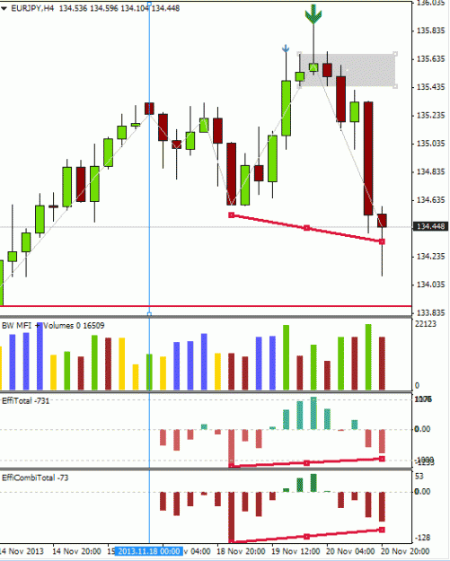
1) The weekend didn’t bring any changes in EURJPY, despite many gaps in other pairs, and I continue in the bearish mood.
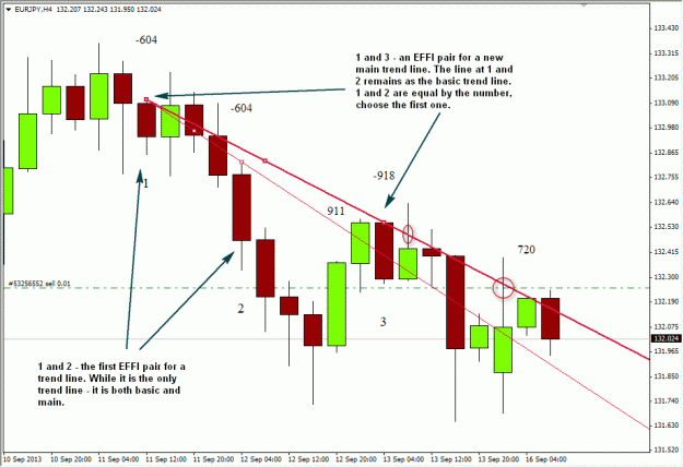
Here is a recent example of my H4 chart
I opened a Sell trade at the pullback to the main trend line. It was already the second touch of the line, the first touch would be better, but I missed it last Friday.
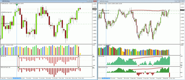
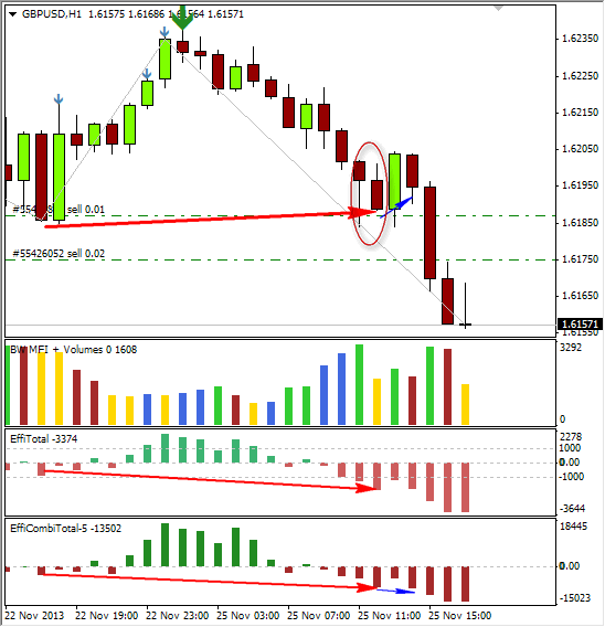
Note: Sometimes you can see a lot of EFFI candles in a row, and it will be difficult to choose pairs for the trend lines. For example, I saw such a situation in USDCAD H1 last Friday.
In this case I would advice a) to switch to the higher time frame and draw the lines there; b) to be very careful with trading decisions, because this is the situation of a hot struggle between bulls and bears.
2) This is outside EFFI topic, but I hope it may be interesting.
Somewhere in 2009 I was browsing Codebase.mq4 site and found an indicator which could help with mechanical identifying of strong supply and demand levels (since the discretionary drawing is sometimes a problem). It is based on sorting of fractals – this logic is different from the classical approach in SupDem method, but it obviously has its fair merits, and it draws only three strongest levels.
I’ve translated several lines (the comments in the code are in Russian) which appear in the upper left corner, and here is the legend of the settings:
frNum = 3; // numbers of bars per fractal: 2=5-bar fractal, 3=7-bar fractal, etc.
frType = 1; // how fractals are chosen: 0=rigorous choice (all peaks), 1=unrigorous choice (missing repeated adjacent peaks)
frMode = 0; // 0=Support&Resistance, 1=Support, 2=Resistance,
dlt = 0.24; // freedom from the average range of participating bars
sBars = 480; // number of bars in the period to analyze
The numbers at the levels (on the chart) seems to be their middle price.
The levels always begin at 24 bars before the current candle; you can enlarge them by hand with a horizontal line placed in the middle of the zone.
For my personal more comfortable use I repeated the code in two split versions of the indicators with different colors of rectangles – one for supply, another for demand. (If you decide to do like this, you will need a separate chart for every version, they overlap if on the same chart). I’ve also chosen 9-bar fractals to denote very strong levels, and I cut the type size.
Tweaks in the use of this indicator:
In the classical SupDem method there is a term of a swap level, when supply is swallowed and becomes demand, or demand is swallowed and becomes supply. It is expected that the price may bounce from such levels as well.
Here I would suggest another approach: The price may bounce only from the corresponding levels – from demand in the uptrend, from supply in the downtrend. No swap levels here. That is, if the price broke a strong supply level, went upwards, but then returned to this level again – how can you expect to find a cow in a bear lair? (Only a dead cow, I believe ) A bounce could happen only if any demand level from any time frame was located in the same zone. And one of these two levels (supply or demand) would rule the situation in general – that which is drawn in the higher TF.
Here is how it looks in EURJPY now:
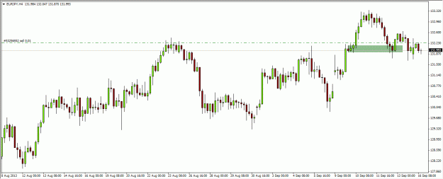
Classical approach: This green rectangle defines a zone from where the price started upwards. This zone also corresponds to the previous supply zone (at the left). The whole chart looks more bullish than bearish. So, it would be natural to expect a bullish bounce at this level. And it did happened, but after a deep penetration of the zone, and not very high, and went back again.
SupDem levels by fractals:
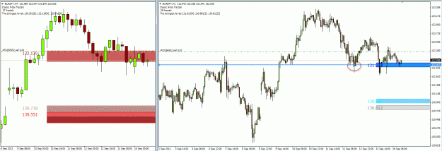
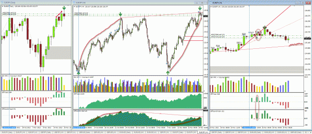
I’ve found that there was a supply zone on H4. At the same time there was a demand zone on H1, which was responsible for the first bounce. But then the H1 demand zone was penetrated several times, and the price is still kept in the H4 supply area, and I see no reasons to buy here. If my Sell trade is stopped by the rules of EFFI method, I will refrain from buying in this area anyway.
Some last notes: I’m not sure, but it seems that the indicator doesn’t recalculate automatically, sometimes. So – refresh from time to time to check the levels. May be it’s ok, and it’s only my wrong impression.
In terms of “freshness” – when the levels appear on the chart for the first time, they are always fresh as in the classical approach. If you see any past price action around a level inside those 24 bars of its length, it only means that you’ve found it too late. But it was drawn fresh initially.
Check different time frames to verify the levels. For example, now on my EURJPY charts there is a D1 supply zone from 131.42 down to 130.79, and there is a H4 supply zone from 130.85 down to 130.40, and there is a H1 demand zone from 130.75 to 131.03. So, in fact, there could be some bullish bounce at 130.75, but it would happen inside a bears municipality, and I will be very careful with Buy trades there, if any.
1) The weekend didn’t bring any changes in EURJPY, despite many gaps in other pairs, and I continue in the bearish mood.
Here is a recent example of my H4 chart
I opened a Sell trade at the pullback to the main trend line. It was already the second touch of the line, the first touch would be better, but I missed it last Friday.
Note: Sometimes you can see a lot of EFFI candles in a row, and it will be difficult to choose pairs for the trend lines. For example, I saw such a situation in USDCAD H1 last Friday.
In this case I would advice a) to switch to the higher time frame and draw the lines there; b) to be very careful with trading decisions, because this is the situation of a hot struggle between bulls and bears.
2) This is outside EFFI topic, but I hope it may be interesting.
Somewhere in 2009 I was browsing Codebase.mq4 site and found an indicator which could help with mechanical identifying of strong supply and demand levels (since the discretionary drawing is sometimes a problem). It is based on sorting of fractals – this logic is different from the classical approach in SupDem method, but it obviously has its fair merits, and it draws only three strongest levels.
I’ve translated several lines (the comments in the code are in Russian) which appear in the upper left corner, and here is the legend of the settings:
frNum = 3; // numbers of bars per fractal: 2=5-bar fractal, 3=7-bar fractal, etc.
frType = 1; // how fractals are chosen: 0=rigorous choice (all peaks), 1=unrigorous choice (missing repeated adjacent peaks)
frMode = 0; // 0=Support&Resistance, 1=Support, 2=Resistance,
dlt = 0.24; // freedom from the average range of participating bars
sBars = 480; // number of bars in the period to analyze
The numbers at the levels (on the chart) seems to be their middle price.
The levels always begin at 24 bars before the current candle; you can enlarge them by hand with a horizontal line placed in the middle of the zone.
For my personal more comfortable use I repeated the code in two split versions of the indicators with different colors of rectangles – one for supply, another for demand. (If you decide to do like this, you will need a separate chart for every version, they overlap if on the same chart). I’ve also chosen 9-bar fractals to denote very strong levels, and I cut the type size.
Tweaks in the use of this indicator:
In the classical SupDem method there is a term of a swap level, when supply is swallowed and becomes demand, or demand is swallowed and becomes supply. It is expected that the price may bounce from such levels as well.
Here I would suggest another approach: The price may bounce only from the corresponding levels – from demand in the uptrend, from supply in the downtrend. No swap levels here. That is, if the price broke a strong supply level, went upwards, but then returned to this level again – how can you expect to find a cow in a bear lair? (Only a dead cow, I believe
Here is how it looks in EURJPY now:
Classical approach: This green rectangle defines a zone from where the price started upwards. This zone also corresponds to the previous supply zone (at the left). The whole chart looks more bullish than bearish. So, it would be natural to expect a bullish bounce at this level. And it did happened, but after a deep penetration of the zone, and not very high, and went back again.
SupDem levels by fractals:
I’ve found that there was a supply zone on H4. At the same time there was a demand zone on H1, which was responsible for the first bounce. But then the H1 demand zone was penetrated several times, and the price is still kept in the H4 supply area, and I see no reasons to buy here. If my Sell trade is stopped by the rules of EFFI method, I will refrain from buying in this area anyway.
Some last notes: I’m not sure, but it seems that the indicator doesn’t recalculate automatically, sometimes. So – refresh from time to time to check the levels. May be it’s ok, and it’s only my wrong impression.
In terms of “freshness” – when the levels appear on the chart for the first time, they are always fresh as in the classical approach. If you see any past price action around a level inside those 24 bars of its length, it only means that you’ve found it too late. But it was drawn fresh initially.
Check different time frames to verify the levels. For example, now on my EURJPY charts there is a D1 supply zone from 131.42 down to 130.79, and there is a H4 supply zone from 130.85 down to 130.40, and there is a H1 demand zone from 130.75 to 131.03. So, in fact, there could be some bullish bounce at 130.75, but it would happen inside a bears municipality, and I will be very careful with Buy trades there, if any.
Attached File(s)
