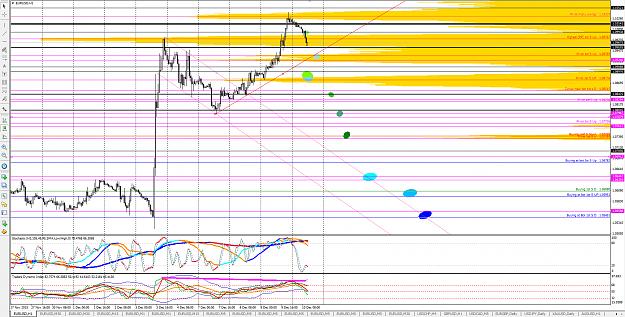
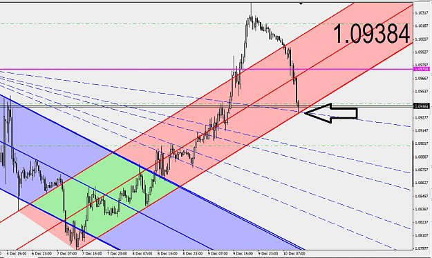
What I see as the S areas (or the BRC areas depending if you want to trade long or short). The darker the color the more
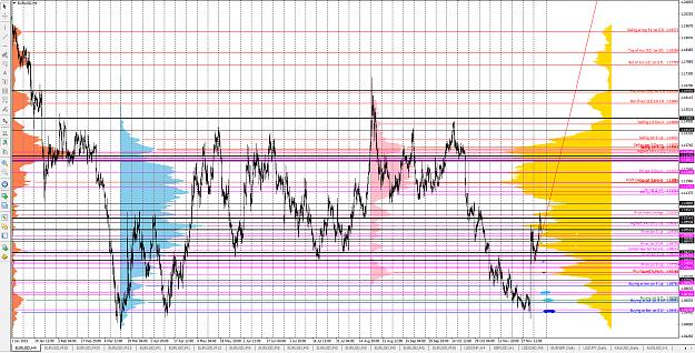
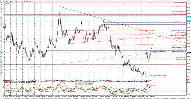
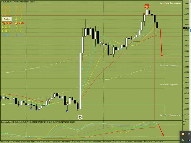
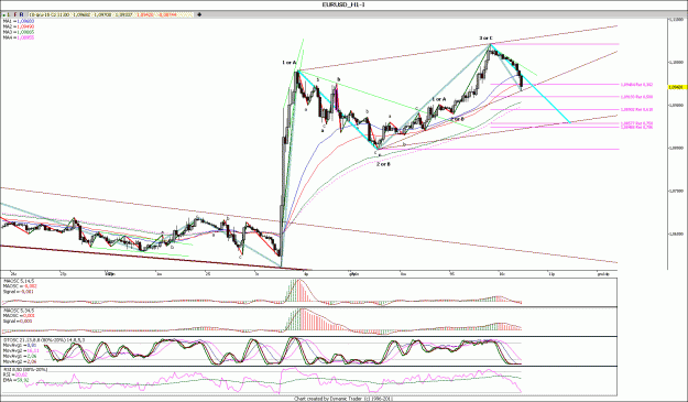
the likelyhood of getting a decent bounce, IMHO. Second chart shows the basis for the analysis.Third chart is the event map - what prices were at critical events
the likelyhood of getting a decent bounce, IMHO. Second chart shows the basis for the analysis.Third chart is the event map - what prices were at critical events
Attached Image(s) (click to enlarge)