DislikedEU 1hr chart starting from a'rd noon of last Friday Feb 6th... and including new pivots for today from 5pm EST.
The TL anchor ends in the yellow circles are drawn not from the Hi/Lo wick ends, but from the S/R zones that the market was respecting and able to sustain at the time based on a 1hr TF.
The white shaded bars are horizontal S/R levels that have held true thruout the week. You can see inside the Aqua circles where price would either congest or bounce at those levels as the week progressed. I didn't draw all of them but you can find others...Ignored
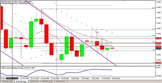
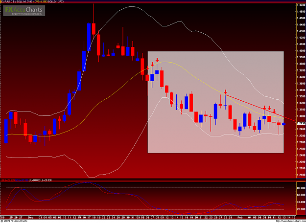
What about the double bottom on the daily chart? Seems like it may be an upclose today, aye?
Attached Image (click to enlarge)