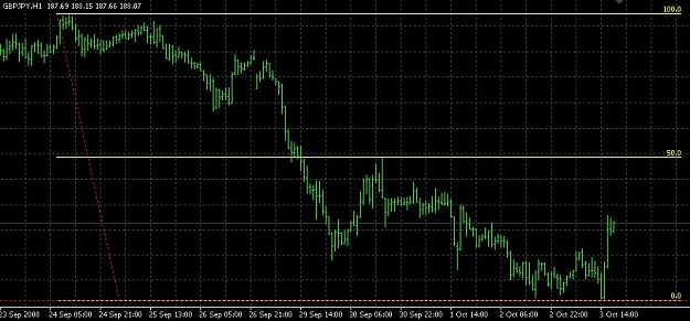
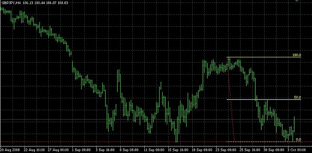
Anyone ever noticed that some pairs display their support and resistance levels easier than others? EURUSD shows them clearly and they hold often. GBPUSD I find more difficult to see. S+R on USDJPY is easy to spot, but GBPJPY is sketchy. This reminded of something akuma99 posted a long time ago, which may be beneficial to those seeking S/R levels to trade.
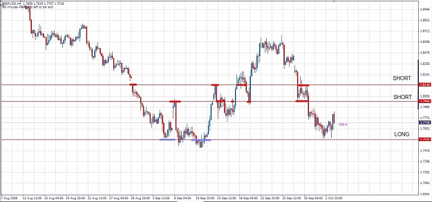
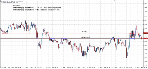
I have found that often it is worth looking at the close values of each major time period on these 'tricky pairs' to see if they give any more clues. It appears some pairs place a greater significance on the highs and lows, whereas other pairs the support and resistance is more likely to exist at the close of the 1H, 4H and daily TF bars. Time is a significant factor, some might say it is even more important than price. Many analysts only consider support/resistance to be broken if a bar closes beyond it, so does it not follow that we should also construct our S+R levels on the closes of these bars?
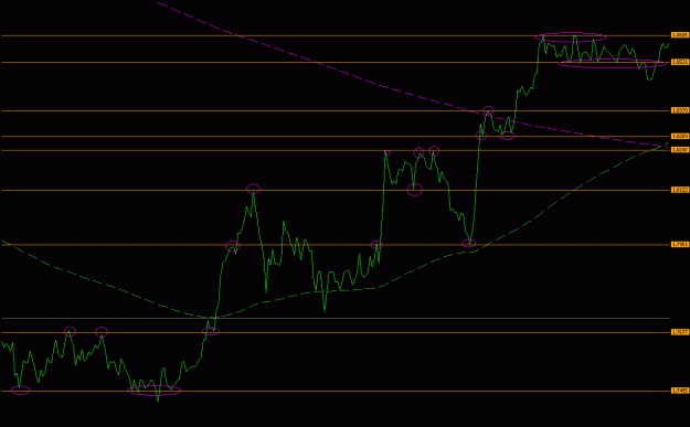
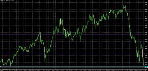
Here's an example of using line charts (dot to dot of the close price on a 1H chart for GBPUSD), with support and resistance defined as levels where the price close line touched and was rejected multiple times either in polarity shifts or where price consolidated. I think we can clearly see that the levels are fairly obvious, and the pivots that defined the levels have been marked out with magenta circles.
I have found that often it is worth looking at the close values of each major time period on these 'tricky pairs' to see if they give any more clues. It appears some pairs place a greater significance on the highs and lows, whereas other pairs the support and resistance is more likely to exist at the close of the 1H, 4H and daily TF bars. Time is a significant factor, some might say it is even more important than price. Many analysts only consider support/resistance to be broken if a bar closes beyond it, so does it not follow that we should also construct our S+R levels on the closes of these bars?
Here's an example of using line charts (dot to dot of the close price on a 1H chart for GBPUSD), with support and resistance defined as levels where the price close line touched and was rejected multiple times either in polarity shifts or where price consolidated. I think we can clearly see that the levels are fairly obvious, and the pivots that defined the levels have been marked out with magenta circles.
Attached Image (click to enlarge)