Correlations are something I've always been interested in. I was talking to a friend today whom is much smarter than I. He trades correlations of equities where there are hundreds of instruments to correlate and trade deviations. As I look at his calculations I cannot stop myself from thinking Forex must be correlated as all currencies flow together like a river from one side of the world to another. Goods are purchased and equities are invested constantly 24 hours a day. There must be some limiting factor used by central banks intra day to stabilize their currencies. If there were not this indicator would not appear so organized with all the pairs moving like sine waves.
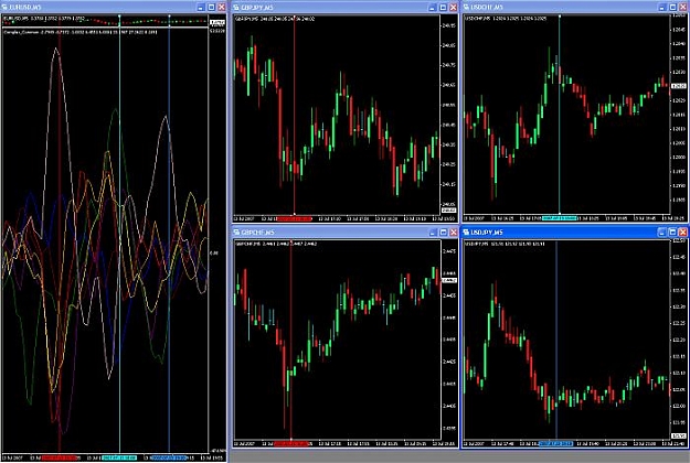
In this indicator you see the average of 4 currency pairs to show the index of each currency. In the attached image we see trade setups using the most deviated currencies at a given time. (I've watched this indicator in real time and these trades setup just like you see them here.)
In the first trade we see GBP is very oversold nearly the lowest of all pairs. On the top around the same time we see JPY is very overbought. The obvious observation would assume GBPJPY is going to go up. Remember that each of these currencies is the index of 4 pairs. So we are not seeing the result of just one pair throwing off a currency. We are seeing a nearly true average of each currency and it's value again other currencies in real time. Think about this. One currency can be moved violently very quickly when we look at one pair. But if we average 4 pairs we see that one currency takes much more effort and volume to move therefore it takes much more energy to reverse meaning trends would be more sustainable. Once these indicies start turning there is not much that can stop them. If we pick the indicies that are deviated the most against one another we are stacking the deck in our favor.
The second trade is also denoted as Red vertical line. Purple being CAD is the lowest index at Red and JPY is still the highest as the color pink. This means CADJPY is going to appreciate in order to balance itself with other pairs.
The third trade is aqua. Green is USD. Blue is CHF. USD should get weaker and CHF should get stronger. USDCHF should go down.
The fourth trade is USDJPY. We see the third blue line on the vertical chart overlaps Green USD and Pink JPY. USDJPY should go up.
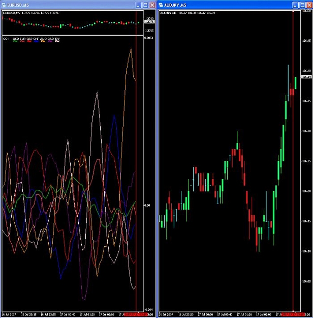
Attached Image (click to enlarge)

It really is that easy.