DislikedHi Diamond,
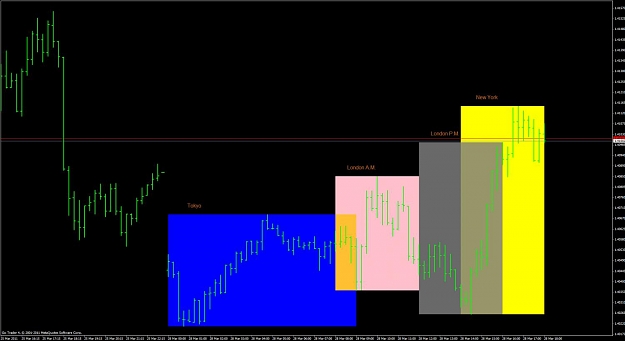
on your Charts here (also on your webinar) you have painted the Asian/London/US-Session in a colored rectangles. Are you doing this manually or is it something like an indicator ?
I'm currently drawing a horizontal line for beginning of the sessions, but this is not very practicalIgnored
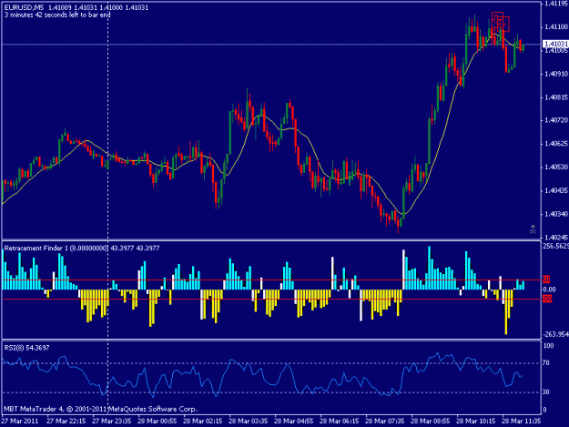
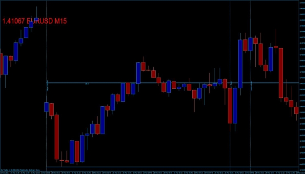
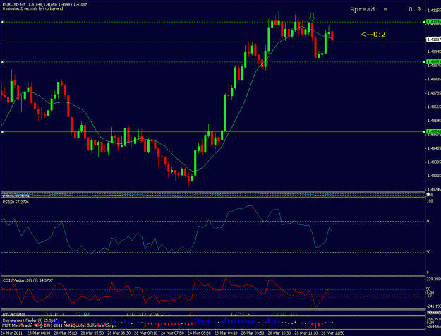
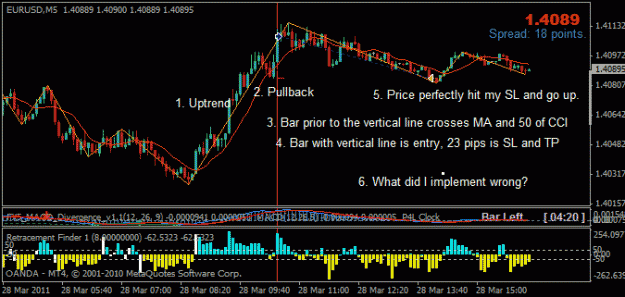
Attached Image (click to enlarge)
Attached File(s)
Canadian by birth  Australian by choice