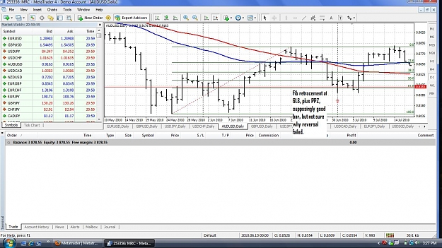
DislikedJust a bit of weekend chart fun.
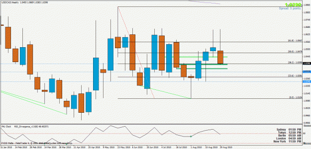
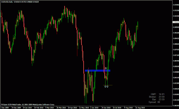
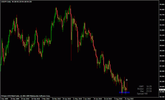
I decided to put a salmon colored rectangle on the weekly negative bars, meaning the close is lower than the open. Just covered half of the vertical bar and dragged it to the right. Green are the positive bars.
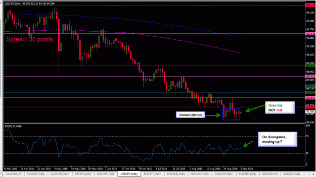
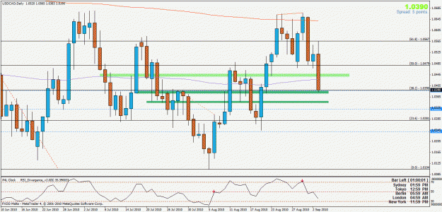
Look what happens when we drop down to D1 & H4.
The overlapping colors seem to show us PPZ areas.
kind of interesting.
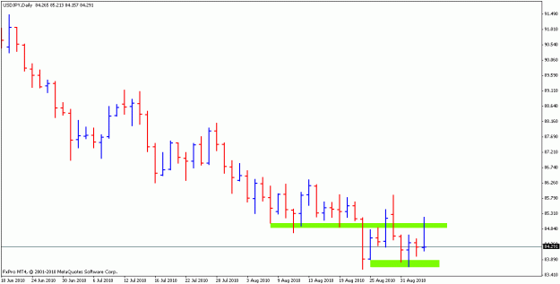
Maybe the High-Low Open-close will show something else.Ignored
g.
I believe . . .
