I will be posting several post and lots of information here this weekend, please do not post until Market open, I want to have all the information in sequence.
Thank you.
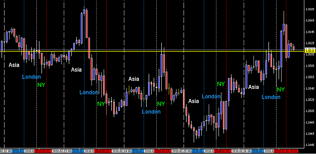
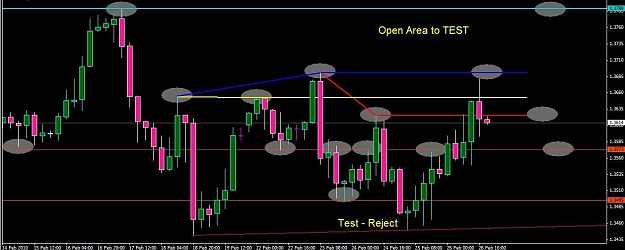
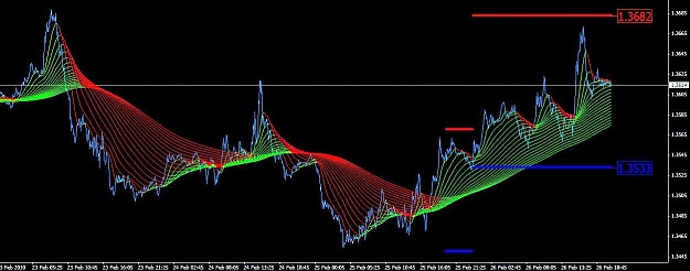
The first chart is a 1 hour chart showing the complete week broken down by each session as marked.
The yellow horizontal line is the weekly open, you can see the week ended about the same area, this could be a sign that the bearish trend has slowed and were setting up for a higher move coming in the month of March.
The chart that I will post later will show the pressure areas and how I monitor trend changing, even though I am showing hour/4hr/daily charts on these analysis, I am trading on a smaller time frame, this is all for precision, and yes it takes numerous hours to make pips, I wished it were easier to be successful, but I am 90% or better on my win/loss ratio.
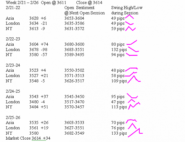
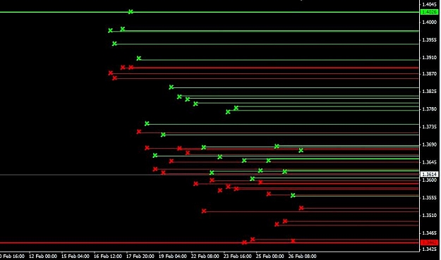
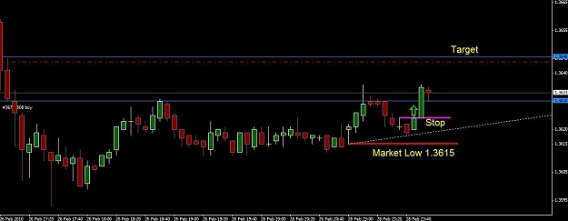
The second picture is the daily analysis of each session.
I have it broken down as follows:
1) The open price of each session and the pips gained or lost during that session.
a. example line 1-Asia opened at 3628 and gained +8 pips at the London open price, and each session I have the open and pips gained/lost at the next open session price.
2) The open sentiment @ next open session is the high and low of the session before the next session opens.
a. example line 1-Asia had a high 3653 and a low 3604 for a 49 pip swing during the period from Asia open until London open.
3) The 3rd thing I have is a small drawing in magenta that shows the basic trend during that period. This helps me see how the swing of price went during this period.
I will be posting several more data inputs for the month of February, and a chart showing how I monitor price lines for targets and trade areas.
Thank you.
The first chart is a 1 hour chart showing the complete week broken down by each session as marked.
The yellow horizontal line is the weekly open, you can see the week ended about the same area, this could be a sign that the bearish trend has slowed and were setting up for a higher move coming in the month of March.
The chart that I will post later will show the pressure areas and how I monitor trend changing, even though I am showing hour/4hr/daily charts on these analysis, I am trading on a smaller time frame, this is all for precision, and yes it takes numerous hours to make pips, I wished it were easier to be successful, but I am 90% or better on my win/loss ratio.
The second picture is the daily analysis of each session.
I have it broken down as follows:
1) The open price of each session and the pips gained or lost during that session.
a. example line 1-Asia opened at 3628 and gained +8 pips at the London open price, and each session I have the open and pips gained/lost at the next open session price.
2) The open sentiment @ next open session is the high and low of the session before the next session opens.
a. example line 1-Asia had a high 3653 and a low 3604 for a 49 pip swing during the period from Asia open until London open.
3) The 3rd thing I have is a small drawing in magenta that shows the basic trend during that period. This helps me see how the swing of price went during this period.
I will be posting several more data inputs for the month of February, and a chart showing how I monitor price lines for targets and trade areas.
Attached Image(s) (click to enlarge)