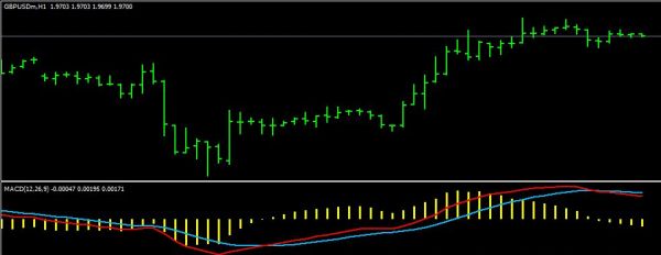
Here is a chart view of the last three entries.
I have a circle on the point of the candle crossing and a new candle open above/below the middle BB.
Below that you will see the RSI, which seems to cross over before we have an entry point on the candles.
Below that is the CCI, it actually crosses around the same time as the candles, and it does not skirt the middle as much as the RSI does.
Between the three, there is nice indication of direction, and entry.
Once you have enough screen time, you could choose the right entry point, and actually catch a more precise profit before your exit, especially if your watching a smaller time frame tpo see what is happening within the Hourly Candle.
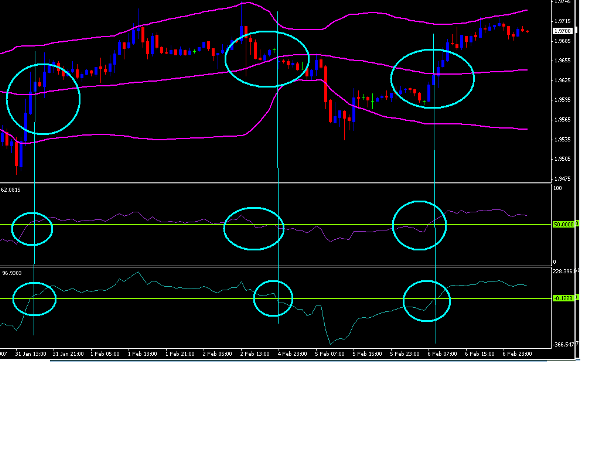
Attached Image
TheCableGuy