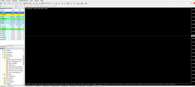
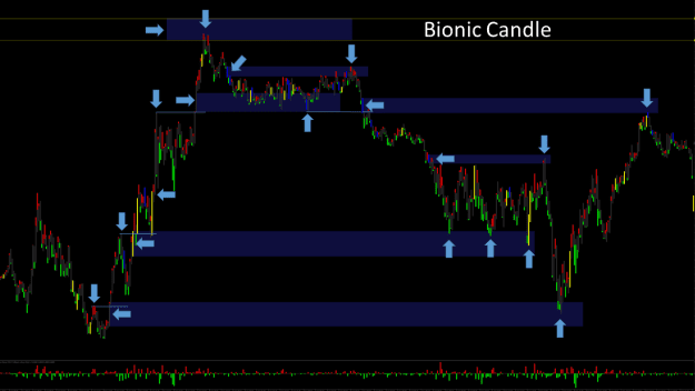
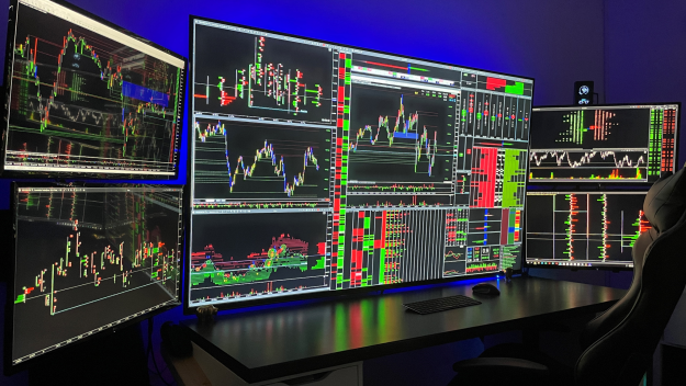
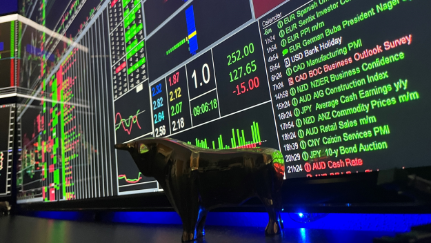
Current bionic chart
Hello dear bionic traders,
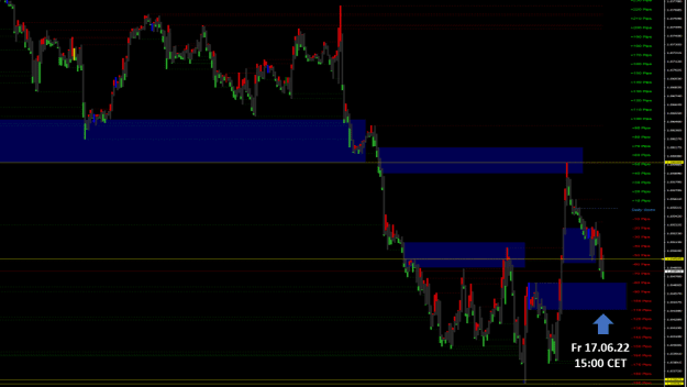
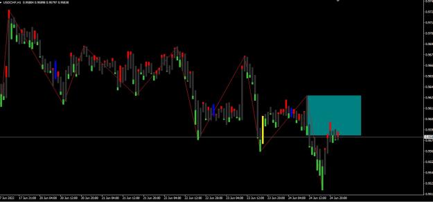
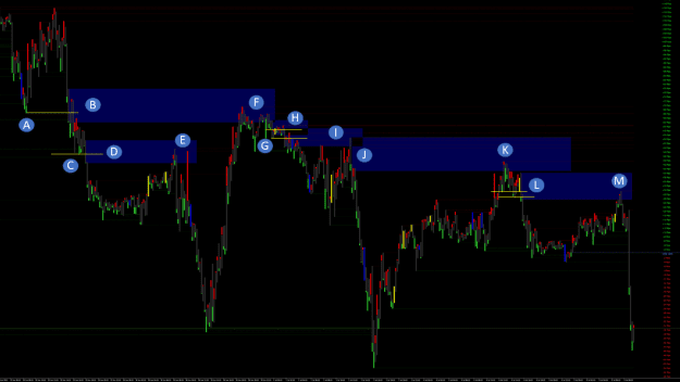
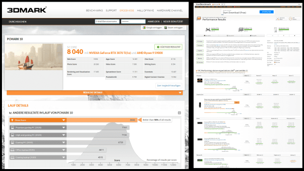
Here you can see an H1 chart in Euro US Dollar from the end of April until today. In early May, the price moved higher and we start from the key candle (Point A)
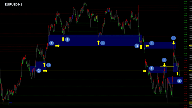
Point A
This key candle was supported by the short traders who, in the underlying equilibrium, thought price was about to turn back.
Point B
After the price went up more strongly and came back, it was rejected in zone A for the first time.
Point C
The price ran into Zone A for the second time and made a new low to pull the long traders out. Here the price was rejected for the second time in the zone and ran back up.
Point D
This time, price ran almost to the end of the zone, but was only rejected up a short distance. The price then broke the yellow line, which was the bottom of Zone A. Pay attention to which candle breaks through the yellow zone first.
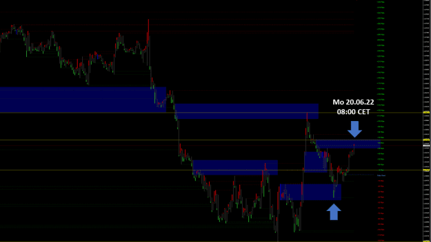
Point E
Exactly this candle now represents the new zone E.
Point F
Again we see a strong key candle where I have marked the lower area with a yellow line.
Point G
On the retrace, price entered zone F and was rebuffed sharply to the upside.
Point H
Here you can again see which candle breaks through the yellow line of Zone F. This created a new zone H.
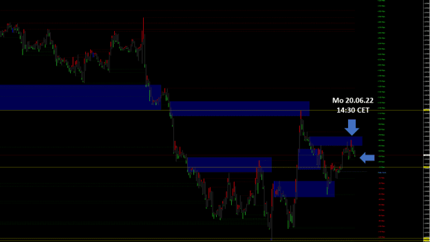
Point I
Initially, the price went down more sharply and formed a larger equilibrium. As the price entered the H zone, it was repelled more sharply to the downside, as expected.
Point J
I calculated this zone J from the last low of zone K. This zone was reached when the Fed announced its rate hike.
Point L
The price was now running sharply higher and when it entered Zone E it was rebuffed sharply down as expected.
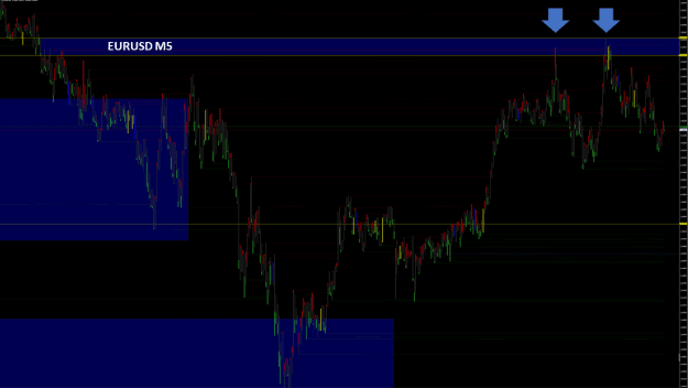
Point M
There is also a stronger zone here, which, however, will be breached downwards in the long term due to the situation.
I wish you a nice weekend
Best regards Michael
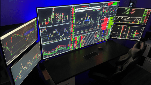
Hello dear bionic traders,
Here you can see an H1 chart in Euro US Dollar from the end of April until today. In early May, the price moved higher and we start from the key candle (Point A)
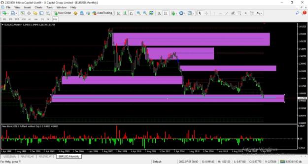
Attached Image (click to enlarge)
Point A
This key candle was supported by the short traders who, in the underlying equilibrium, thought price was about to turn back.
Point B
After the price went up more strongly and came back, it was rejected in zone A for the first time.
Point C
The price ran into Zone A for the second time and made a new low to pull the long traders out. Here the price was rejected for the second time in the zone and ran back up.
Point D
This time, price ran almost to the end of the zone, but was only rejected up a short distance. The price then broke the yellow line, which was the bottom of Zone A. Pay attention to which candle breaks through the yellow zone first.
Point E
Exactly this candle now represents the new zone E.
Point F
Again we see a strong key candle where I have marked the lower area with a yellow line.
Point G
On the retrace, price entered zone F and was rebuffed sharply to the upside.
Point H
Here you can again see which candle breaks through the yellow line of Zone F. This created a new zone H.
Point I
Initially, the price went down more sharply and formed a larger equilibrium. As the price entered the H zone, it was repelled more sharply to the downside, as expected.
Point J
I calculated this zone J from the last low of zone K. This zone was reached when the Fed announced its rate hike.
Point L
The price was now running sharply higher and when it entered Zone E it was rebuffed sharply down as expected.
Point M
There is also a stronger zone here, which, however, will be breached downwards in the long term due to the situation.
I wish you a nice weekend
Best regards Michael
Forget:That does not work, amateurs build the ark, pros the Titanic!
3