Post 500: How do I find the important turning points?
Hello dear traders,
This is my 500th contribution in this forum and thus a small anniversary. I came here to help other traders and get help as well. If you read my first article and compare it with the last article, you will find that a significant development has taken place. What has remained is my system of supply and demand. I have developed it together with you so far that it is getting easier.
At this point I would like to express once again my heartfelt thanks, because all projects would not have been possible without the help of you. One hand washes the other, we say in germany.
That's why I put together a very special article for you today.
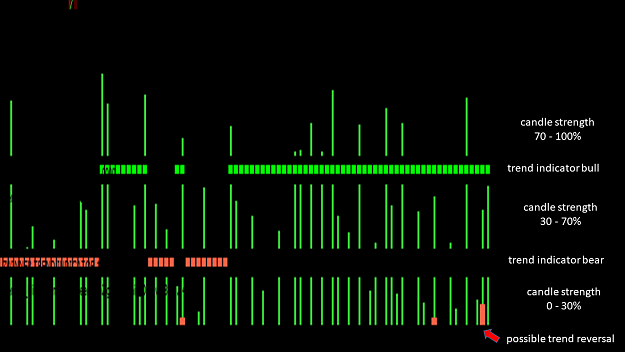
Every trader wants an ad that always tells him exactly when a trend is going up or down. The area of supply and demand has always given me very reliable information about the trend consequences, but I often lacked crucial information that I did not recognize quickly enough.
The creation of the Bionic Chart and the Bionic Trend Strength Indicator had a very definite reason. The goal was to be able to recognize the trend reverses more precisely with the help of demand and supply. I clearly succeeded in achieving this goal and today I would like to show you a concrete example of this.
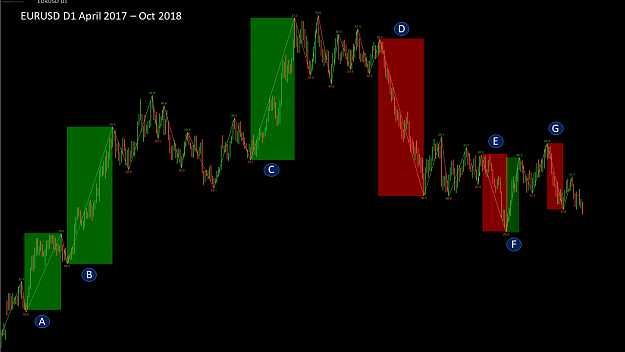
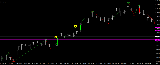
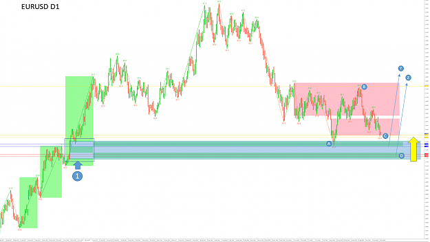
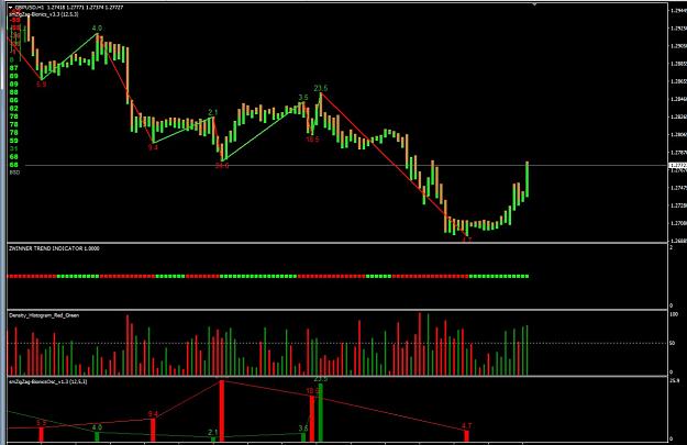
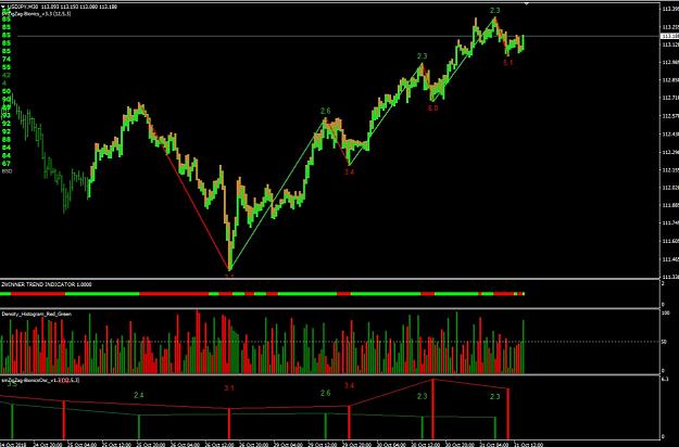
Here is a D1 chart from the EURUSD from April 2017 to October 2018. Using the smBionic-ZigZag indicator (setting: 8/2/4), I once worked out and colored the strongest uptrend and downtrend. It can be seen here that Trend B, C & D were the strongest in this period. The Bionic Chart I need to make the candles monochrome without wick. This clearly shows the strong uptrend or downtrend in the daily chart.
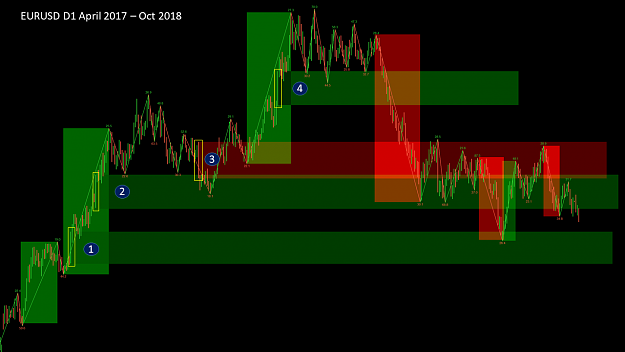
Next, within these strong trends, I picked the strongest day candles and drew a resistance line out of them. In total, this resulted in four resistance lines from number one to number four. Sure, I could have drawn more, but to illustrate the whole thing I leave it at these four resistance levels. After drawing the resistance line number 4 you can see how the course within these lines behaved afterwards. This aspect is quite interesting.
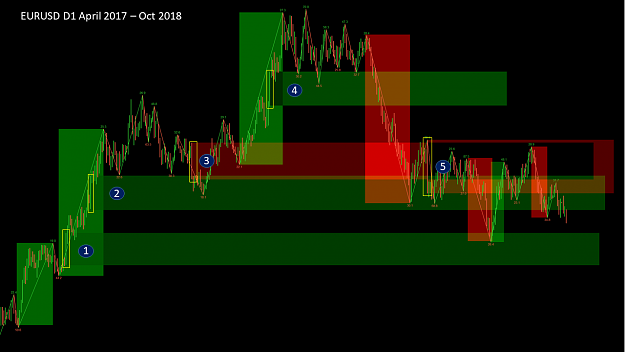
Now, at point 5, another resistance line has been added, you can see that after the line was drawn, the course did not manage to cross that line.

Now it's time to determine the concrete resistance line within the drawn resistance lines. For me it is clear that a crucial resistance within the strongest candle is in the strongest trend. This strong candle is so strong because it breaks through a very strong resistance. We have to find this resistance. A line of resistance is characterized by the fact that a course of her strong upward and / or downward runs. From the resistance line A, the price went up sharply. The course, which went up below point A, bounced off this line exactly. That's why I drew this line and as you can see, the course was bounced right there with the yellow arrow and went back up.
At point C we see the next strong candle within a very strong trend. It was relatively easy to draw the resistance line because there was a small downtrend in front of the candle that was the deciding factor. If we look at how the course reacts with the blue arrows on it, we realize that it is a strong resistance.
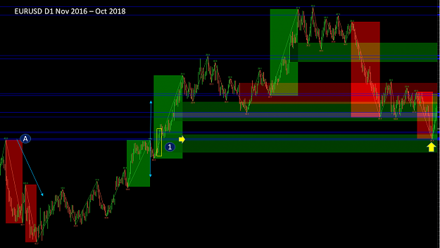
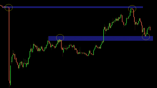
Here you can see again the confirmation for the point A. We scroll back to November 2016. We can see here how the course from the point A runs very strong down. After the course ran back to this line, he was again briefly dismissed and then went up with an extreme strength. This strong candle thus proves that it must be a very strong resistance.
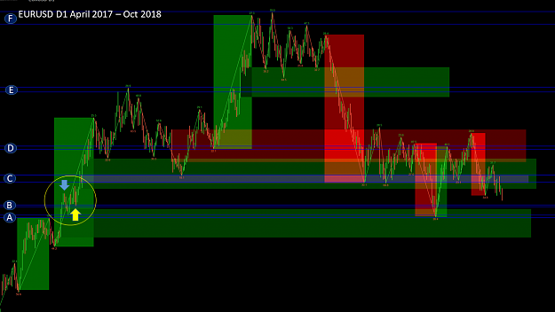
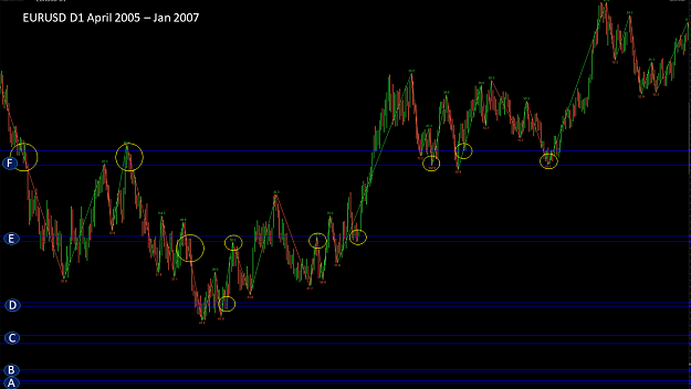
Following the same principle, I have drawn the resistance line B. The upper line I would have had to pull up a bit to have some air. This line was for me the decisive turning point for a further upward trend in the EURUSD. The resistance zones D, E & F come from the past. Let's take a closer look at where they came from and how they came about.
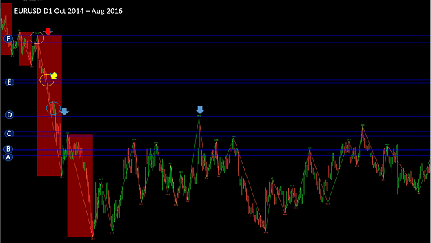
To do that, we have to go back to October 2014, where we identified two very strong downtrends. From point F, the strong downtrend began and ran down. At point E you will see a gap of 50 pip in the yellow circle. The 50 pip are not the deciding factor, but they still represent a resistance for me. Below that you will find another gap, which also had significant effects, but I did not want to go into that for reasons of efficiency. Shortly before the point D, an equilibrium is created, the course goes into zone D and is strongly rejected there. After that, the price goes down very sharply. At the blue arrow you can see how the course is strongly turned down. If you go back to the previous slide, you will see how the individual zones developed. We now have six resistance levels from A to F. Now let's look into the past and see how the course reacted.
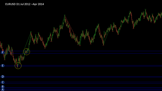
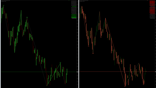
Here you can see how the course reacted to resistance line E and F.
Again, you can see that the individual resistance lines are working. It's not about the price bouncing off this resistance line, it's about the price going up or down sharply from that resistance line. Often this resistance is broken several times until the price breaks up or down.
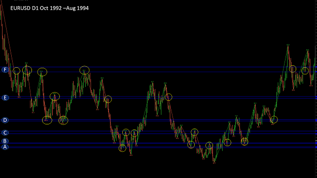
Again, you can see very well that the resistance lines are in zones that appear again and again, to which the course reacts. Of course it can also be a coincidence but I do not believe it, because a coincidence happens by accident but the lines always work. These lines I have drawn are in the daily chart and show me a medium term trend. Of course, I can do this in every unit of time.
I can recommend four time units.
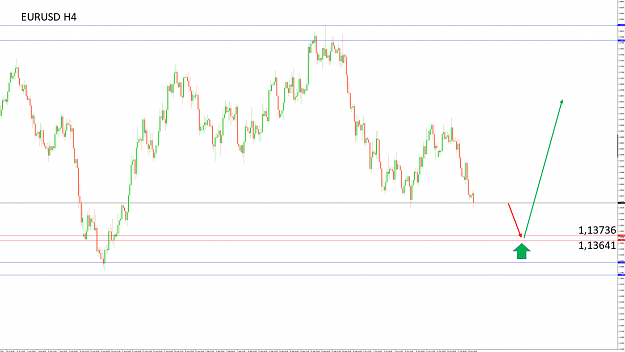
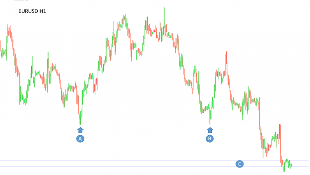
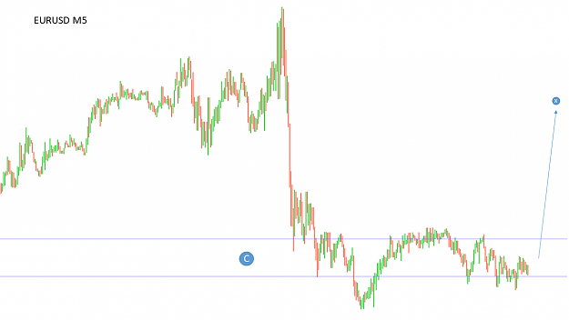
The weekly chart for the long-term trend. The daily chart for the medium term trend. The H4 / H1 chart for the short-term trend and the M15 / M5 for the ultra short-term trend.
Work your way down from the high time units. Try it yourself and start to identify the trends. This approach can be well combined with their system. After all, it's all about recognizing reversals early.
I hope you enjoy trying it out and looking forward to your feedback.
For project number 3 I will post more information in the next few days.
I wish you a successful trading week
best regards
Hello dear traders,
This is my 500th contribution in this forum and thus a small anniversary. I came here to help other traders and get help as well. If you read my first article and compare it with the last article, you will find that a significant development has taken place. What has remained is my system of supply and demand. I have developed it together with you so far that it is getting easier.
At this point I would like to express once again my heartfelt thanks, because all projects would not have been possible without the help of you. One hand washes the other, we say in germany.
That's why I put together a very special article for you today.
Every trader wants an ad that always tells him exactly when a trend is going up or down. The area of supply and demand has always given me very reliable information about the trend consequences, but I often lacked crucial information that I did not recognize quickly enough.
The creation of the Bionic Chart and the Bionic Trend Strength Indicator had a very definite reason. The goal was to be able to recognize the trend reverses more precisely with the help of demand and supply. I clearly succeeded in achieving this goal and today I would like to show you a concrete example of this.
Attached Image (click to enlarge)
Here is a D1 chart from the EURUSD from April 2017 to October 2018. Using the smBionic-ZigZag indicator (setting: 8/2/4), I once worked out and colored the strongest uptrend and downtrend. It can be seen here that Trend B, C & D were the strongest in this period. The Bionic Chart I need to make the candles monochrome without wick. This clearly shows the strong uptrend or downtrend in the daily chart.
Attached Image (click to enlarge)
Next, within these strong trends, I picked the strongest day candles and drew a resistance line out of them. In total, this resulted in four resistance lines from number one to number four. Sure, I could have drawn more, but to illustrate the whole thing I leave it at these four resistance levels. After drawing the resistance line number 4 you can see how the course within these lines behaved afterwards. This aspect is quite interesting.
Attached Image (click to enlarge)
Now, at point 5, another resistance line has been added, you can see that after the line was drawn, the course did not manage to cross that line.
Attached Image (click to enlarge)
Now it's time to determine the concrete resistance line within the drawn resistance lines. For me it is clear that a crucial resistance within the strongest candle is in the strongest trend. This strong candle is so strong because it breaks through a very strong resistance. We have to find this resistance. A line of resistance is characterized by the fact that a course of her strong upward and / or downward runs. From the resistance line A, the price went up sharply. The course, which went up below point A, bounced off this line exactly. That's why I drew this line and as you can see, the course was bounced right there with the yellow arrow and went back up.
At point C we see the next strong candle within a very strong trend. It was relatively easy to draw the resistance line because there was a small downtrend in front of the candle that was the deciding factor. If we look at how the course reacts with the blue arrows on it, we realize that it is a strong resistance.
Attached Image (click to enlarge)
Here you can see again the confirmation for the point A. We scroll back to November 2016. We can see here how the course from the point A runs very strong down. After the course ran back to this line, he was again briefly dismissed and then went up with an extreme strength. This strong candle thus proves that it must be a very strong resistance.
Attached Image (click to enlarge)
Following the same principle, I have drawn the resistance line B. The upper line I would have had to pull up a bit to have some air. This line was for me the decisive turning point for a further upward trend in the EURUSD. The resistance zones D, E & F come from the past. Let's take a closer look at where they came from and how they came about.
Attached Image (click to enlarge)
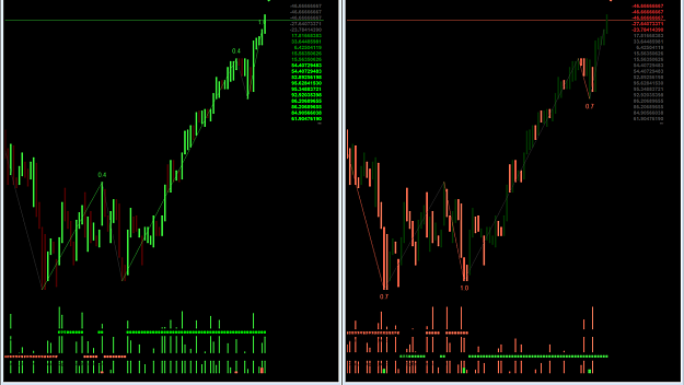
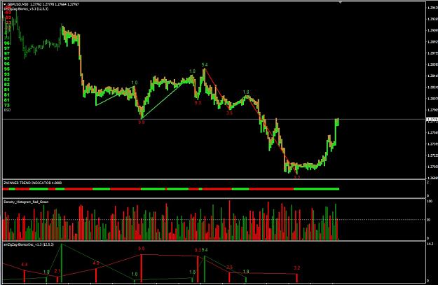
To do that, we have to go back to October 2014, where we identified two very strong downtrends. From point F, the strong downtrend began and ran down. At point E you will see a gap of 50 pip in the yellow circle. The 50 pip are not the deciding factor, but they still represent a resistance for me. Below that you will find another gap, which also had significant effects, but I did not want to go into that for reasons of efficiency. Shortly before the point D, an equilibrium is created, the course goes into zone D and is strongly rejected there. After that, the price goes down very sharply. At the blue arrow you can see how the course is strongly turned down. If you go back to the previous slide, you will see how the individual zones developed. We now have six resistance levels from A to F. Now let's look into the past and see how the course reacted.
Attached Image (click to enlarge)
Here you can see how the course reacted to resistance line E and F.
Attached Image (click to enlarge)
Again, you can see that the individual resistance lines are working. It's not about the price bouncing off this resistance line, it's about the price going up or down sharply from that resistance line. Often this resistance is broken several times until the price breaks up or down.
Attached Image (click to enlarge)
Again, you can see very well that the resistance lines are in zones that appear again and again, to which the course reacts. Of course it can also be a coincidence but I do not believe it, because a coincidence happens by accident but the lines always work. These lines I have drawn are in the daily chart and show me a medium term trend. Of course, I can do this in every unit of time.
I can recommend four time units.
The weekly chart for the long-term trend. The daily chart for the medium term trend. The H4 / H1 chart for the short-term trend and the M15 / M5 for the ultra short-term trend.
Work your way down from the high time units. Try it yourself and start to identify the trends. This approach can be well combined with their system. After all, it's all about recognizing reversals early.
I hope you enjoy trying it out and looking forward to your feedback.
For project number 3 I will post more information in the next few days.
I wish you a successful trading week
best regards
Forget:That does not work, amateurs build the ark, pros the Titanic!
2