Hello, I want to make a "recreational" contribution.
I will explain everything in the following graphics.
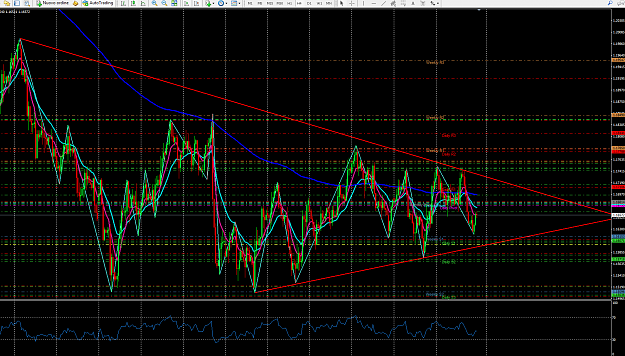
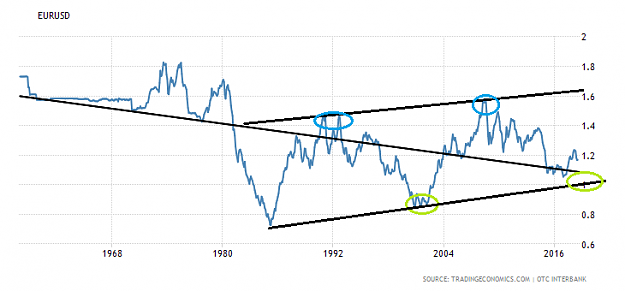
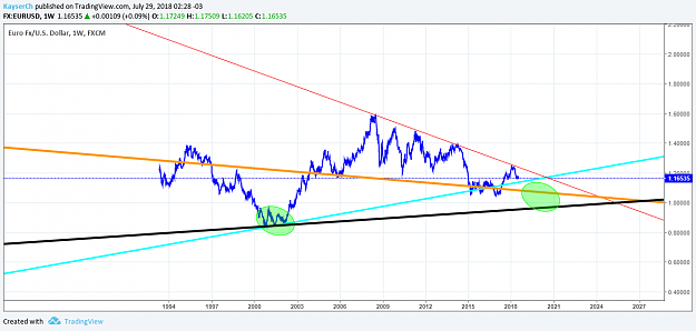
1) as we can see the historical trend is bearish.
So you can observe the price could be found in a SUPER bearish rectangle pattern at 40%
Why ?
I have highlighted in the graphic an area that I think is important (green zone)
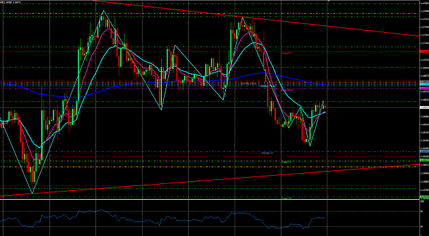
In the TW graph we can observe
Orange line (Historical trend)
Black Line (Bearish flagg)
Blue line (trend from green zone)
Red line (diagonal support)
Now that is what could be expected in the long term (4 - 5 years), a possible price of 0.95- 1.05. Why in that time? Many of us will have read excellent data from the US, especially in recent months, a lot of data that probably has not been seen for a long time. This makes me think that the economy is on the curve between the recovery and the economic boom. If you are more interested (Search economic cycle)
Returning to the graphics if we take into account the green area this minimum occurred in the years 2000-2001. reaching a minimum of 0.80aprox.
If we look at the pattern that is formed with some inclination, something that could give us a signal that we will not see 0.80 in a lot of time. And it projects us a little more at the previously mentioned levels of 0.95- 1.05.
After that level, who knows? maybe we will see in 20 years 1.80 (if both currencies still exist jeje)
The probable analysis gives for hundreds of theories. Do your theory: p
You can find the long-term graph in tradingeconomics.
I will explain everything in the following graphics.
1) as we can see the historical trend is bearish.
So you can observe the price could be found in a SUPER bearish rectangle pattern at 40%
Why ?
I have highlighted in the graphic an area that I think is important (green zone)
In the TW graph we can observe
Orange line (Historical trend)
Black Line (Bearish flagg)
Blue line (trend from green zone)
Red line (diagonal support)
Now that is what could be expected in the long term (4 - 5 years), a possible price of 0.95- 1.05. Why in that time? Many of us will have read excellent data from the US, especially in recent months, a lot of data that probably has not been seen for a long time. This makes me think that the economy is on the curve between the recovery and the economic boom. If you are more interested (Search economic cycle)
Returning to the graphics if we take into account the green area this minimum occurred in the years 2000-2001. reaching a minimum of 0.80aprox.
If we look at the pattern that is formed with some inclination, something that could give us a signal that we will not see 0.80 in a lot of time. And it projects us a little more at the previously mentioned levels of 0.95- 1.05.
After that level, who knows? maybe we will see in 20 years 1.80 (if both currencies still exist jeje)
The probable analysis gives for hundreds of theories. Do your theory: p
You can find the long-term graph in tradingeconomics.
Attached Image(s) (click to enlarge)
1