Hey Strat,
Sid,
Why have you honed in on GBPCHF? - what makes it an attractive trade for you? Why this pair over any other pair?
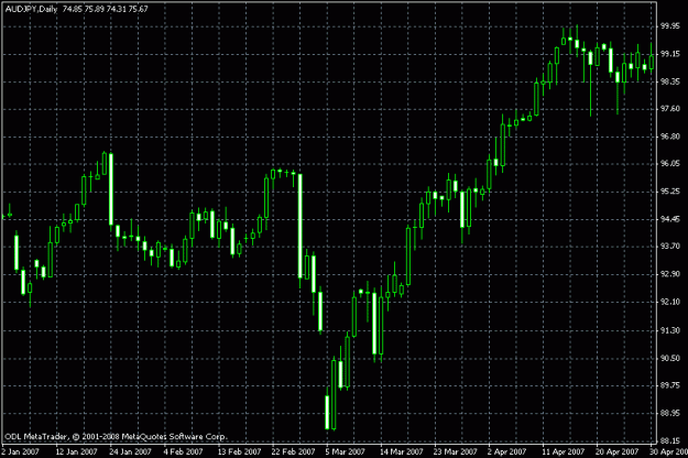
My current overall favourites pairs currently are AUD/USD and USD/YEN and GBP/CHF. I zoomed in on the latter because the others had been discussed before. But apart from that, GBP/CHF has "wound up" for quite a while now which has two benefits: it allows for tight stop/losses and I expect the move to be very strong once it breaks out of the consolidation.
Also, for me the chart shows a certain clarity or aesthetic which stands out.
I'm surprised you can't see the likely direction from your charts. Take a 2 second glance at the BIG BOSS, then the BOSS and then the Worker - what do they tell you?
All three are telling me down. That's why I am suscpicious ;-)
Why have you drawn your trend line from the points you chose?
Trend lines are something I am experimenting with - so far I've found out that chalk and oil colours don't work well on my particular laptop screen and a friend suggested a scratching technique, but he doesn't know anything about trading; so I am back to the digital lines.
Apart from that I currently ask myself "which area along a line does the price tend to react to?" In this specific case I saw biggest correlation along the opening/closing prices of the bars that I have connected - so price tended to pull back to or stop at this line. (At the very beginning there is a slight inaccuracy of my drawing though).
Do you have any feedback on this?
Sid,
Why have you honed in on GBPCHF? - what makes it an attractive trade for you? Why this pair over any other pair?
My current overall favourites pairs currently are AUD/USD and USD/YEN and GBP/CHF. I zoomed in on the latter because the others had been discussed before. But apart from that, GBP/CHF has "wound up" for quite a while now which has two benefits: it allows for tight stop/losses and I expect the move to be very strong once it breaks out of the consolidation.
Also, for me the chart shows a certain clarity or aesthetic which stands out.
I'm surprised you can't see the likely direction from your charts. Take a 2 second glance at the BIG BOSS, then the BOSS and then the Worker - what do they tell you?
All three are telling me down. That's why I am suscpicious ;-)
Why have you drawn your trend line from the points you chose?
Trend lines are something I am experimenting with - so far I've found out that chalk and oil colours don't work well on my particular laptop screen and a friend suggested a scratching technique, but he doesn't know anything about trading; so I am back to the digital lines.
Apart from that I currently ask myself "which area along a line does the price tend to react to?" In this specific case I saw biggest correlation along the opening/closing prices of the bars that I have connected - so price tended to pull back to or stop at this line. (At the very beginning there is a slight inaccuracy of my drawing though).
Do you have any feedback on this?