Thank you Orest for your nice word about my English.
So if it’s not mine then it might be yours? Just kidding.
But more seriously it’s scary that it’s so difficult to communicate properly within the same language and in such a limited technical field.
Anyway I’ll try again.
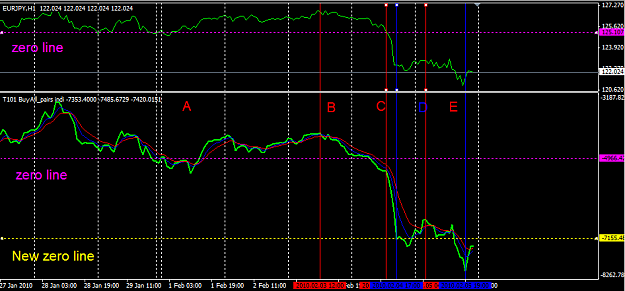
First the new indicator: I was not expecting that at all, but when I first looked at it I was amazed, then I zoomed out to max and it appeared clearly that the anchor spread line was giving us a mirrored image of the Synthetic Basket Line (SBL) graph. And yes it makes a valley when the other one makes a peak but it also make a peak (anchor spread increases) when the SBL is at a bottom. Actually if anything, the anchor spread line should behave in an oscillator fashion. I don’t know how it is calculated (the code is way too sophisticated for me) but I guess it’s related to the look back value, I remember having seen something like 12 weeks? It might be too much…
What I was referring to when asking for “a line with the distance in pip between the 2 anchors” was not a graphic line but a text line. You have “T= xx, we could have Ta = anchor spread. And it was not supposed to show a trend change, total T does it accurately when it passes from plus to minus. It was more to tell you that under a certain size of anchor spread the trend is not reliable especially at the beginning of the week, T101 did say something like this … But that’s ok, it’s not critical.
Now the main point: why having a fix origin of time? When you look at the column “this week”, (provided that I’m not wrong and this column has a fix origin at the opening of the market on Sunday), you get the pip value of each pair and the total of them related to this origin. It gives you a reliable image of their behaviours.
In a column like “4h ago” on another hand, the move of the origin through B to C for example has more influence on the resulting pip value than what the different pairs and the SBL are actually doing. It could be ranging flat in the last 3 hours and give you a highly trending result because the origin moved so much.
We should distinguish clearly “look back” and “TF”. TF gives you an incremental (stepped) value, look back on another hand gives you an image through a moving window, but if your feed is the tick, this image won’t be incremental either.
For sure, the size of the look back value tends to buffer the negative effect of the moving origin, because as the pip value increases, the importance of change decreases (percentage).
So for me only “this week” column has relevance. “this day” is less interesting because 00:00 today is arbitrary, it depends on your feed.
An origin like London or NY Market opening would make more sense. I still prefer to manually attach the origin to a main peak or valley. But I guess it’s an old debate between those who prefer to fib each weekly candle or each daily candle versus those who fib the major moves.
But even in fibbing the daily candle you fib the high and low, not the opening. What about rolling fibs?
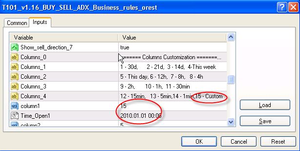
I hope you can understand now why I’d like to have those two customizable columns. Then the anchor spread would have some relevance, it let you know how long to wait after the opening of the new column.
Have a great weekend.
Schmurex
So if it’s not mine then it might be yours? Just kidding.
But more seriously it’s scary that it’s so difficult to communicate properly within the same language and in such a limited technical field.
Anyway I’ll try again.
First the new indicator: I was not expecting that at all, but when I first looked at it I was amazed, then I zoomed out to max and it appeared clearly that the anchor spread line was giving us a mirrored image of the Synthetic Basket Line (SBL) graph. And yes it makes a valley when the other one makes a peak but it also make a peak (anchor spread increases) when the SBL is at a bottom. Actually if anything, the anchor spread line should behave in an oscillator fashion. I don’t know how it is calculated (the code is way too sophisticated for me) but I guess it’s related to the look back value, I remember having seen something like 12 weeks? It might be too much…
What I was referring to when asking for “a line with the distance in pip between the 2 anchors” was not a graphic line but a text line. You have “T= xx, we could have Ta = anchor spread. And it was not supposed to show a trend change, total T does it accurately when it passes from plus to minus. It was more to tell you that under a certain size of anchor spread the trend is not reliable especially at the beginning of the week, T101 did say something like this … But that’s ok, it’s not critical.
Now the main point: why having a fix origin of time? When you look at the column “this week”, (provided that I’m not wrong and this column has a fix origin at the opening of the market on Sunday), you get the pip value of each pair and the total of them related to this origin. It gives you a reliable image of their behaviours.
In a column like “4h ago” on another hand, the move of the origin through B to C for example has more influence on the resulting pip value than what the different pairs and the SBL are actually doing. It could be ranging flat in the last 3 hours and give you a highly trending result because the origin moved so much.
We should distinguish clearly “look back” and “TF”. TF gives you an incremental (stepped) value, look back on another hand gives you an image through a moving window, but if your feed is the tick, this image won’t be incremental either.
For sure, the size of the look back value tends to buffer the negative effect of the moving origin, because as the pip value increases, the importance of change decreases (percentage).
So for me only “this week” column has relevance. “this day” is less interesting because 00:00 today is arbitrary, it depends on your feed.
An origin like London or NY Market opening would make more sense. I still prefer to manually attach the origin to a main peak or valley. But I guess it’s an old debate between those who prefer to fib each weekly candle or each daily candle versus those who fib the major moves.
But even in fibbing the daily candle you fib the high and low, not the opening. What about rolling fibs?
I hope you can understand now why I’d like to have those two customizable columns. Then the anchor spread would have some relevance, it let you know how long to wait after the opening of the new column.
Have a great weekend.
Schmurex
Attached Image (click to enlarge)