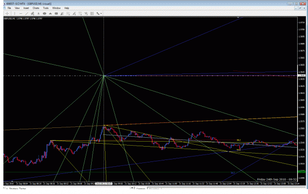
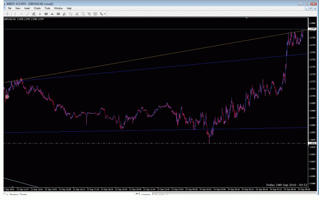
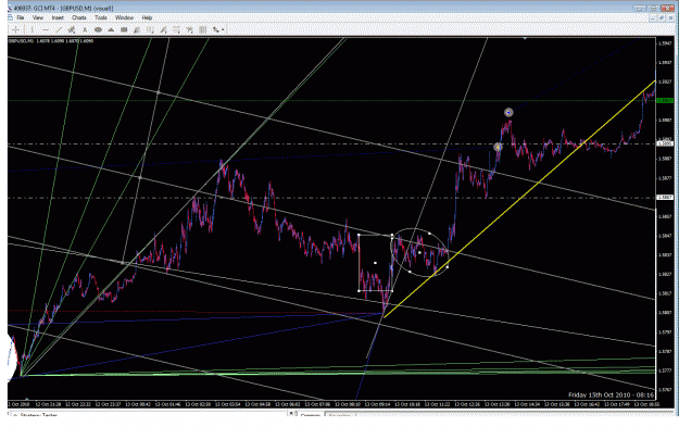
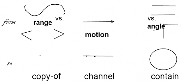
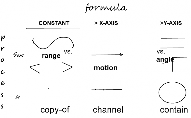
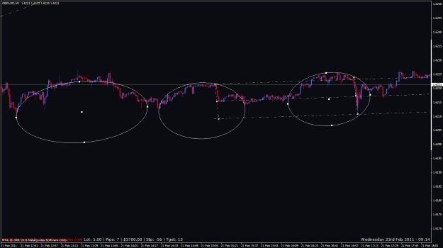
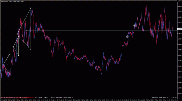
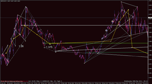
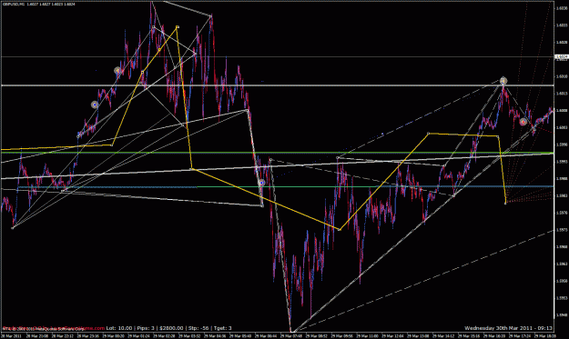
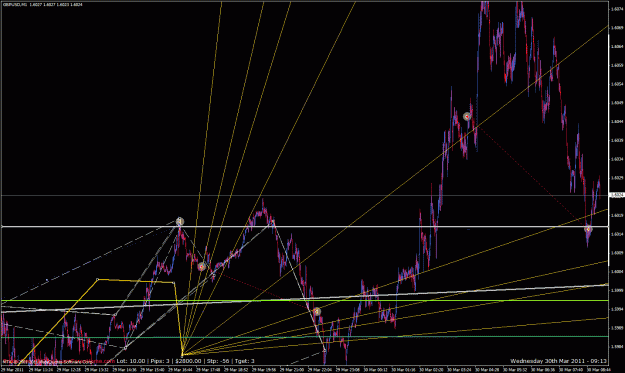
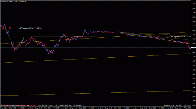
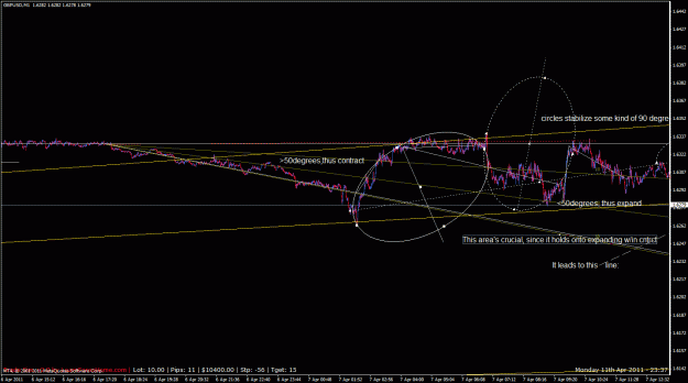
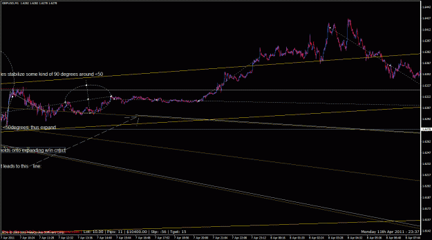
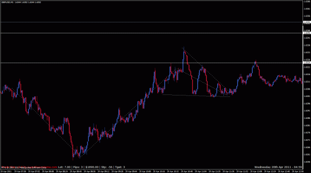
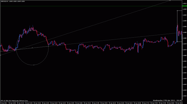
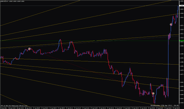
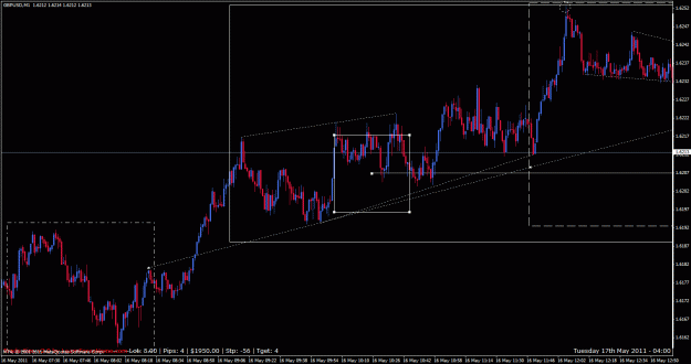
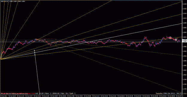
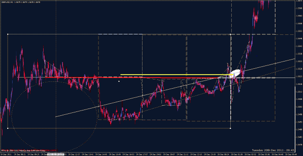
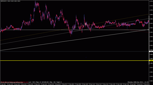
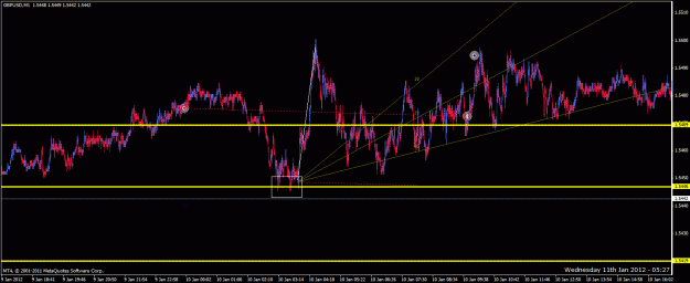
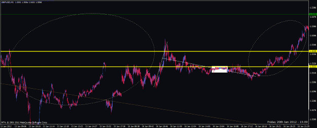
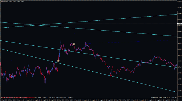
I got the 'axis' idea both from my post in and while visiting another ff member's thread -- aka, moving averages and such -- , the word 'axis' being a measure of size above and below a line drawn on the chart.
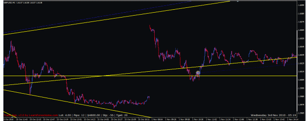
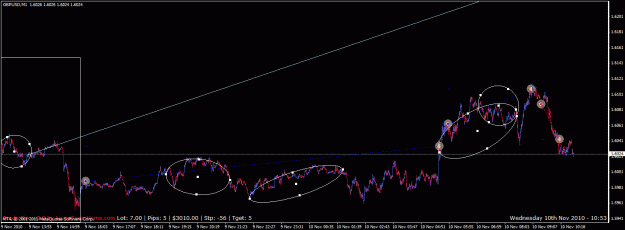
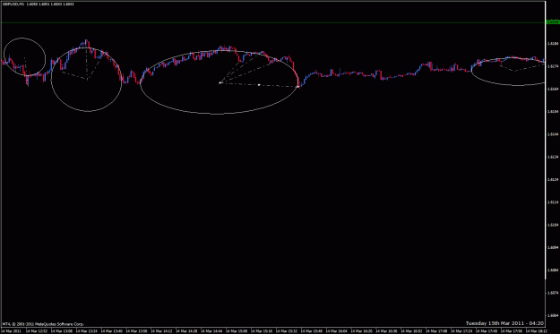
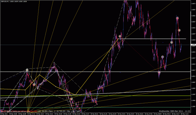
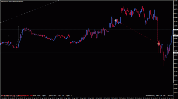
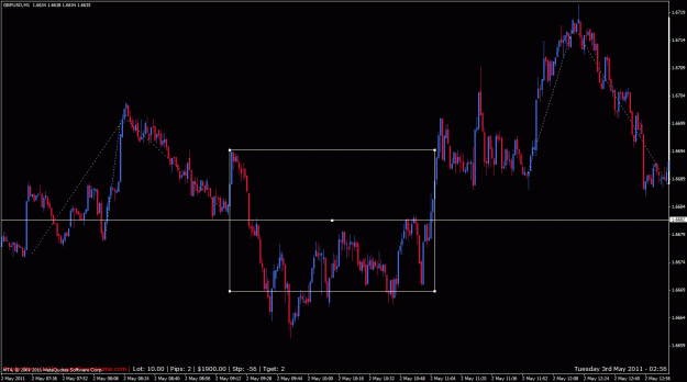
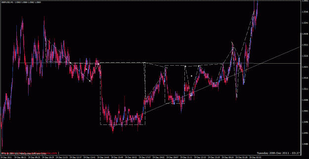
This addition to the method did well for me below:
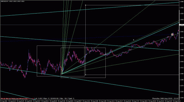
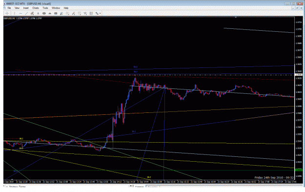
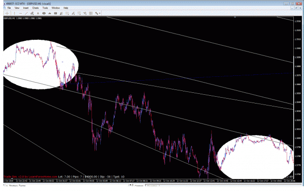
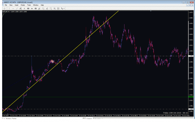
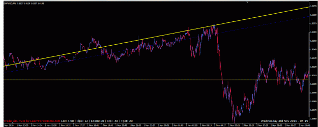
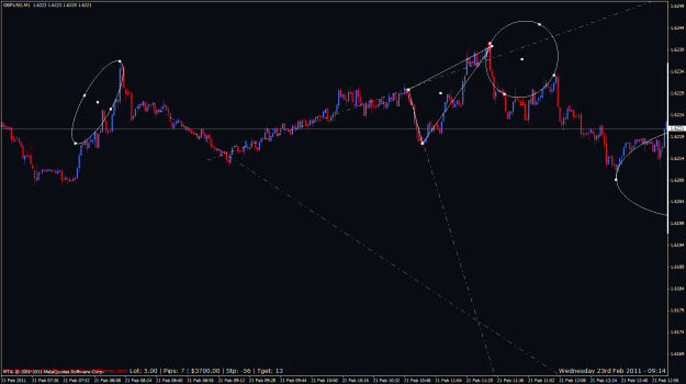
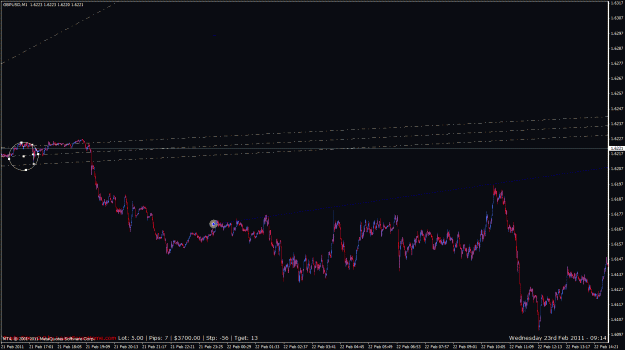
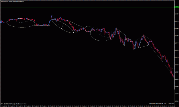
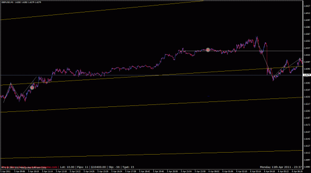
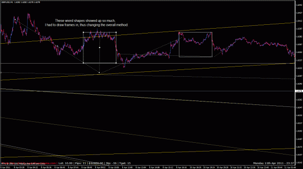
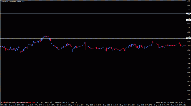
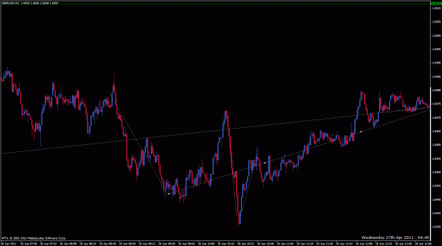
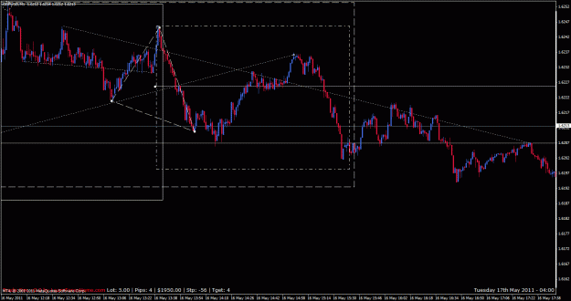
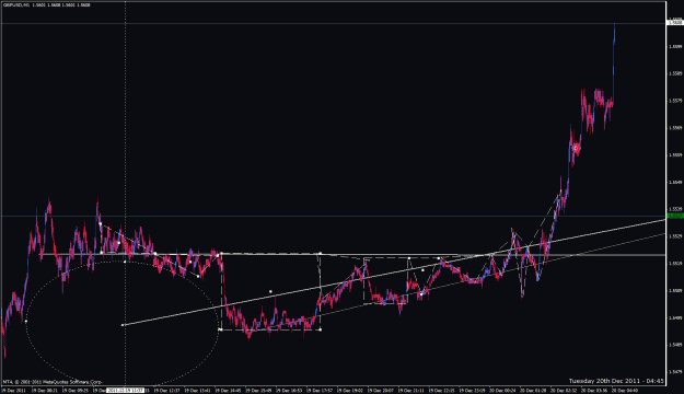
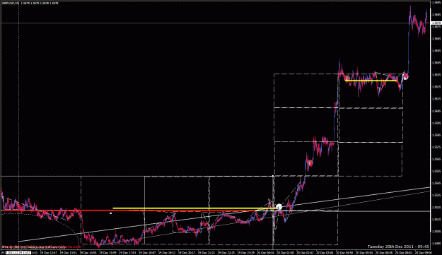
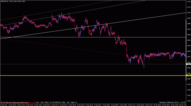
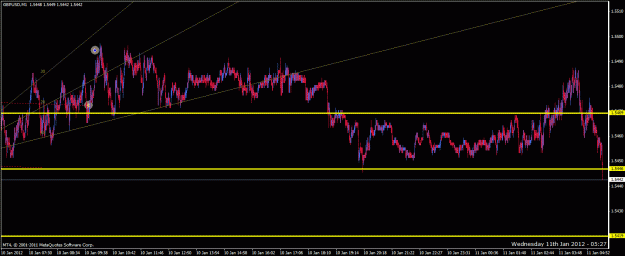
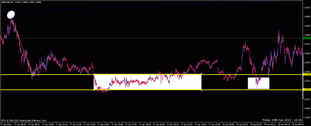
This addition to the method did well for me below:
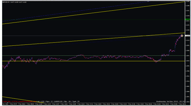
Attached Image (click to enlarge)
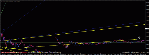
Attached Image (click to enlarge)
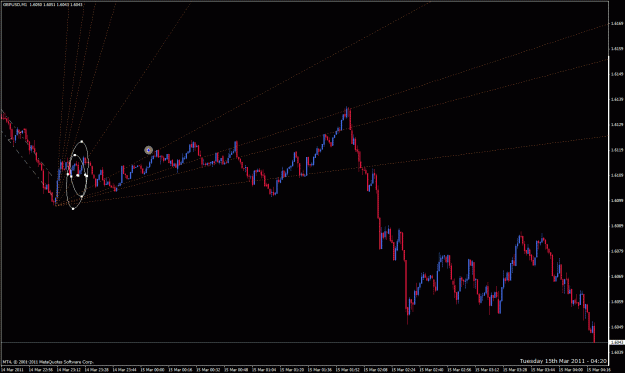
Attached Image (click to enlarge)
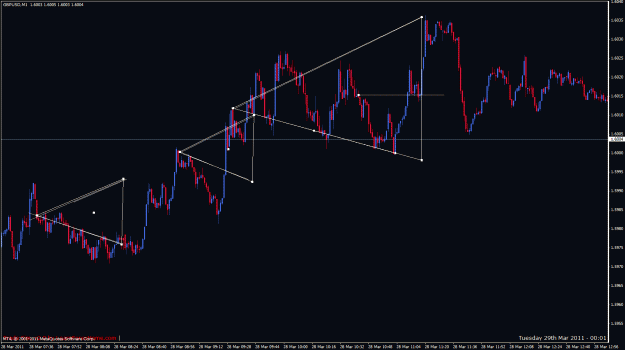
Attached Image (click to enlarge)