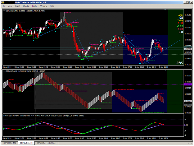
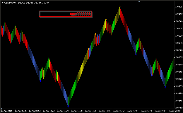
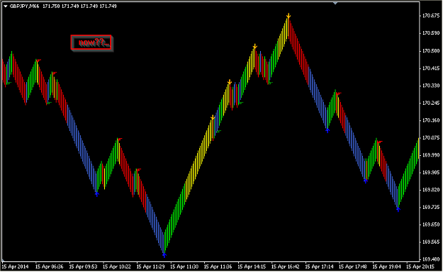
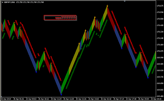
This chart configuration helped me see the relationship between SSA/Georenko and conventional price movement more clearly by viewing SSA as a 'leading' indicator, with higher lows/lower highs being the confirmation. When compared to the HLs/LHs on the M5 chart (along with trendline breaks and bounces) it was easier to see how Kiads' tools work. Maybe this will help others to understand a little better, too.
(BTW, my SSA settings are 10/100, and Renko is 12 pip, 12.5% shift with ADX and MACD set to True. I don't know if that's the optimal combination, but it seems to work pretty well.)
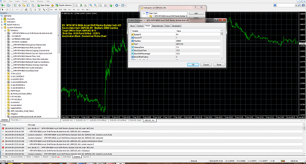
(BTW, my SSA settings are 10/100, and Renko is 12 pip, 12.5% shift with ADX and MACD set to True. I don't know if that's the optimal combination, but it seems to work pretty well.)
Attached Image (click to enlarge)