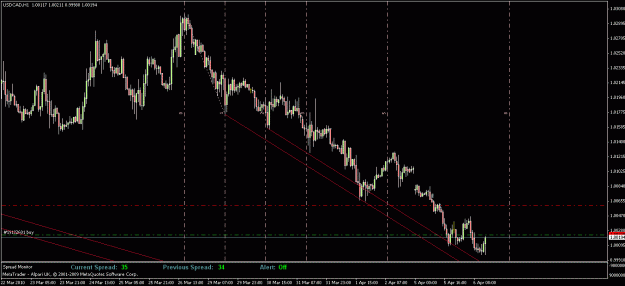
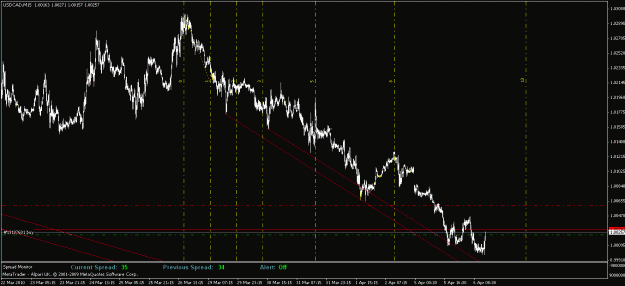
a couple of friends from work and i were discussing 3D charting and this is what we came up with.
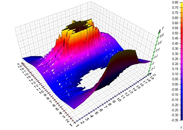
we all know what a candle looks like. it has open high low close, but it doesn't show you for how long the candle stayed at a certain price. so what we came up with is that the z axis would show how long a currency stayed at a certain price within a candle or how many ticks occured at a certain price within a candle. this is what it would look like:
http://i203.photobucket.com/albums/a...fghnfgnfgn.jpg http://i203.photobucket.com/albums/a...dsfbdfbdfb.jpg
obviously, it's a crude drawing and doesn't give a perfect example, but you can get a basic idea of what i'm talking about. basically, the bigger the bar, the longer the price stayed at that point or the more ticks happened at that price.
it was just an idea we had and it sounds cool. obviously you couldn't use it with a whole chart, but maybe you could select a few bars or whatever. just my two cents.