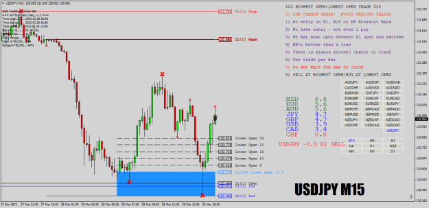
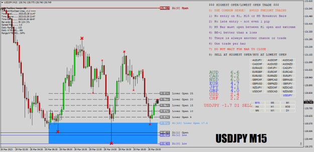
Disliked{quote} Hi TooSlow, although after studying the logic of TRO's systems (I think he is the invention of "holo"), I deduced that the higher the range, the higher the probability that the price will return. And about the time, it is quite obvious that the best entries are in the "range" periods of the price, I did not manage to deduce the significance of the data from image 2 and 3. Please explain to me what the first line in the two pictures represents, I looked for minutes on end but I don't understand what it means. {image} {image}Ignored
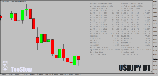
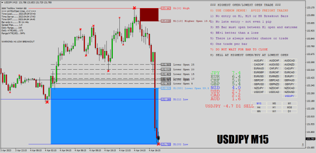
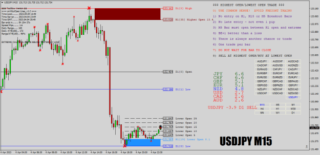
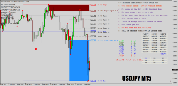
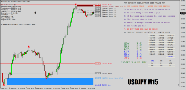
Second chart is the frequency distribution of the occurence of the daily high and daily low. 0 is the 00:00 bar or first hour of the day. The daily high occurred 3 times and the daily low occurred 2 times during the 00:00 bar in the last 240 days.
Cheers.
My Threads: Trading is as simple as 1-2-3, Highest Open / Lowest Open Trade
2