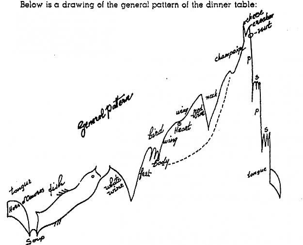
An interesting metaphor, from the booklet The Egg of Columbus of G. Bayer (PDF easily found on the net). He postulates a standard pattern of growth and decay of stocks and commodities. He (with some humour) compares it to the course of the dinner (bull phase), and later relieving at the toilet (bear phase). Overall it looks like an Elliott wave pattern.
The guest was in the mood for red wine, I kept the position open. Now the neck is showing up. Time for a burst upwards (champagne) and then reversal pattern (desert of the dinner).
k
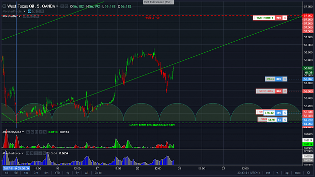
Price decided to go down there, and has triggered the s/l for a small overall loss. Will be interesting to see whether this creates a larger-scale similar pattern tomorrow.
k
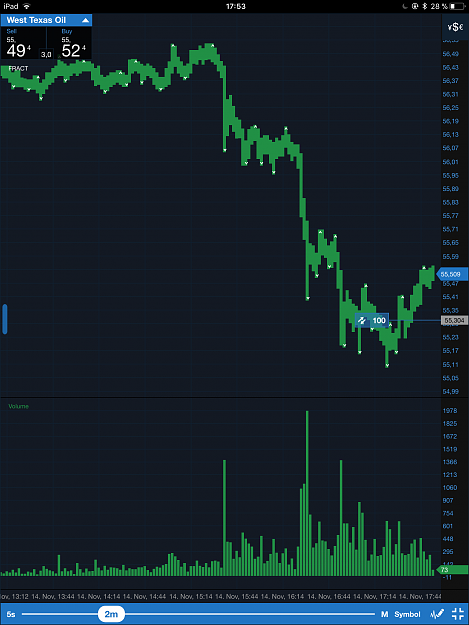
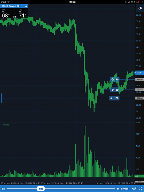
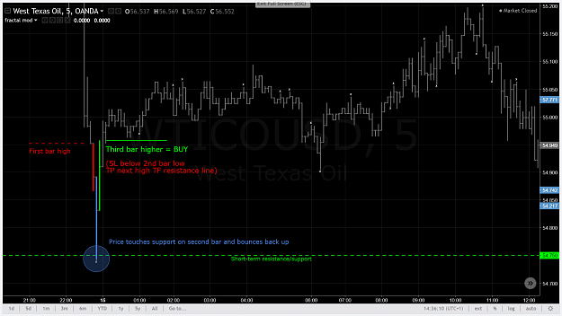
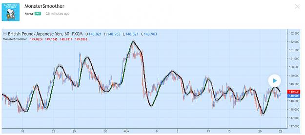
I relied on s/r lines for quite some time now, but have always been nervous about it. It requires continuous monitoring of the charts. I think I may have found the time element that I was looking for, allowing me to make educated guesses when the bounces would happen. It is an indicator as old as the hills, and it appears to work: the pitchfork.
See below an example of a pitchfork/support line cross in oil yesterday evening. Both were drawn ahead of the time of bounce.
Cheers,
k
Price decided to go down there, and has triggered the s/l for a small overall loss. Will be interesting to see whether this creates a larger-scale similar pattern tomorrow. k
I relied on s/r lines for quite some time now, but have always been nervous about it. It requires continuous monitoring of the charts. I think I may have found the time element that I was looking for, allowing me to make educated guesses when the bounces would happen. It is an indicator as old as the hills, and it appears to work: the pitchfork. See below an example of a pitchfork/support line cross in oil yesterday evening. Both were drawn ahead of the time of bounce. Cheers, k {image}
Ignored
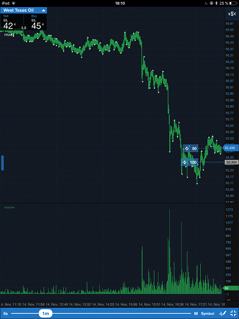
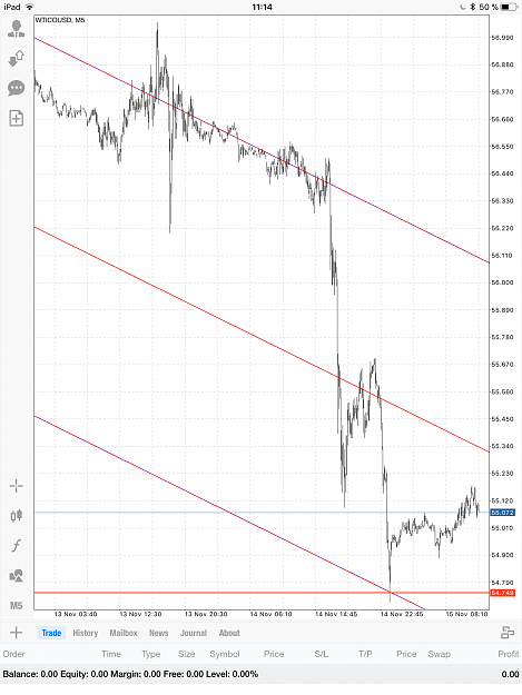
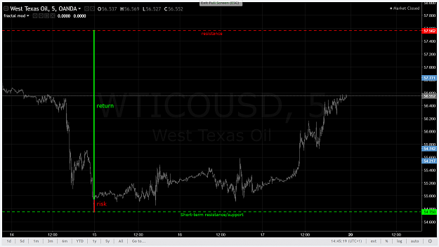
The pitchfork, basically an imaginary line on the screen (but drawn according to rules), becomes a price support. Random market my ass.
k
{quote} The pitchfork, basically an imaginary line on the screen (but drawn according to rules), becomes a price support. Random market my ass. k {image}
Ignored
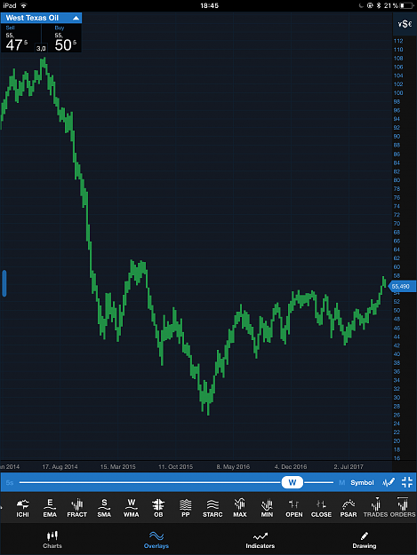
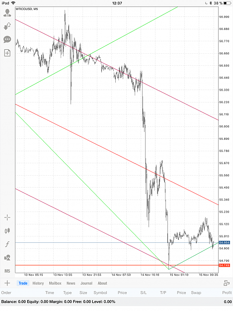
Epilogue of the news supposed to be negative for oil price today. Notable are the repetition of the Bayer’s pattern (soup+fish) at an even bigger time/price scale, as well as the support provided by the pitchfork - a “random line on the chart”.
k
An interesting metaphor, from the booklet The Egg of Columbus of G. Bayer (PDF easily found on the net). He postulates a standard pattern of growth and decay of stocks and commodities. He (with some humour) compares it to the course of the dinner (bull phase), and later relieving at the toilet (bear phase). Overall it looks like an Elliott wave pattern. {image}
Ignored
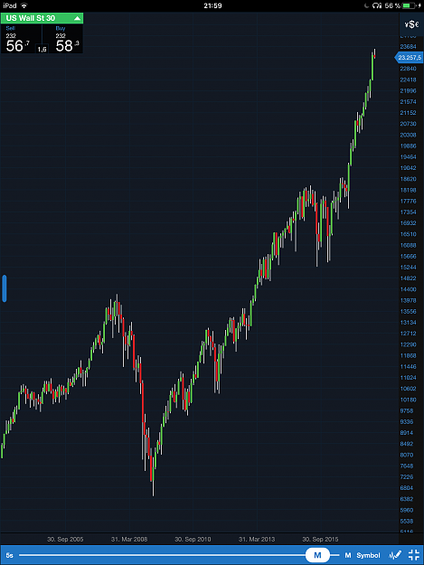
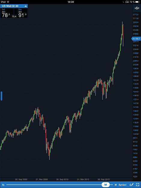
Interesting to compare the Dow with the Bayer’s pattern. As far as I can see, we are in the “champagne” phase... (Some time ago I calculated the resistances in Dow to be 25000 and 29370.) Hope I am not correct on this.
k
{quote} Interesting to compare the Dow with the Bayer’s pattern. As far as I can see, we are in the “champagne” phase... (Some time ago I calculated the resistances in Dow to be 25000 and 29370.) Hope I am not correct on this. k {image}
Ignored
Like clockwork. Hopefully Trump’s corporate tax reform wins this market test. Last crisis (pullback to Dow uptrend) shattered much of southern EU economies...
Nice picture Parisboy !
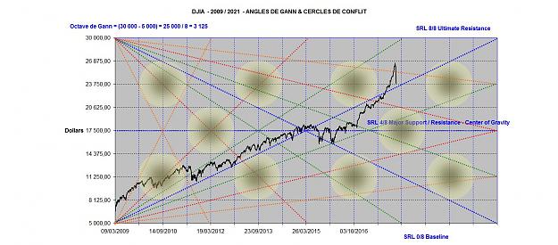
Price on your picture is at left side (Y axis), and time on the bottom side (X axis), if i understand it correctly. Beginning of the image is just pure candle stick or bar chart, and you try to add angles lines and squares line on it. Not understand how do you choose the octave, i assume it is from Zero percent to 100 percent scaling, and divide it with 8 ??
If i look at Murrey Math calculation, there are spare -1/8 and -2/8 range at bottom, and +1/8 and +2/8 at top of the range, so total are 12 lines. Is it the reason ?
Time are also important besides price calculation, and i do not understand why there is jumping time ? Note that time series are in one, two, three years duration are acceptable, ex : 2011, 2014, 2017 are the three years duration of time series Exists. Why we choose this duration ?
Does it mean that next month the price will go to around 20,750 may be ?? Just trying to understand your image, i can be wrong though. Any explanation is really appreciated.
Today is not too hot, so have a nice day ...
{quote} Nice picture Parisboy ! Price on your picture is at left side (Y axis), and time on the bottom side (X axis), if i understand it correctly. Beginning of the image is just pure candle stick or bar chart, and you try to add angles lines and squares line on it. Not understand how do you choose the octave, i assume it is from Zero percent to 100 percent scaling, and divide it with 8 ?? If i look at Murrey Math calculation, there are spare -1/8 and -2/8 range at bottom, and +1/8 and +2/8 at top of the range, so total are 12 lines. Is it the reason...
Ignored
Pedma many thanks to ask such questions.
a) beginning of the image is located at the last significant Low of March 2009
b) as you can notice present Dow Octave is 25.000 / 8 = (30.000 - 5000) / 8 = 3.125
c) Murrey Math calculation is primitive and does not cover the whole ground . I will explain this point later.
d) time requirement has to be divisible by 8 too so that Time and Price could "square"