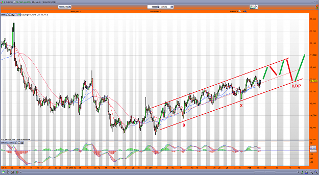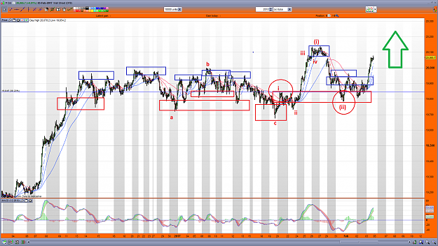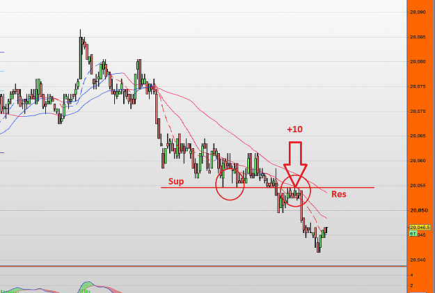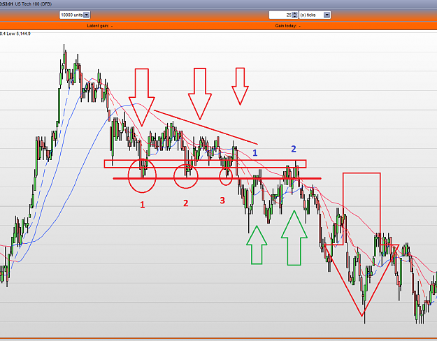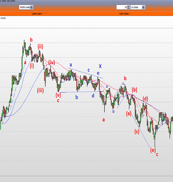


The purpose of this following chart is to try to map out where various Supply and demand zones are as PA prints. I probably should have swapped the colours around as i have Demand zones (buying) in red! but anyway, you can see how the various battlezones take place and move up whilst the cycle is bullish and then the real war starts when the Supply zones grow in number (selling), eventually they take over and trend changes;

Attached Image (click to enlarge)
GoFundMe -stage-4-glioma-brain-cancer-fighter (link in my profile)