I have been mulling over the idea that if I pay more attention to the overall market structure (you might like to think of this as trend, or pivots) as opposed to the move of individual price bars, I will overall be more profitable.
2 examples:
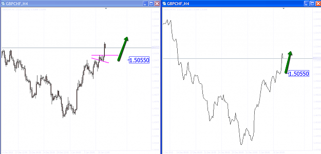
GBPCHF240 (top)
I had a buy as shown, but did not like the resistance building at the pink line. These individual bars were enough to put me off the trade.
Switching to a line chart, and the immediate picture (at my buy zone) better represents, A] the overall market structure which is bullish right now (on 240) and B] the actual outcome, an up move.
Not to mention, encourages a buy given my bias was bullish.
Hence, the left chart showing individual bars puts me off the trade at my buy zone. But the line chart encourages me to buy in my buy zone.
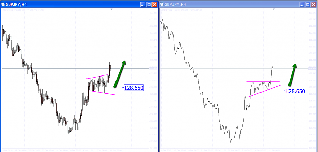
GBPJPY240 (bottom)
Again, a buy as shown, but the wedge configuration forming on individual candle bars puts me off the trade.
Switching to a line chart, and the immediate picture (at my buy zone) better represents, A] the overall market structure which is bullish right now (on 240) and B] the actual outcome, an up move.
Not to mention, encourages a buy given my bias was bullish.
Hence, the left chart showing individual bars puts me off the trade at my buy zone. But the line chart encourages me to buy in my buy zone.
Hence
It seems to make sense to me to focus more upon overall market structure via line charts or some other representation of price, and less on the move of individual price bars.
The above examples perhaps are biased and there may be good reasons/examples why individual bars matter.
There is also the matter of “trading style” and timeframe, which will impact upon the practical application of using an alternative representation of price.
Your thoughts!
2 examples:
GBPCHF240 (top)
I had a buy as shown, but did not like the resistance building at the pink line. These individual bars were enough to put me off the trade.
Switching to a line chart, and the immediate picture (at my buy zone) better represents, A] the overall market structure which is bullish right now (on 240) and B] the actual outcome, an up move.
Not to mention, encourages a buy given my bias was bullish.
Hence, the left chart showing individual bars puts me off the trade at my buy zone. But the line chart encourages me to buy in my buy zone.
GBPJPY240 (bottom)
Again, a buy as shown, but the wedge configuration forming on individual candle bars puts me off the trade.
Switching to a line chart, and the immediate picture (at my buy zone) better represents, A] the overall market structure which is bullish right now (on 240) and B] the actual outcome, an up move.
Not to mention, encourages a buy given my bias was bullish.
Hence, the left chart showing individual bars puts me off the trade at my buy zone. But the line chart encourages me to buy in my buy zone.
Hence
It seems to make sense to me to focus more upon overall market structure via line charts or some other representation of price, and less on the move of individual price bars.
The above examples perhaps are biased and there may be good reasons/examples why individual bars matter.
There is also the matter of “trading style” and timeframe, which will impact upon the practical application of using an alternative representation of price.
Your thoughts!
Attached Image(s) (click to enlarge)