Dislikedlol , it is easy to put the arrow down and up when the chart is already established ?Ignored
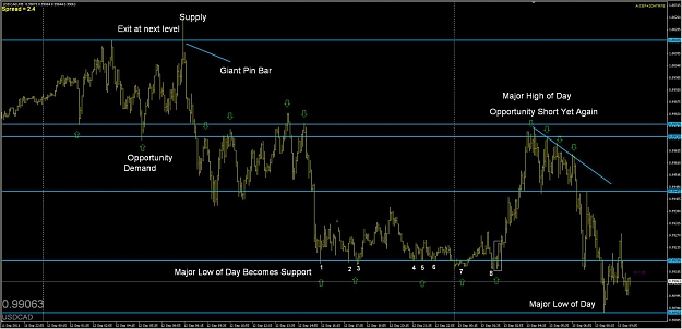
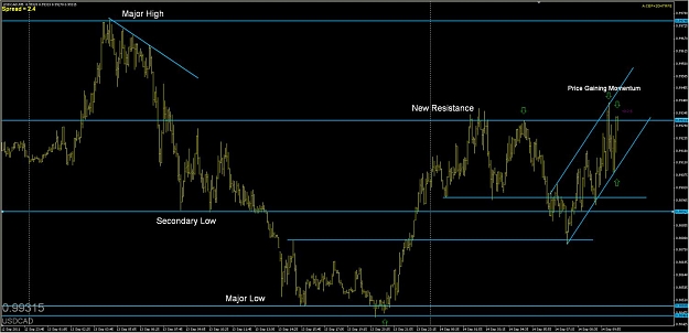
If you look at the USDCAD chart i show an arrow to give a heads up that price may react there again, as it did. It reacted as a demand level to the previous supply level.
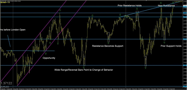
For the Euro Chart I put levels on that I felt would be reactive also. And for this chart I have shown that the channel up coincided with another previous major high with to strike points forming resistance that becomes support that you could have taken for a long to the next level or waited to the upper part of the channel to exit.
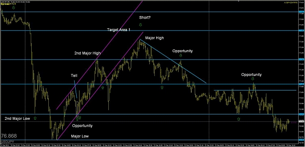
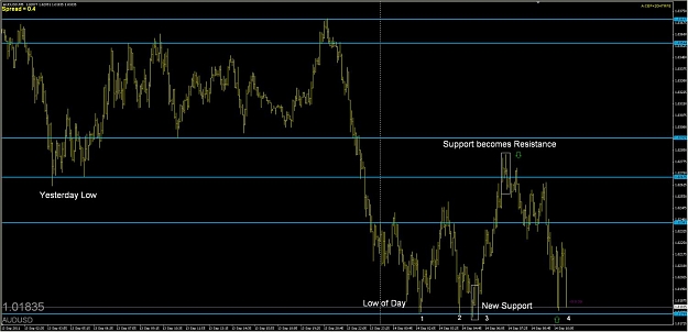
For the AUDUSD chart I spotted the levels that would be possible reactive points as well. The 2nd important high of the 9th may come to act again as resistance for a potential trade short for 10-30pips within the next 2 days.
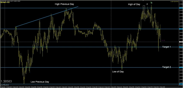
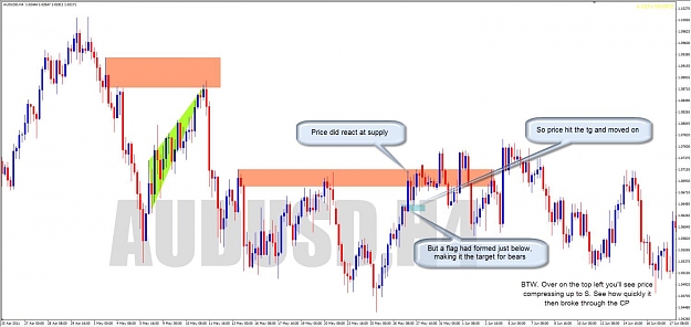
For the USDJPY the highs of the 11th may act as resistance again and may be an opportunity to short as supply may exceed demand. Price dipped below support, but came again to test it and found buyers where I marked the Tell box. A large bar like this signifies that there are new buyers/sellers entering the market to push price up.
I recommend if you are interested to continue to read this thread as well as another thread I enjoy No Brainer Trades. Pay attention also to Ifmayante, Orbital, and Kenny posts as they are very involved.
Hopefully this shows my logic as to why I drew the areas I did, and what I go about when thinking of taking a trade. Good luck and Trade Well.
Attached Image(s) (click to enlarge)


The things that we love tell us what we are Thanks Redsword11 and Tim Morge