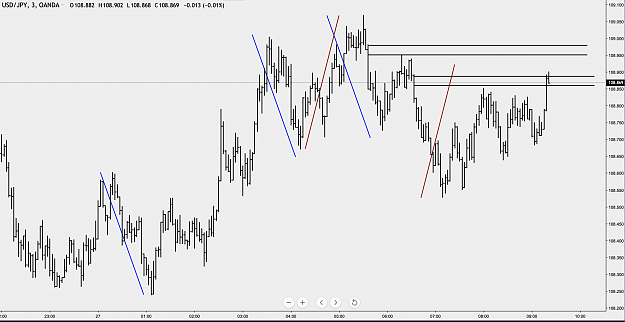
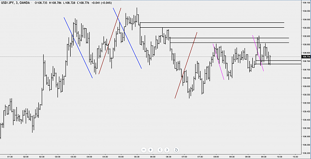
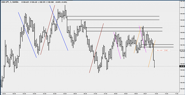
DislikedUsing this NZDUSD 60 minute chart I'll go through a typical example of how I analyze a chart. I don't always put all the markings you'll see here but they are just to illustrate. {image} I start by marking the obvious corrective swings. I don't mark impulse swings. Here the red is the largest corrective wave and the blues are the next biggest corrective waves. {image} Now I clone and move the swing projections to the bottom of the chart where current price action is at. Now I wait for price to swing up. If price keeps going down I move the projections...Ignored
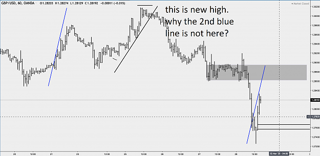
and as i understand well you dont know where the second line will apear the chart.
what is the advantage of it? ( maybe i dont understand something
1