Dislikedoh boy.... I guess you guys have a lot of time in your hands to waste with something that will never work.
Just for the record....did you guys know that every single thing you add to your chart is like adding another variable to an equation.
x+3=5 is easy right? Ok but forex is not that simple
x+y=5 that's a little more close to the degree of forex complexity.
Now lets see what you guys are doing to it:
[email protected] hard uh?
The market can only succumb to its own inefficiency and...Ignored
You, also, brought something to think about, and I appreciate it, especially from a trader who makes money. Any charting method can stand a good test.
The randomness issue has been broached in several ff threads (1, 2 and others) , so I'll skip that one.
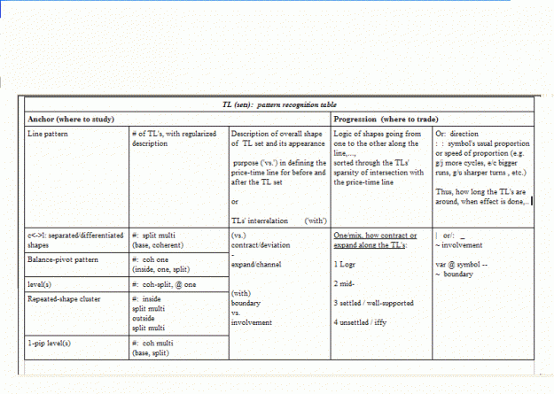
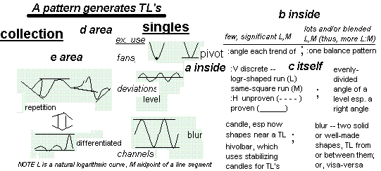
Visual logic is what I go for in drawing my TL sets. I'll play along, though, with your math approach.
Okay, how about this. You're using algebra, right? Let's pretend that each shape on a 1' candle chart (which is my main chart TF) can be explained with a function (log x, cos y, etc.) or simple formula (your polynomials with 1-2 variables and/or constants.)
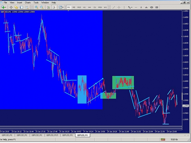
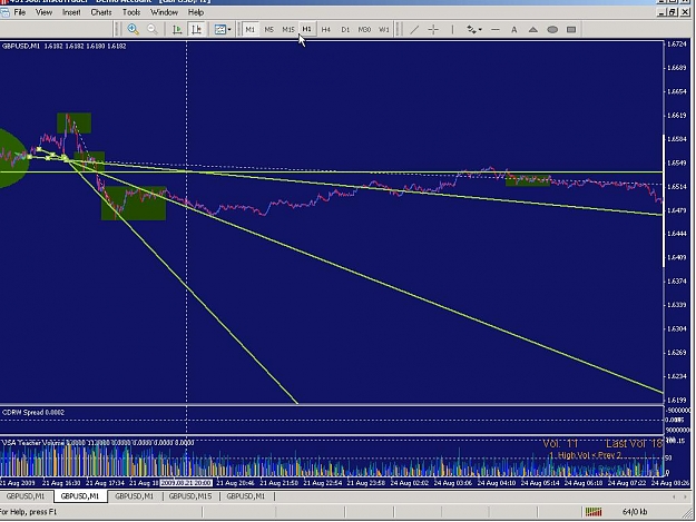
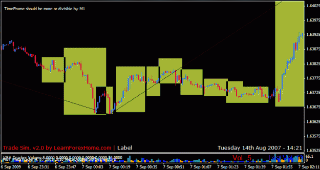
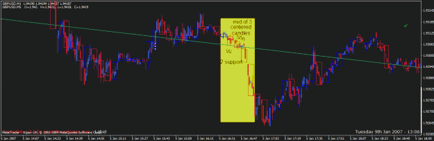
Given this, the following charts have one TL that connects the stability
within two consecutive logarithmic curves (or log x) on the 5' overlay chart in the two yellow boxes:
Attached Image (click to enlarge)
Attached Image (click to enlarge)
----
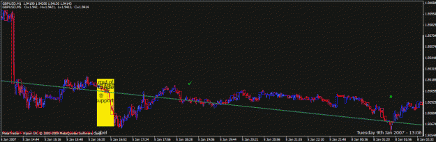
Attached Image (click to enlarge)
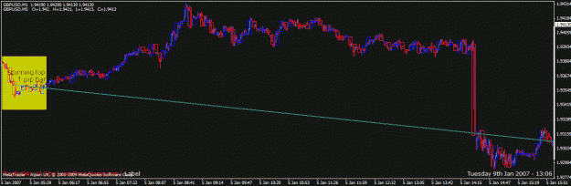
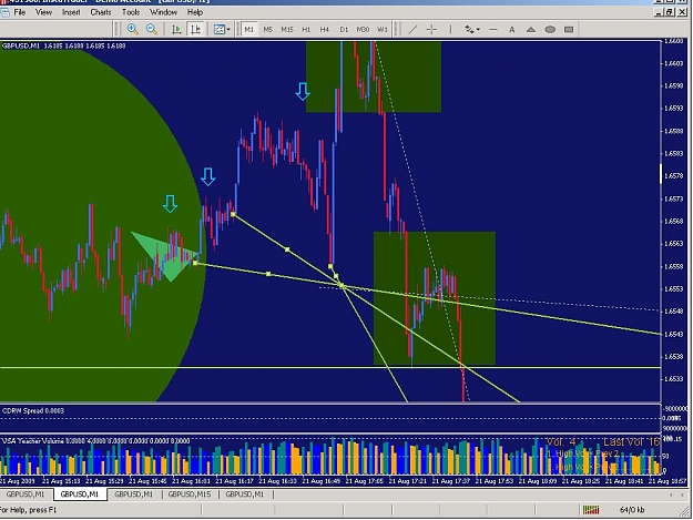
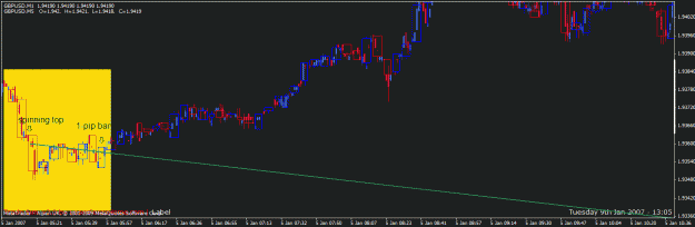
The check in the fourth picture shows a side shape where the TL's effective, and the 'x' where the price-time line verticalizes thru the TL and begins to leave the area in the fifth picture.
Attached Image (click to enlarge)
Attached Image (click to enlarge)
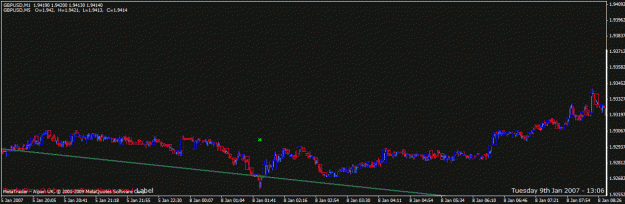
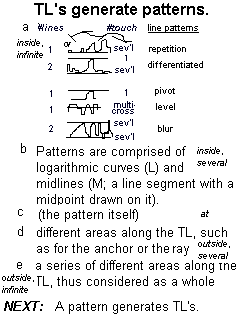
The TL in the pictures above has one main variable, the logarithm, which is conditioned with various candles to make the stability of each logarithm, and that one logarithm is mostly below the TL and the other is mostly above the TL could be a third variable. The TL's progression after then has two main constants, the flat and the spike.
Of course, I'm only considering what I see, not that I pretend to have the sophistication it'd take to say that the flat (checked) and the spike ('x'ed) would necessarily be there because of the TL I drew.
Usually, I try and gather an entire area into one understanding of how to draw TL's for that type of area. I've made great strides over the past fourteen months in this rather difficult approach to chart study.
----
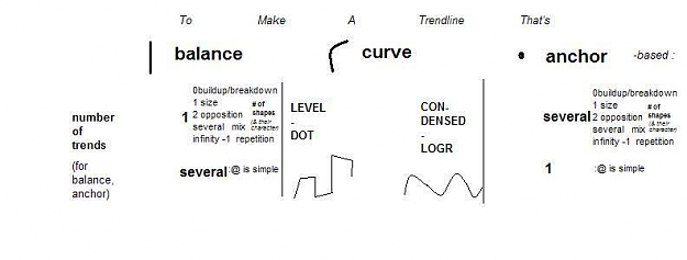
So, to answer your question, a TL is basically A (initial point) + B (second point) = C (progression of the ray from the TL). Use a chart pattern within which is a simple shape found in lots of patterns -- say, a right angle, logarithm or rectangle -- and such a three-part polynomial as you suggested makes sense for each TL of a set that repeats along the core to explain the entire chart pattern and/or repetitions of that pattern. Algebraically, I suppose you would be concatenating a bunch of polynomials that are related in the area the TL set deals with.
I hope that answers your question. Good trading to you.