I am trying to write an indicator that shows how often the price has changed direction at a particular price. I think it would offer some help when deciding where support and resistance levels are.
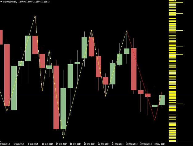
The column of yellow marks shows how often the price has pivoted at a particular price. So where the marks are closer together there's a higher chance of the price changing direction.
But because of the resolution of the screen and the closeness of the marks it's very difficult to decipher.
What I need is some way of smoothing out the column.
I'm not a statistical expert but I suspect I need some kind of distribution graph.
Does anyone out there know enough about statistics and, in particular, distribution to help?
Attached Image (click to enlarge)
The column of yellow marks shows how often the price has pivoted at a particular price. So where the marks are closer together there's a higher chance of the price changing direction.
But because of the resolution of the screen and the closeness of the marks it's very difficult to decipher.
What I need is some way of smoothing out the column.
I'm not a statistical expert but I suspect I need some kind of distribution graph.
Does anyone out there know enough about statistics and, in particular, distribution to help?