Hello dear traders!
So in a nutshell about yourself. A trader with extensive trading experience with almost everything that can be assumed. I trade solely on technical analysis.
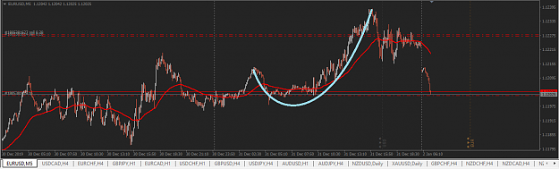
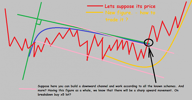
A very long time ago I began to observe such figures as described below, but nowhere did I find a clear statement of what and how to use it.
I can assume that this is part of.....
So... its graph of a cubic function ? - and its called a cubic parabola. Alternative definitions of a cubic parabola as a function graph are often found in the literature - Y=AX^3 OR y=x^3 (pic.6)
Real application and trade:
1.) I tried to use the eliot waves, especially the 3rd wave in the 3rd. As a rule, this helped to find similar figures in 30% of cases. (The waves are much smaller than the size of the figure.)
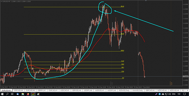
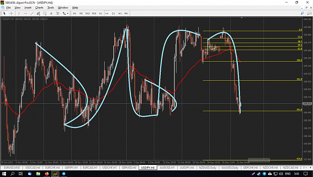
2.) Also tried to use fibonacci. In the case of the second option, in 90% of cases the price reaches 261.8 (as in picture 2, a new figure (marked in yellow)).
In case first figure on pic.2 - mostly i can see pullback to 23.6 than move to 100.0 - so its both our tp.
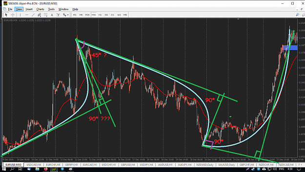
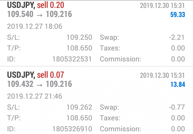
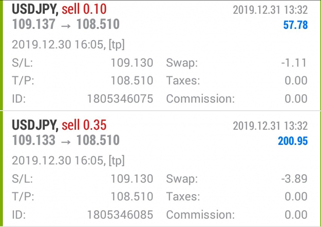
3.) Trading this idea I can get 91-94% win rate depending on the pair, usually with 3to1+ risk ratio. By the way example of last move and my trade. I fixed part of the profit on Fibo 100.0 couse expected a larger pullback and the ability to sell later. Then I continued trading to the above mentioned target 261.8 fibo - as tp.
The problem is that I spend an incredible amount of time in front of computer and still I cannot sometimes define such figures. I know how to trade them perfectly BUT it is often difficult to find exactly the beginning.
If someone offer an exact method for determining this figure, and perhaps even an automated way to determine its rotation relative to the coming one (in this way I determine the strength of the movement and size), I’m ready to share my best practices on this topic in full, or we can discuss some kind of cash reward.
Thank you all!
Success and profits!
So in a nutshell about yourself. A trader with extensive trading experience with almost everything that can be assumed. I trade solely on technical analysis.
A very long time ago I began to observe such figures as described below, but nowhere did I find a clear statement of what and how to use it.
I can assume that this is part of.....
So... its graph of a cubic function ? - and its called a cubic parabola. Alternative definitions of a cubic parabola as a function graph are often found in the literature - Y=AX^3 OR y=x^3 (pic.6)
Real application and trade:
1.) I tried to use the eliot waves, especially the 3rd wave in the 3rd. As a rule, this helped to find similar figures in 30% of cases. (The waves are much smaller than the size of the figure.)
2.) Also tried to use fibonacci. In the case of the second option, in 90% of cases the price reaches 261.8 (as in picture 2, a new figure (marked in yellow)).
In case first figure on pic.2 - mostly i can see pullback to 23.6 than move to 100.0 - so its both our tp.
3.) Trading this idea I can get 91-94% win rate depending on the pair, usually with 3to1+ risk ratio. By the way example of last move and my trade. I fixed part of the profit on Fibo 100.0 couse expected a larger pullback and the ability to sell later. Then I continued trading to the above mentioned target 261.8 fibo - as tp.
The problem is that I spend an incredible amount of time in front of computer and still I cannot sometimes define such figures. I know how to trade them perfectly BUT it is often difficult to find exactly the beginning.
If someone offer an exact method for determining this figure, and perhaps even an automated way to determine its rotation relative to the coming one (in this way I determine the strength of the movement and size), I’m ready to share my best practices on this topic in full, or we can discuss some kind of cash reward.
Thank you all!
Success and profits!
Attached Image(s) (click to enlarge)
Attached Image