Diversified Systematic Trend Following - The Quiet Achievers
This post looks at the long term performance metrics of alternative investments in the category of diversified systematic trend following managers.
Unlike a classic long term buy and hold investment approach typically deployed by most passive Fund Managers that attempt to match overall market performance returns (Beta), this class of active Fund Manager specialise in 'following the trend' by utilising a diversified portfolio with the intent of outperforming the market return (Alpha).
This diversification is achieved through a combination of techniques including system diversification, market diversification and time-frame diversification.
The intent of diversification is to reduce the volatility of returns generated by a chosen individual system component allowing for a less volatile risk-return profile that can otherwise be achieved. For example an investment in any single instrument generates it's own distinctive equity curve over the course of the investment period. A combination of investments in an investment portrfolio also generates a distinctive equity curve that comprise the summation of each individual contributing equity curve.
The aim of the game with portfolio management is to achieve an optimal risk-return profile over the investment period.
As we all know there is a continuous trade-off between risk and return. In general a higher return comes with higher risk....but the skilled trader and portfolio manager has a few tricks up their sleeve to deal with this dillema. What stops the typical investor from leveraging up their performance returns to achieve heady results is the classic trade-off between reward and risk. Uncertainty hides within every investment decision in our complex markets. The main weapon used to address the inherent volatility of returns present in any investment is a sound appreciation of correlation and what this means in an investment portfolio.
Correlation is a statistical measure of how two or more investments move in relation to each other. If instruments in the portfolio are highly correlated, they tend to move in a similar manner. When one goes up, the other correlated instrument goes up and vice versa. Negatively correlated investments on the other hand are diametrically opposed. When one goes up, the other goes down and vice versa. What a portfolio manager is after however is a portfolio comprising instruments of zero correlation with each other.
Portfolios comprising postively or negatively correlated instruments tend to accentuate performance returns in good times and lousy returns during bad times. In boom times such as asset bubbles, the equity curve of a portfolio of +1/-1 correlated instruments can offer extreme performance returns that are unsustainable and it is during these times that even unskilled investors/traders are treated graciously by the market....however the contrary is also true when hard times hit and the bubbles burst......For example a global crisis will see a sea of red in the watch list which will then be echoed through the trading floors. This is because the correlated nature of markets typically only reveals itself when the tide retreats.
The reasons for correlated market movements are numerous but in general, a correlation is created when a dependency is generated between individual investments. For example, when the market experiences a shock and investors scarper for the exits it is not simply a single investment that suffers. The investor/trader might have investments in other assets that require liquidation to extract themselves from that single position and the possibility of a margin call....as a result....like a set of domino's, the impacts spread from investment to investment across the global market place.
Another example might be the internal dependencies that exist between investments such as listed equity instruments. For example an ASX listed contractor providing services to an ASX listed mining company would be correlated to the performance of the major client. A hit to the ASX Listed mining company would be translated to a hit to the supplier and a compounded hit to the index.
It is important to note that correlation changes over time. What has been evident particularly since 2008 is the tendency for more investments to become correlated in part attributed to rising intra and inter-market dependencies that may be attributed in part to central bank intervention.
The key to successful diversification is to reduce the internal correlation that exists within a portfolio to as close to zero correlation as possible. While more and more asset classes are becoming more correlated, portfolio managers can now turn to different approaches such as system diversification to specifically address this tendency. In reducing a portfolio's correlation, what is being achieved is the ironing out of the volatile return distributions of the portfolio to a more linear consistent profile. In doing so we smooth the portfolio equity curve by adding new investment contributions that specifically address the volatility weaknesses of each individual contributor to allow the investor to sleep at night and avoid ulcers. More importantly, a portfolio equity curve with a smooth linear equity curve allows you to leverage your position and magnify returns within managed risk constraints.
Diversification is often called the 'only free lunch'....and for good reason. It is a critical component of risk management.
Anyway....back to our review of diversified systematic trend following managers. Does it work and what sort of long-term investment performance are we talking about?
For those that might profess that 'markets are efficient' and that no performance edge can be achieved to outperform beta aside from random luck....the following might fall on deaf ears.....however for those investors out there who prefer to use quantifiable measures as opposed to gut instinct, you could for example refer to the actual long-term audited performance returns of some of the Commodity Trading Advisers (CTA's)....and be pleasantly surprised......and no....this does not include the Warren Buffet story.
We don't hear much about these guys....namely because they fly in the face of investment logic and recognise that the human brain has it's floors and actually contributes to making markets inefficient through irrational human behaviour.
It is during market crisis periods when rational investment behaviour is thrown out with the bath water and mass hysteria (of fear or greed) contributes to collective behaviour that drives the fat tails of market uncertainty. Most of the time markets are generally efficient....however some of the time they simply aren't. It is during these periods that trend following shines.
The guys we are talking about are always ready to pounce on these times as they span across asset classes using diversification as their primary weapon to simply be there at the right time when pandemonium strikes, have fully automated systems that are ready to pounce 24/7, simply turn off the market news feeds as they instantly react to current price as opposed to predicting future price, and apply algorithms with very simple trading rules to reap the rewards of irrational behaviour.........again and again and again...to dramatic effect.
To highlight their performance lets look at the market return of an investment portfolio that mirrors the performance of the S&P500 TR Index (total return including dividends). This would be a familiar benchmark for the passive Fund Manager in the buy and hold fraternity that seeks to offer Beta. By the way.....the passive Fund Manager rarely achieves or outperforms beta as you would see in industry SPIVA scorecard results (S&P Indices versus Active managers)....but I digress.......another day perhaps.
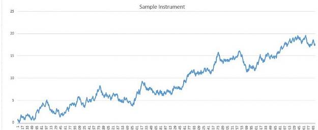
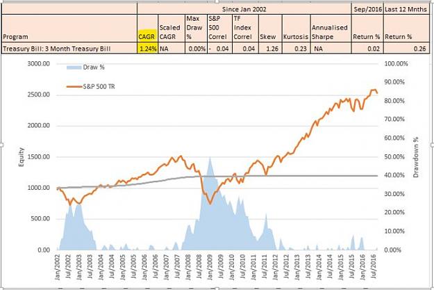
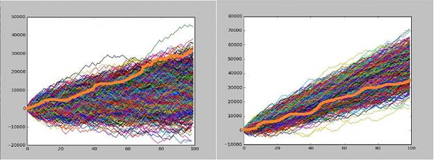
Chart 1: S&P500 TR Index - January 2002 to September 2016
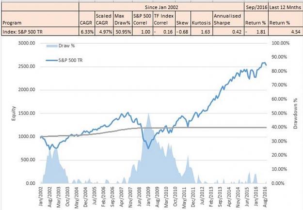
What does the equity curve of the chart above say? Well in terms of performance, an investment portfolio that mirrored the performance of the S&P 500 Index, would possess similar risk-return characteristics as the overall index (assuming that investment returns were all reinvested). This means that over the course of the 14 year period, your initial investment of $1,000 would have achieved a compound annual growth of 6.33% PA and now be worth $2,500, but......and here is the but.......... to enjoy that return, you would have had to endure a nasty drawdown of 30% in 2003 and a gut-wrenching drawdown of 50.95% in 2008. More important however is the question to you of whether you would have had the nerve to ride out a 50% decline in the value of your investment without scarpering for the exits.
Is is easy to look back in hindsight to a past market crisis with a brave voice and say, I could have handled that....but a different kettle of fish to be in the middle of a wicked drawdown and wondering when the pain will cease or if your investment will ever recover in value. You should all try it some time. What doesn't kill you makes you stronger.
For those with poor memories or are new to the game, you may be congratulating yourselves on the strong performance of the equity markets since 2009, however as mentioned previously, everyone becomes an investment expert during bull markets. In the great bull run at the end of the last century, a long term buy and hold investor could not put a foot wrong.....until of course they did.
However...for those revelling in the current market madness of this equity bubble driven by a glut of printed money by the central banks, just ask yourself this....... how long is this bull run going to continue?......tomorrow?, next week?, next month?, next year?....let's leave that to the CNN expert commentary shall we as many investment gurus of the news networks have the incredible ability to actually read the future?
The more prudent investor however who has stood the test of time and possesses a longer memory might not be so bullish as the average pundit and may prefer to actually trade/invest in 'what is' as opposed to 'what may be'. Some of these wise investors have already been through the school of hard knocks and have let history teach them a lesson.
In other words they simply follow the trend and don't try to predict where price will be tomorrow....... They simply ride the current price and cut losses short. In a nutshell, that is the secret sauce of trend following. Simply be patient, manage risk, be prepared to pull that trigger when the price comes to you and protect your capital at all costs......and simple human behaviour will deliver you long term returns. History has demonstrated this again and again for time immemorial. It's as simple as that. These simple heuristics of trend following are sufficient to cut through the noise of the complex financial markets.
Now have a look at the scaled CAGR of 4.97% in Chart 1. This metric is used as a comparable measure to rate different investments in terms of risk-reward. We will be using this shortly to compare the performance of the S&P500 TR Index against our CTA's.
Don't worry about the other statistics such as skew, kurtosis and annualised sharpe....that's just stats guff for geeks like me.
So without more further ado, let's put the facts on the table about these quiet achievers of the investment industry that call themselves diversified systematic trand traders.
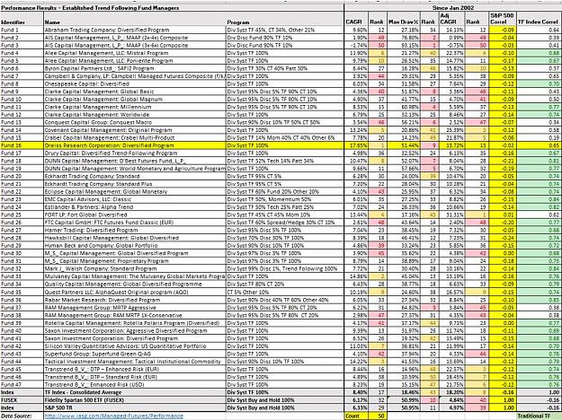
Here are the performance metrics of 47 active fund managers that are classed (in general) as diversified systematic trend traders.
Table 1: CTA Performance Metrics - January 2002 to September 2016
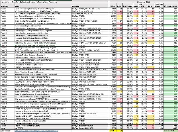
Put the glasses on and spend some time becoming familiar with the table. The important columns to focus on are CAGR and the Adjusted CAGR ( a risk weighted return measure). You will see that I have ranked these performance metrics across the chosen Fund Managers of Table 1.
Note that at the bottom of the Table, I have also included the performance metrics of the S&P500 TR Index, Fidelity Spartan 500 ETF (that mirrors the performance of the S&P500) and also the Trend Following Index (TF Index) which is an index compiled from the 47 fund managers contained in this performance assessment.
I have also included a column titled "TF Index Correl". This column highlights how correlated each Fund is to the TF Index. Those in green are strongly correlated to each other. In other words, their performance metrics are similar and reflect the performance metrics of a typical systematic diversified trend trading Fund Manager (FM). What this means is that despite what you may hear, there is not much secret sauce in the strategies employed by these FM's. They simply focus on simple proven recipes that work.
Also note how the performance of these trend following FM's correlate with the S&P 500 Index (refer to the column S&P 500 Correl). The very low correlations with the S&P500 Index reflect that these FM's aggresssively employ diversification techniques to ensure the overall performance of the portfolio is as uncorrelated with the equity market as possible. This alternative investment class is very attractive to the Portfolio Manager given their very low correlation to equities and as a result are often used by the PM to assist in flattenning the return distributions of portfolios that are concentrated in equities.
What a low correlation to equities means is that when the equity market collapses, these FM's shine. This feature in industry talk terms is referred to as the 'CTA smile' and is a classic symptom that emerges during market crisis. It is usually the CTA's that are sitting on the other side of your trade exits when the market death knell sounds and investors flurry to the exits.
Let's have a look at the equity curve of the TF Index (that represents the overall performance of this entire group). Refer to 2008 when the GFC was in full swing. Look at how the TF Index performed during this period. Guess who were the beneficiaries of this market crisis.
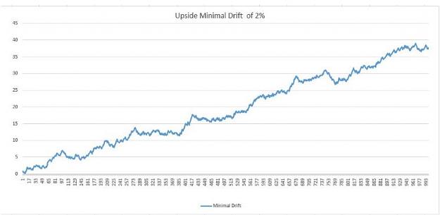
Chart 2: Trend Following Index (TF Index) - January 2002 to September 2016
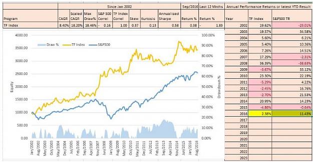
Now have a closer look at the chart above to see what it says in performance terms. That's right, the scaled CAGR is 3.7 x higher than the S&P500 TR Index. What this says is that over the period concerned from 2002 to 2016, diversified portfolio trend following has significantly outperformed Beta. Your initial investment of $1000 in the TF Index would now we worth $3,500.....and according to the investment guru's, trend following is dead....LOL.
Perhaps we should be critical thinkers and not necessarily take heed of what the 'experts' say. Do you see anything in the performance metrics above that suggests that trend following is dead? No matter how you cut it, the equity curve clearly demonstrates the power of this very under-rated approach to investment.
Let's did a little deeper into the statistics and see who are the best performers in this group as these guys deserve a special mention.
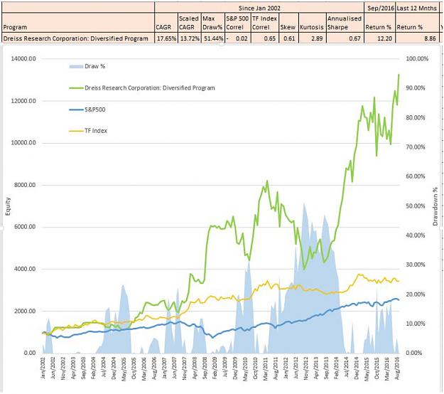
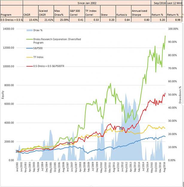
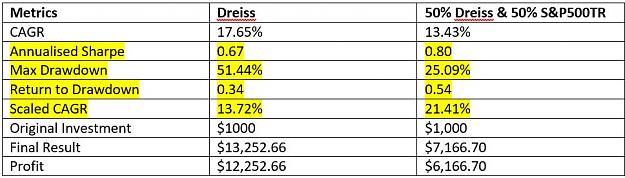
Award for the best raw CAGR - Dreiss Research Corporation: Diversified Program.
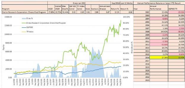
OMG.......have a look at that stellar performance above. Look how it dwarves the result of the S&P500 TR Index and also the TF Index equity curves. Is this random luck? Well if you consider random luck to apply to a performance history of over 14 years.....then we probably have a different idea of what 'random luck' means.
An investment of $1,000 in January 2002 fully invested over the period would now be worth $12,000. Imagine you were a time traveller.....where would you now be parking some of your hard earned investment capital?
Bill Dreiss from Driess research has applied a similar trend following trading recipe to his performance with little change over the entire period from fund inception. While some may have concern over the volatility of returns delivered....Bill and his investors don't. I tried to catch up with Bill, but he was on his morning surf.

Award for the best Adjusted CAGR - Fort LP: Global Diversified Program.
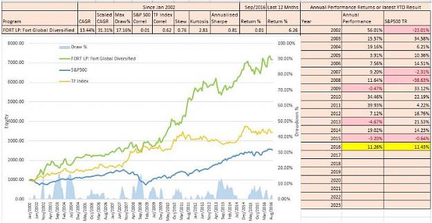
It truly doesn't get much better than this. Fort has nailed it and has demonstrated a superb track record since 2002. For the Funds that I track in this alternative investment class, Fort currently offers the greatest risk weighted return of them all. Look how it dwarves the performance of the TF Index and the S&P500 TR Index. Also look at the drawdown history.........impressive.
So what does this post demonstrate? In searching for strong risk weighted investment returns it is worthwhile doing your homework and not accepting the position of the status quo in the investment industry.
Cheers C
Attached Image (click to enlarge)
This post looks at the long term performance metrics of alternative investments in the category of diversified systematic trend following managers.
Unlike a classic long term buy and hold investment approach typically deployed by most passive Fund Managers that attempt to match overall market performance returns (Beta), this class of active Fund Manager specialise in 'following the trend' by utilising a diversified portfolio with the intent of outperforming the market return (Alpha).
This diversification is achieved through a combination of techniques including system diversification, market diversification and time-frame diversification.
The intent of diversification is to reduce the volatility of returns generated by a chosen individual system component allowing for a less volatile risk-return profile that can otherwise be achieved. For example an investment in any single instrument generates it's own distinctive equity curve over the course of the investment period. A combination of investments in an investment portrfolio also generates a distinctive equity curve that comprise the summation of each individual contributing equity curve.
The aim of the game with portfolio management is to achieve an optimal risk-return profile over the investment period.
As we all know there is a continuous trade-off between risk and return. In general a higher return comes with higher risk....but the skilled trader and portfolio manager has a few tricks up their sleeve to deal with this dillema. What stops the typical investor from leveraging up their performance returns to achieve heady results is the classic trade-off between reward and risk. Uncertainty hides within every investment decision in our complex markets. The main weapon used to address the inherent volatility of returns present in any investment is a sound appreciation of correlation and what this means in an investment portfolio.
Correlation is a statistical measure of how two or more investments move in relation to each other. If instruments in the portfolio are highly correlated, they tend to move in a similar manner. When one goes up, the other correlated instrument goes up and vice versa. Negatively correlated investments on the other hand are diametrically opposed. When one goes up, the other goes down and vice versa. What a portfolio manager is after however is a portfolio comprising instruments of zero correlation with each other.
Portfolios comprising postively or negatively correlated instruments tend to accentuate performance returns in good times and lousy returns during bad times. In boom times such as asset bubbles, the equity curve of a portfolio of +1/-1 correlated instruments can offer extreme performance returns that are unsustainable and it is during these times that even unskilled investors/traders are treated graciously by the market....however the contrary is also true when hard times hit and the bubbles burst......For example a global crisis will see a sea of red in the watch list which will then be echoed through the trading floors. This is because the correlated nature of markets typically only reveals itself when the tide retreats.
The reasons for correlated market movements are numerous but in general, a correlation is created when a dependency is generated between individual investments. For example, when the market experiences a shock and investors scarper for the exits it is not simply a single investment that suffers. The investor/trader might have investments in other assets that require liquidation to extract themselves from that single position and the possibility of a margin call....as a result....like a set of domino's, the impacts spread from investment to investment across the global market place.
Another example might be the internal dependencies that exist between investments such as listed equity instruments. For example an ASX listed contractor providing services to an ASX listed mining company would be correlated to the performance of the major client. A hit to the ASX Listed mining company would be translated to a hit to the supplier and a compounded hit to the index.
It is important to note that correlation changes over time. What has been evident particularly since 2008 is the tendency for more investments to become correlated in part attributed to rising intra and inter-market dependencies that may be attributed in part to central bank intervention.
The key to successful diversification is to reduce the internal correlation that exists within a portfolio to as close to zero correlation as possible. While more and more asset classes are becoming more correlated, portfolio managers can now turn to different approaches such as system diversification to specifically address this tendency. In reducing a portfolio's correlation, what is being achieved is the ironing out of the volatile return distributions of the portfolio to a more linear consistent profile. In doing so we smooth the portfolio equity curve by adding new investment contributions that specifically address the volatility weaknesses of each individual contributor to allow the investor to sleep at night and avoid ulcers. More importantly, a portfolio equity curve with a smooth linear equity curve allows you to leverage your position and magnify returns within managed risk constraints.
Diversification is often called the 'only free lunch'....and for good reason. It is a critical component of risk management.
Anyway....back to our review of diversified systematic trend following managers. Does it work and what sort of long-term investment performance are we talking about?
For those that might profess that 'markets are efficient' and that no performance edge can be achieved to outperform beta aside from random luck....the following might fall on deaf ears.....however for those investors out there who prefer to use quantifiable measures as opposed to gut instinct, you could for example refer to the actual long-term audited performance returns of some of the Commodity Trading Advisers (CTA's)....and be pleasantly surprised......and no....this does not include the Warren Buffet story.
We don't hear much about these guys....namely because they fly in the face of investment logic and recognise that the human brain has it's floors and actually contributes to making markets inefficient through irrational human behaviour.
It is during market crisis periods when rational investment behaviour is thrown out with the bath water and mass hysteria (of fear or greed) contributes to collective behaviour that drives the fat tails of market uncertainty. Most of the time markets are generally efficient....however some of the time they simply aren't. It is during these periods that trend following shines.
The guys we are talking about are always ready to pounce on these times as they span across asset classes using diversification as their primary weapon to simply be there at the right time when pandemonium strikes, have fully automated systems that are ready to pounce 24/7, simply turn off the market news feeds as they instantly react to current price as opposed to predicting future price, and apply algorithms with very simple trading rules to reap the rewards of irrational behaviour.........again and again and again...to dramatic effect.
To highlight their performance lets look at the market return of an investment portfolio that mirrors the performance of the S&P500 TR Index (total return including dividends). This would be a familiar benchmark for the passive Fund Manager in the buy and hold fraternity that seeks to offer Beta. By the way.....the passive Fund Manager rarely achieves or outperforms beta as you would see in industry SPIVA scorecard results (S&P Indices versus Active managers)....but I digress.......another day perhaps.
Chart 1: S&P500 TR Index - January 2002 to September 2016
Attached Image (click to enlarge)
What does the equity curve of the chart above say? Well in terms of performance, an investment portfolio that mirrored the performance of the S&P 500 Index, would possess similar risk-return characteristics as the overall index (assuming that investment returns were all reinvested). This means that over the course of the 14 year period, your initial investment of $1,000 would have achieved a compound annual growth of 6.33% PA and now be worth $2,500, but......and here is the but.......... to enjoy that return, you would have had to endure a nasty drawdown of 30% in 2003 and a gut-wrenching drawdown of 50.95% in 2008. More important however is the question to you of whether you would have had the nerve to ride out a 50% decline in the value of your investment without scarpering for the exits.
Is is easy to look back in hindsight to a past market crisis with a brave voice and say, I could have handled that....but a different kettle of fish to be in the middle of a wicked drawdown and wondering when the pain will cease or if your investment will ever recover in value. You should all try it some time. What doesn't kill you makes you stronger.
For those with poor memories or are new to the game, you may be congratulating yourselves on the strong performance of the equity markets since 2009, however as mentioned previously, everyone becomes an investment expert during bull markets. In the great bull run at the end of the last century, a long term buy and hold investor could not put a foot wrong.....until of course they did.
However...for those revelling in the current market madness of this equity bubble driven by a glut of printed money by the central banks, just ask yourself this....... how long is this bull run going to continue?......tomorrow?, next week?, next month?, next year?....let's leave that to the CNN expert commentary shall we as many investment gurus of the news networks have the incredible ability to actually read the future?
The more prudent investor however who has stood the test of time and possesses a longer memory might not be so bullish as the average pundit and may prefer to actually trade/invest in 'what is' as opposed to 'what may be'. Some of these wise investors have already been through the school of hard knocks and have let history teach them a lesson.
In other words they simply follow the trend and don't try to predict where price will be tomorrow....... They simply ride the current price and cut losses short. In a nutshell, that is the secret sauce of trend following. Simply be patient, manage risk, be prepared to pull that trigger when the price comes to you and protect your capital at all costs......and simple human behaviour will deliver you long term returns. History has demonstrated this again and again for time immemorial. It's as simple as that. These simple heuristics of trend following are sufficient to cut through the noise of the complex financial markets.
Now have a look at the scaled CAGR of 4.97% in Chart 1. This metric is used as a comparable measure to rate different investments in terms of risk-reward. We will be using this shortly to compare the performance of the S&P500 TR Index against our CTA's.
Don't worry about the other statistics such as skew, kurtosis and annualised sharpe....that's just stats guff for geeks like me.
So without more further ado, let's put the facts on the table about these quiet achievers of the investment industry that call themselves diversified systematic trand traders.
Here are the performance metrics of 47 active fund managers that are classed (in general) as diversified systematic trend traders.
Table 1: CTA Performance Metrics - January 2002 to September 2016
Attached Image (click to enlarge)
Put the glasses on and spend some time becoming familiar with the table. The important columns to focus on are CAGR and the Adjusted CAGR ( a risk weighted return measure). You will see that I have ranked these performance metrics across the chosen Fund Managers of Table 1.
Note that at the bottom of the Table, I have also included the performance metrics of the S&P500 TR Index, Fidelity Spartan 500 ETF (that mirrors the performance of the S&P500) and also the Trend Following Index (TF Index) which is an index compiled from the 47 fund managers contained in this performance assessment.
I have also included a column titled "TF Index Correl". This column highlights how correlated each Fund is to the TF Index. Those in green are strongly correlated to each other. In other words, their performance metrics are similar and reflect the performance metrics of a typical systematic diversified trend trading Fund Manager (FM). What this means is that despite what you may hear, there is not much secret sauce in the strategies employed by these FM's. They simply focus on simple proven recipes that work.
Also note how the performance of these trend following FM's correlate with the S&P 500 Index (refer to the column S&P 500 Correl). The very low correlations with the S&P500 Index reflect that these FM's aggresssively employ diversification techniques to ensure the overall performance of the portfolio is as uncorrelated with the equity market as possible. This alternative investment class is very attractive to the Portfolio Manager given their very low correlation to equities and as a result are often used by the PM to assist in flattenning the return distributions of portfolios that are concentrated in equities.
What a low correlation to equities means is that when the equity market collapses, these FM's shine. This feature in industry talk terms is referred to as the 'CTA smile' and is a classic symptom that emerges during market crisis. It is usually the CTA's that are sitting on the other side of your trade exits when the market death knell sounds and investors flurry to the exits.
Let's have a look at the equity curve of the TF Index (that represents the overall performance of this entire group). Refer to 2008 when the GFC was in full swing. Look at how the TF Index performed during this period. Guess who were the beneficiaries of this market crisis.
Chart 2: Trend Following Index (TF Index) - January 2002 to September 2016
Attached Image (click to enlarge)
Now have a closer look at the chart above to see what it says in performance terms. That's right, the scaled CAGR is 3.7 x higher than the S&P500 TR Index. What this says is that over the period concerned from 2002 to 2016, diversified portfolio trend following has significantly outperformed Beta. Your initial investment of $1000 in the TF Index would now we worth $3,500.....and according to the investment guru's, trend following is dead....LOL.
Perhaps we should be critical thinkers and not necessarily take heed of what the 'experts' say. Do you see anything in the performance metrics above that suggests that trend following is dead? No matter how you cut it, the equity curve clearly demonstrates the power of this very under-rated approach to investment.
Let's did a little deeper into the statistics and see who are the best performers in this group as these guys deserve a special mention.
Award for the best raw CAGR - Dreiss Research Corporation: Diversified Program.
Attached Image (click to enlarge)
OMG.......have a look at that stellar performance above. Look how it dwarves the result of the S&P500 TR Index and also the TF Index equity curves. Is this random luck? Well if you consider random luck to apply to a performance history of over 14 years.....then we probably have a different idea of what 'random luck' means.
An investment of $1,000 in January 2002 fully invested over the period would now be worth $12,000. Imagine you were a time traveller.....where would you now be parking some of your hard earned investment capital?
Bill Dreiss from Driess research has applied a similar trend following trading recipe to his performance with little change over the entire period from fund inception. While some may have concern over the volatility of returns delivered....Bill and his investors don't. I tried to catch up with Bill, but he was on his morning surf.
Attached Image (click to enlarge)
Award for the best Adjusted CAGR - Fort LP: Global Diversified Program.
Attached Image (click to enlarge)
It truly doesn't get much better than this. Fort has nailed it and has demonstrated a superb track record since 2002. For the Funds that I track in this alternative investment class, Fort currently offers the greatest risk weighted return of them all. Look how it dwarves the performance of the TF Index and the S&P500 TR Index. Also look at the drawdown history.........impressive.
So what does this post demonstrate? In searching for strong risk weighted investment returns it is worthwhile doing your homework and not accepting the position of the status quo in the investment industry.
Cheers C
Inserted Video
2