►►Financial Markets Observatory Lab.◀◀
❖ H! ALL ❖
Some notes/charts about US Capacity of Utilization.
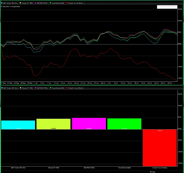
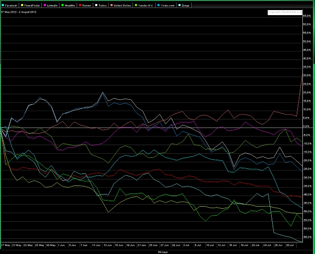
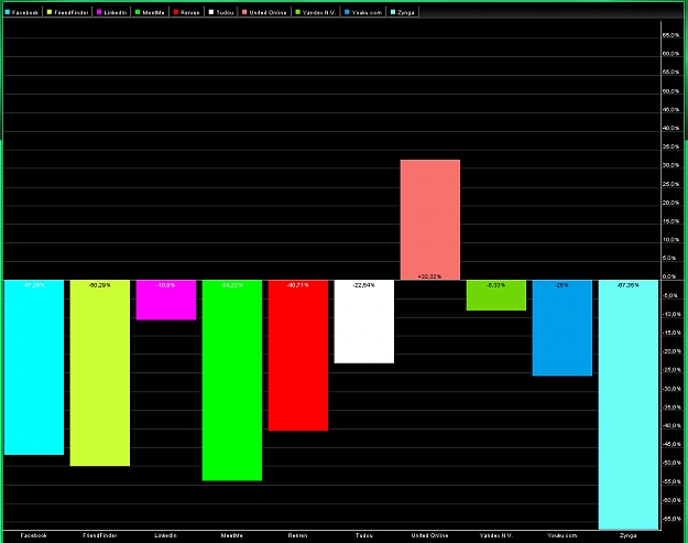
General stocks-benchmarks as follows:
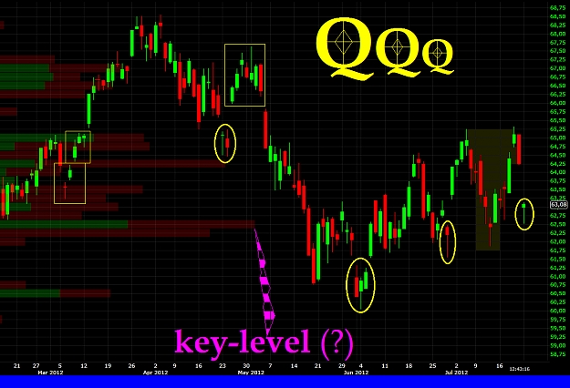
► main U.S. stocks-benchmarks (charts & notes: QQQ; ONEQ; DIA; OEF; SPY);
► global U.S. stocks-benchmarks (charts & notes: EUSA; ISI; IWB; IWV; IYY; TMW);
► global World stocks-benchmarks (charts & notes: ACWI; DGT; IOO; NYSE W.L.I.; ONEF; VT).
► Previous charts; previous sept.2011-study.
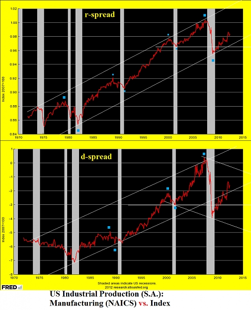
In the first chart there are two indicators of US Capacity of Utilization: Total Industry; Manifacturing (NAICS).
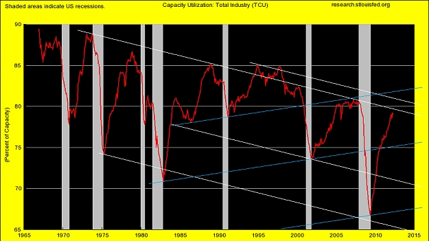
The second chart is the Total Industry only, with some main trend-lines; the graphical elements are the followings:
-) lows of 2009 are well below the previous lows of curve in the decade '80 !!!
-) the global array of curve is descending;
-) the main ascending line (lows of '80 & 2003) was broken during the SellOff 2008;
-) actual values are well below the previous tops of 2006/2007, and inside the descending white rectangle.
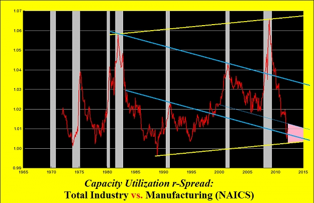
In the chart III there is the r-spread between Total Industry vs. Manifacturing (NAICS), an indicator about contrarian to main trend of US economy. The graphical elements are the followings:
-) The tops of 2009 is well above the previous tops of decade '80 (bad sign in long-term ???);
-) The SellOff of curve after the top of 2009, has pushed prices toward the lows of decade '90, in full-test inside an important set-up area (pink marked).
Curve above this pink set-up, is a possible sign of financial stress increase; curve below this pink set-up, is a possible sign of new bullish leg.
Sorry for my bad English. I hope that this post is at least minimally useful.
☻/ ❖ Globo.pk, Alert 2.O !!! ❖
/▌
/|
Tuned on main trend, but follows short-medium term signs from underlying prices, for a correct & real-time set-up.
It is very important do not anticipate the main trend of the underlying financial instruments.
Ⓘℳ☢ ℬɣ $@❣♆¥ ►►♥
₭€$AⅅⅅhAPhA'pe'₭AℳℙA' ℬunda-ℬunda €MP¥R€ ❣❣❣
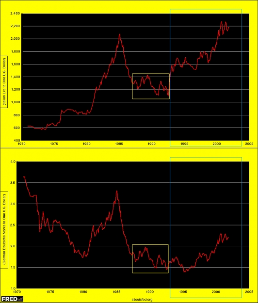
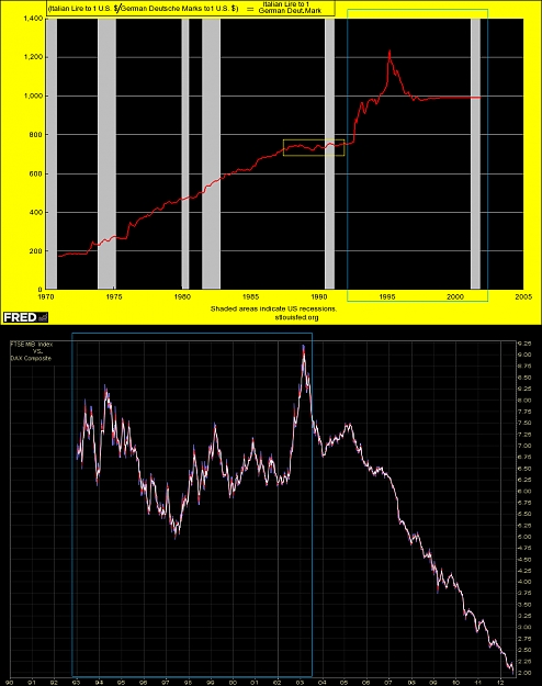
https://research.stlouisfed.org/fred...graph_id=48832
Attached Image(s) (click to enlarge)