A special Easter present
Hello dear subscribers,
At Easter I would like to make you a special present once. We private traders are a special species and should stick together in this tough market and help us out. A good trader learns every day and constantly questions his strategy to become effectively better.
On May 8, 1985, our former Federal President Richard von Weizsäcker made a historic speech. The headline read: If you close your eyes to the past, you become blind to the present and thus to the future. I have successfully applied this sentence in my life and asked myself if this does not work in stock market trading.
Let's do a test and learn from the past to get better in the future.
One of the reasons why I only trade the EURUSD is based on the fact that there are a lot of price data. On August 10, 1953, the US dollar was first listed on the Frankfurt Foreign Exchange. This year he reached a mean of around 2.10 euros for one dollar. Until the early 1970s, the exchange rates were set by the D-Mark to the US dollar according to the Bretton Woods system. Only then did a flexible exchange rate develop according to supply and demand in the foreign exchange market.
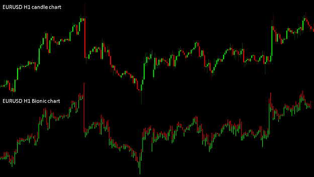
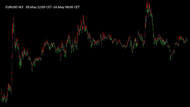
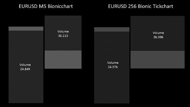
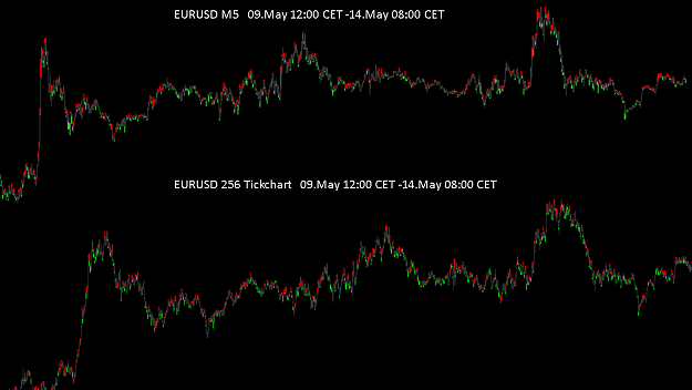
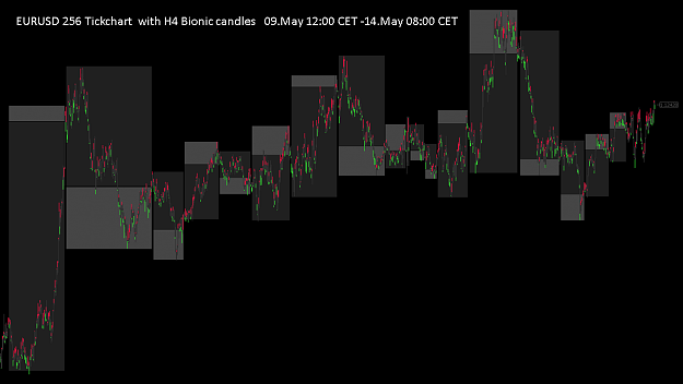
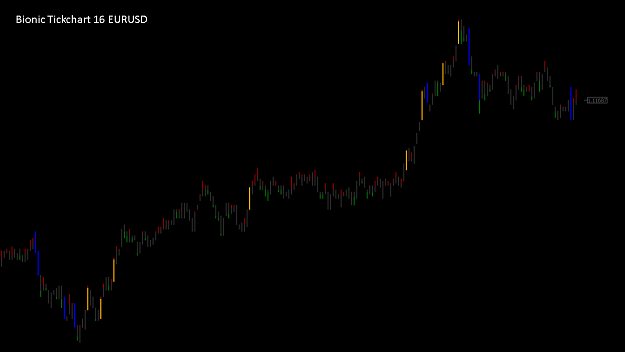
The euro was only created in the year 2000 and was introduced in 2002, but the price calculations DM / USD were converted accordingly into EURO before that. Thus, today we have 580 months with concrete course calculations OHLC. In the H4 chart, however, these courses only become clearer and clearer from 1989 onwards. With the Bionicchart you can also present the courses much clearer.
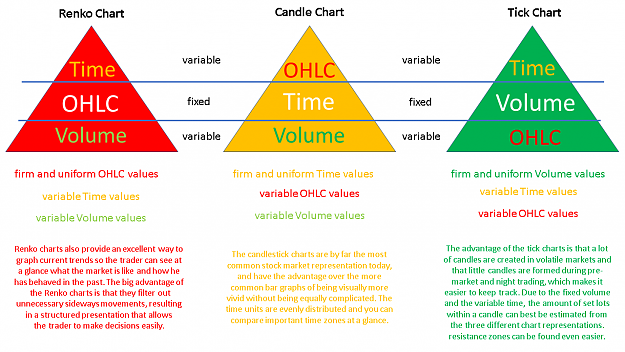
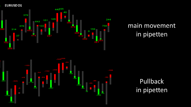
The monthly candle has the highest priority, as it clearly and clearly reflects the price trend. I have now downloaded 2,320 OHLC data from the last 580 months to find out in which relationship the bulls and bears are. As a basis, I took my developed Bionickerze, which works only with HLC and renounces the Open. This creates, as you know, only a wick, which I would like to call a pullback. Within a candle we have a bullish or bearish movement and a pullback. I once examined and analyzed these movements in more detail.
Please note that in this post Pip is supposed to represent an abbreviation of pipette, as pipettes are displayed in the Metatrader.
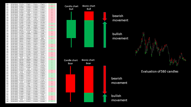
Of the 580 monthly candles, there have been 307 bullish and 273 bearish candles so far. Although there were also two Doji in 1974 and 1999, which I did not take into account, as the courses were not clear there. The distribution of bulls and bears is almost identical to this day.
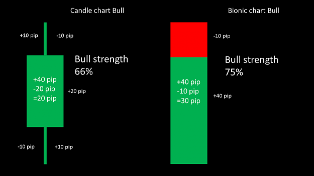
The average bullish candle had 3,401 pip and a pullback of 1,011 pip while the bearish candle reached 3,591 pip and had a pullback of 1,077 pip. The average bullish candle performance was 2,390 pip and the average bearish candle yield was 2,515 pip. This shows that the bearish candle is on average 5% larger than the bullish candle. This proves that it goes down faster on average than up.
Conclusion: The bulls and bears are almost evenly distributed, even if it does not look like this at first glance.
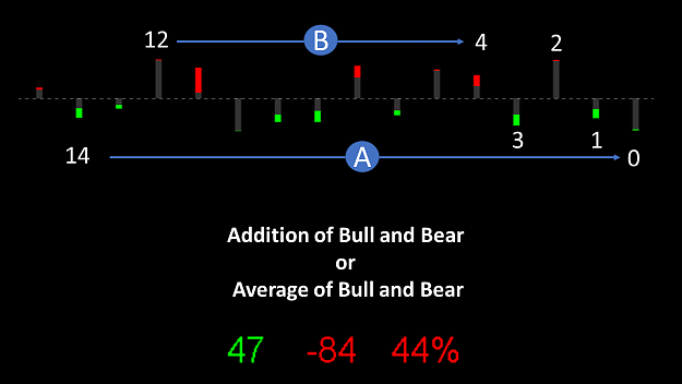
In the 580 months bullish candles reached a total of 1,043,963 pips and a pullback of 293,979 pips. The bearish candles reached 980,460 pip and a pullback of 310,241 pip. Add the bullish candles and the bearish pullbacks and all bullish candles with the bullish pullbacks, we get a distribution of 48% bearish moves to 52% bullish moves.
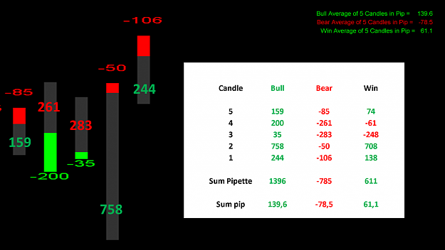
Striking were the pullbacks inside the candle. Over the entire 580-month period, the pullback was an average of 30% in both bearish and bullish candles. That should be very interesting for our Fibonacci friends.
If we compare the pure bullish and bearish candle movements, we come to the result of 63.503 pip in favor of the bulls. All pullbacks added together give a minus of 16,262 pip. The total result is thus 47,241 pip in favor of the bulls. From 1971 to the present day, we have an average bullish increase of 81.5 pip per month. If we now calculate the lowest price of 0.58796 and the now calculated close of 1.12446, 58.796 pip come out. Why is this difference of more than 11,000 pips created? If you look at the chart, you will see that the candles partially overlap. If the candles were to connect exactly to the next candle the result would be correct.
So we note that in the EURUSD to this day the bulls as well as the bears are in balance with each other. This also corresponds basically to all physical laws and also the laws of nature: What I give in a maximum, I can also take out maximum again. Exactly this aspect is very in line with my trade approach of supply and demand. I just wanted to go one step further to find out to what extent these bullish and bearish moves are crucial to a possible trend reversal.
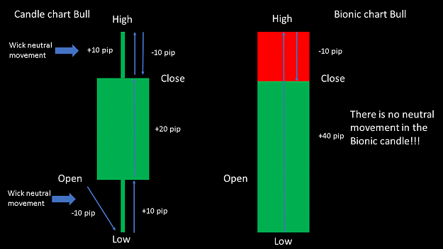
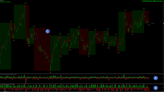
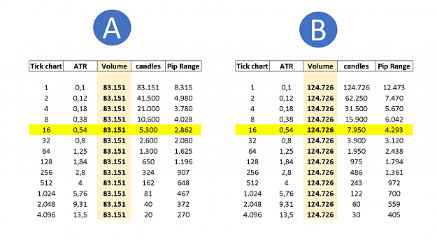
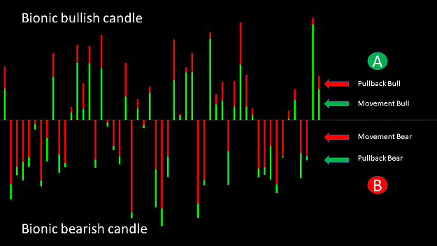
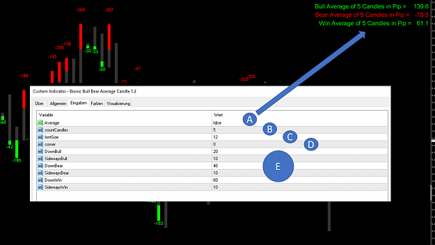
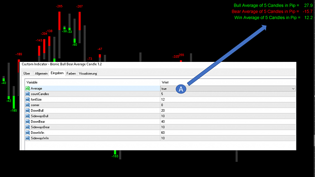
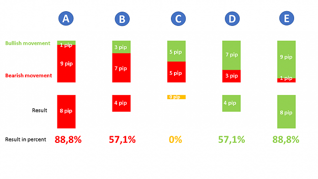
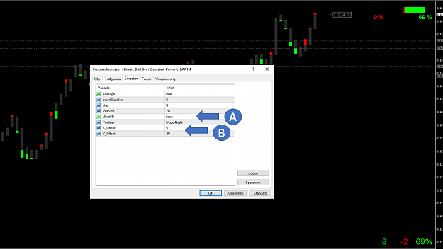
At point A and B I have again listed the difference between a normal candle and the bionic candle. At point C you will see different Bionic candles from left to right, from the pure bullish candle to the pure bearish candle.
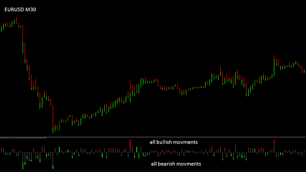
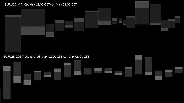
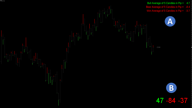
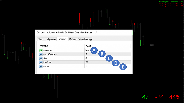
I have now developed an indicator that records all bullish movements above the zero line and all bearish movements below the zero line, but according to the calculation principles of the Bionic candle. We remember the Bionickerze I renounce the Open. The indicator records both the pure candle movement and the pullback within a candle.
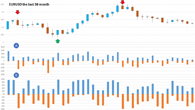
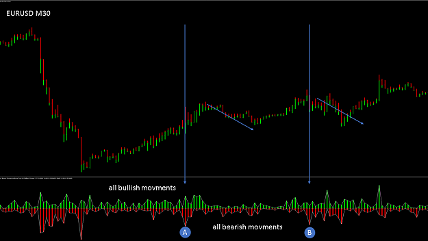
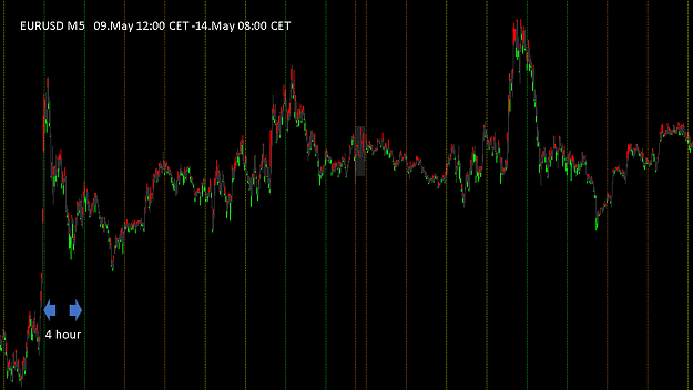
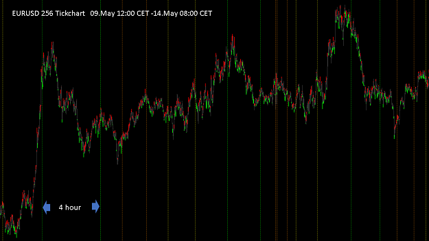
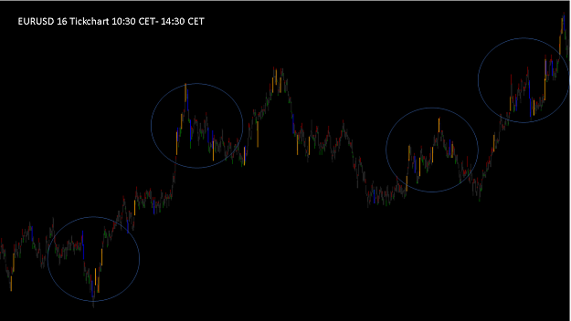
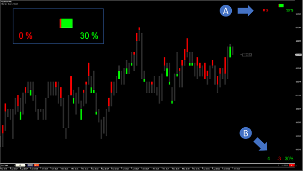
Now let's take a look at the last 38 month candles in EURUSD with the new indicator. Crucial for the consideration are the three previously known trend reversals, which are each marked with an arrow. At point A is the redesigned indicator that records both bullish and bearish moves. Below point B is an indicator that compares the percentages of the individual values on the whole. This makes it possible to show the proportionality of the pullbacks more efficiently. The indicator has yet to be created, but is only marginally important to our contribution today.
To make it easier, I have shown the standard candle. We start with the red arrow in May 2016. There we see a strong candle going down. Two things stand out. At points A and B you can see how the bullish strength wears off. At point 1 you can see that it is a strong move as there is only a very small pullback. It is not a question of downsizing this bearish candle, but it is a matter of determining if a big downtrend is initiated or not. During the session, you will notice that after the strong downtrend, a small uptrend has taken place again, followed by a stronger downtrend. The mere fact of knowing that a price is in a prolonged downtrend gives the opportunity for very interesting trading approaches.
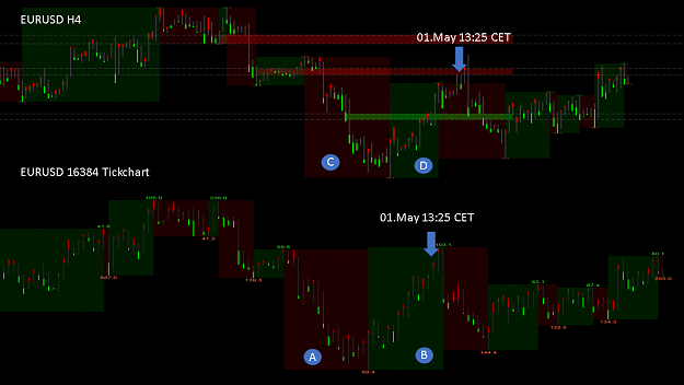
At point 3 in January 2017, a turnaround is emerging. Again, we find that it is a strong bullish candle with a very small pullback. At the same time we see at point C and D how the bearish movements get smaller and smaller. Again, bullish trading after closing would have been a mistake as the price went down. However, one could already have seen here that a new trend reversal was launched. This phenomenon of the small pullback I have already described several times in my previous blogs.
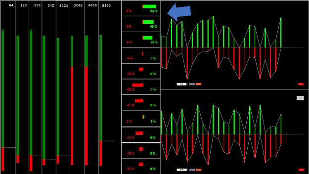
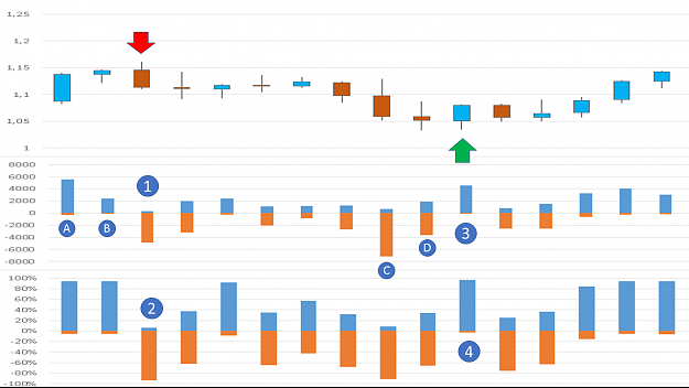
Let's take a look at the third example from February 2018. In this case, you could not see a reduction in bullish movements in the two previous candles, but there was a significant increase in bearish pullbacks. Here, the bottom indicator to bear the very clearly shows that the last bullish candle before the turnaround was significantly weaker than the two candles before. After point 1 they see on the indicator how the bears dominate towards the bulls.
In principle, I would like to emphasize once again that it is not about entering into a trade based on this information. Rather, this information serves a possible long-term prediction of a trend. So it's all about defining the overall trend order. In smaller time units I can then find out the middle and smaller trend sequence.
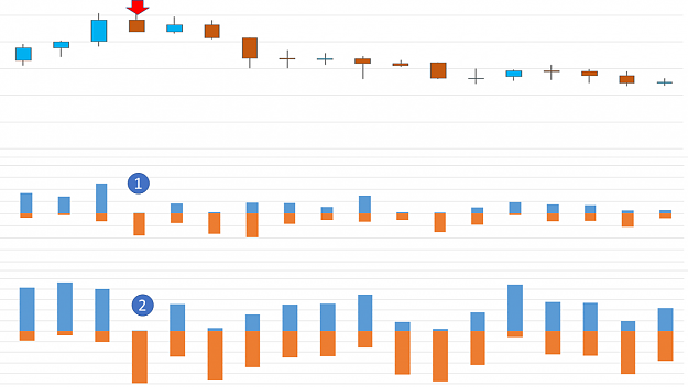
Now let's look at the indicator in MT4. As you can see, the large movements with a small pullback are so-called key candles, which can give an indication of a possible trend reversal. However, as traders, we know that there will not be 100% reliability, as the market is always good for a surprise.
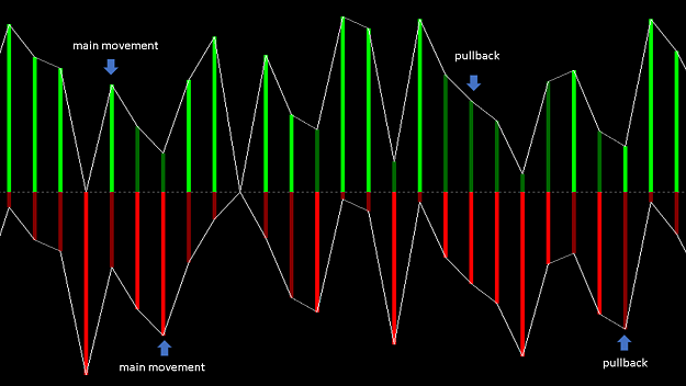
I have now colored the trend once, you can clearly see how the bearish movements in the downtrend dominate and vice versa. In addition, you can see how the pullback becomes stronger before a turnaround. Of course you should pay attention to the resistance zones with the help of demand and supply. The strongest resistance zones are always inside the strongest candles, so the ones with the smallest pullback
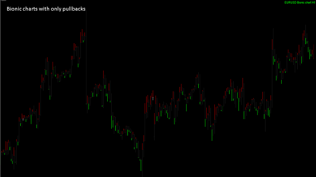
The interesting thing about this indicator is that both the strong moves and the pullbacks are listed. This shows at a glance where the main direction is going. As soon as the pullback increases in a major move, there is a high probability that a turnaround will be initiated. Of course, this indicator works in all time units and also on all tick charts. Try it yourself, I am sure that over time it will be easy for you to identify potential long-term reversals more quickly. In addition, I recommend you in the future to work with the Bionic Chart because it shows all the pullbacks at a glance.
This indicator is an auxiliary indicator and optimal for preparing the trending. Please note that the last candle is meaningful only after the close. Of course, you can also show the pullbacks in other colors, or just leave them out, then you only have the bionic net movement.
At this point, I wanted to thank you once again for your cooperation and the great ideas that we have worked out over the last few months and look forward to the coming years with you. I am convinced that we are taking a small step each month.
I wish you all a great Easter and a few contemplative days in the circle of your loving family.
I am looking forward to your feedback
Lovely wishes
Hello dear subscribers,
At Easter I would like to make you a special present once. We private traders are a special species and should stick together in this tough market and help us out. A good trader learns every day and constantly questions his strategy to become effectively better.
On May 8, 1985, our former Federal President Richard von Weizsäcker made a historic speech. The headline read: If you close your eyes to the past, you become blind to the present and thus to the future. I have successfully applied this sentence in my life and asked myself if this does not work in stock market trading.
Let's do a test and learn from the past to get better in the future.
One of the reasons why I only trade the EURUSD is based on the fact that there are a lot of price data. On August 10, 1953, the US dollar was first listed on the Frankfurt Foreign Exchange. This year he reached a mean of around 2.10 euros for one dollar. Until the early 1970s, the exchange rates were set by the D-Mark to the US dollar according to the Bretton Woods system. Only then did a flexible exchange rate develop according to supply and demand in the foreign exchange market.
The euro was only created in the year 2000 and was introduced in 2002, but the price calculations DM / USD were converted accordingly into EURO before that. Thus, today we have 580 months with concrete course calculations OHLC. In the H4 chart, however, these courses only become clearer and clearer from 1989 onwards. With the Bionicchart you can also present the courses much clearer.
Attached Image (click to enlarge)
The monthly candle has the highest priority, as it clearly and clearly reflects the price trend. I have now downloaded 2,320 OHLC data from the last 580 months to find out in which relationship the bulls and bears are. As a basis, I took my developed Bionickerze, which works only with HLC and renounces the Open. This creates, as you know, only a wick, which I would like to call a pullback. Within a candle we have a bullish or bearish movement and a pullback. I once examined and analyzed these movements in more detail.
Please note that in this post Pip is supposed to represent an abbreviation of pipette, as pipettes are displayed in the Metatrader.
Attached Image (click to enlarge)
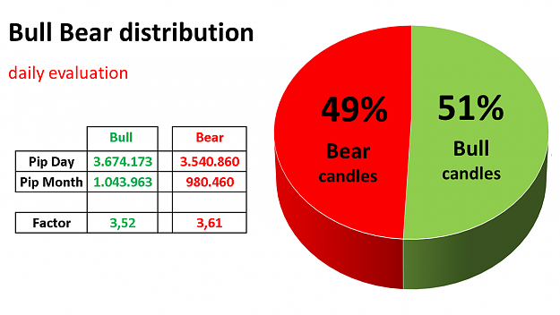
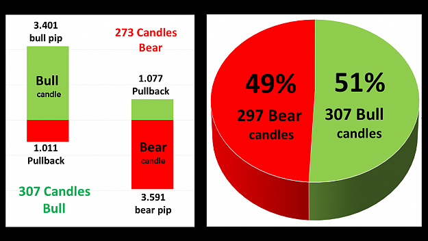
Of the 580 monthly candles, there have been 307 bullish and 273 bearish candles so far. Although there were also two Doji in 1974 and 1999, which I did not take into account, as the courses were not clear there. The distribution of bulls and bears is almost identical to this day.
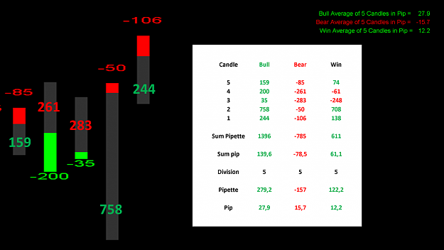
The average bullish candle had 3,401 pip and a pullback of 1,011 pip while the bearish candle reached 3,591 pip and had a pullback of 1,077 pip. The average bullish candle performance was 2,390 pip and the average bearish candle yield was 2,515 pip. This shows that the bearish candle is on average 5% larger than the bullish candle. This proves that it goes down faster on average than up.
Conclusion: The bulls and bears are almost evenly distributed, even if it does not look like this at first glance.
Attached Image (click to enlarge)
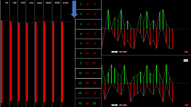
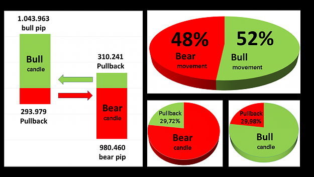
In the 580 months bullish candles reached a total of 1,043,963 pips and a pullback of 293,979 pips. The bearish candles reached 980,460 pip and a pullback of 310,241 pip. Add the bullish candles and the bearish pullbacks and all bullish candles with the bullish pullbacks, we get a distribution of 48% bearish moves to 52% bullish moves.
Striking were the pullbacks inside the candle. Over the entire 580-month period, the pullback was an average of 30% in both bearish and bullish candles. That should be very interesting for our Fibonacci friends.
Attached Image (click to enlarge)
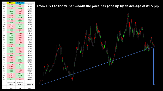
If we compare the pure bullish and bearish candle movements, we come to the result of 63.503 pip in favor of the bulls. All pullbacks added together give a minus of 16,262 pip. The total result is thus 47,241 pip in favor of the bulls. From 1971 to the present day, we have an average bullish increase of 81.5 pip per month. If we now calculate the lowest price of 0.58796 and the now calculated close of 1.12446, 58.796 pip come out. Why is this difference of more than 11,000 pips created? If you look at the chart, you will see that the candles partially overlap. If the candles were to connect exactly to the next candle the result would be correct.
So we note that in the EURUSD to this day the bulls as well as the bears are in balance with each other. This also corresponds basically to all physical laws and also the laws of nature: What I give in a maximum, I can also take out maximum again. Exactly this aspect is very in line with my trade approach of supply and demand. I just wanted to go one step further to find out to what extent these bullish and bearish moves are crucial to a possible trend reversal.
Attached Image (click to enlarge)
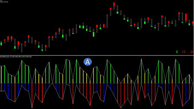
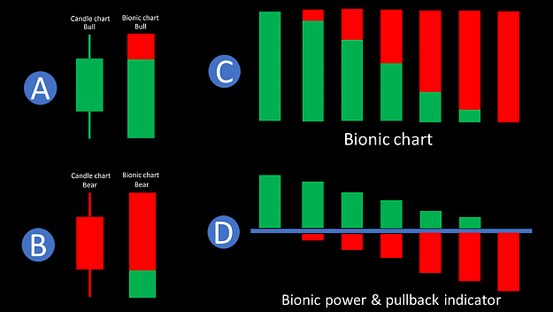
At point A and B I have again listed the difference between a normal candle and the bionic candle. At point C you will see different Bionic candles from left to right, from the pure bullish candle to the pure bearish candle.
I have now developed an indicator that records all bullish movements above the zero line and all bearish movements below the zero line, but according to the calculation principles of the Bionic candle. We remember the Bionickerze I renounce the Open. The indicator records both the pure candle movement and the pullback within a candle.
Attached Image (click to enlarge)
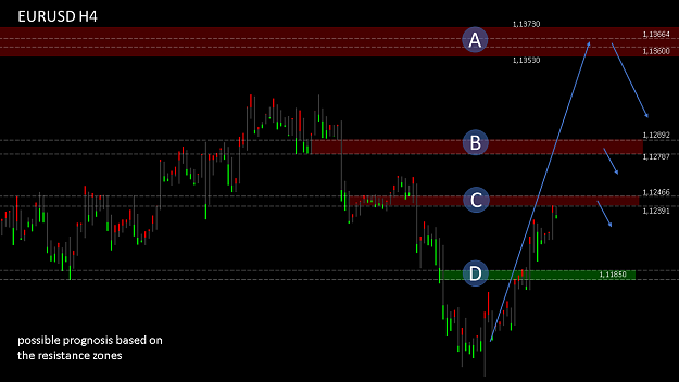
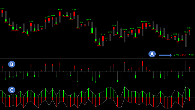
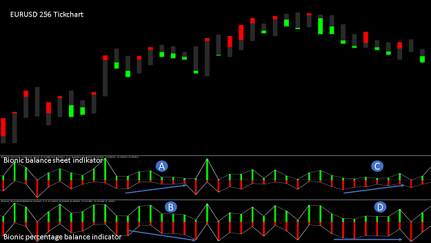
Now let's take a look at the last 38 month candles in EURUSD with the new indicator. Crucial for the consideration are the three previously known trend reversals, which are each marked with an arrow. At point A is the redesigned indicator that records both bullish and bearish moves. Below point B is an indicator that compares the percentages of the individual values on the whole. This makes it possible to show the proportionality of the pullbacks more efficiently. The indicator has yet to be created, but is only marginally important to our contribution today.
Attached Image (click to enlarge)
To make it easier, I have shown the standard candle. We start with the red arrow in May 2016. There we see a strong candle going down. Two things stand out. At points A and B you can see how the bullish strength wears off. At point 1 you can see that it is a strong move as there is only a very small pullback. It is not a question of downsizing this bearish candle, but it is a matter of determining if a big downtrend is initiated or not. During the session, you will notice that after the strong downtrend, a small uptrend has taken place again, followed by a stronger downtrend. The mere fact of knowing that a price is in a prolonged downtrend gives the opportunity for very interesting trading approaches.
At point 3 in January 2017, a turnaround is emerging. Again, we find that it is a strong bullish candle with a very small pullback. At the same time we see at point C and D how the bearish movements get smaller and smaller. Again, bullish trading after closing would have been a mistake as the price went down. However, one could already have seen here that a new trend reversal was launched. This phenomenon of the small pullback I have already described several times in my previous blogs.
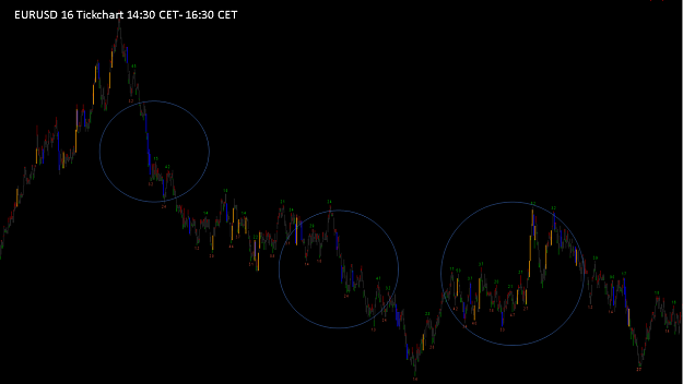
Attached Image (click to enlarge)
Let's take a look at the third example from February 2018. In this case, you could not see a reduction in bullish movements in the two previous candles, but there was a significant increase in bearish pullbacks. Here, the bottom indicator to bear the very clearly shows that the last bullish candle before the turnaround was significantly weaker than the two candles before. After point 1 they see on the indicator how the bears dominate towards the bulls.
In principle, I would like to emphasize once again that it is not about entering into a trade based on this information. Rather, this information serves a possible long-term prediction of a trend. So it's all about defining the overall trend order. In smaller time units I can then find out the middle and smaller trend sequence.
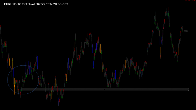
Attached Image (click to enlarge)
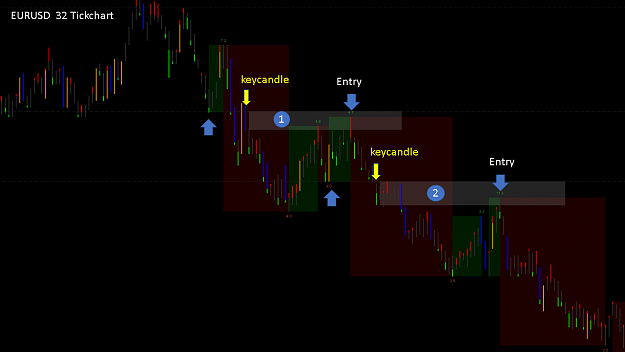
Now let's look at the indicator in MT4. As you can see, the large movements with a small pullback are so-called key candles, which can give an indication of a possible trend reversal. However, as traders, we know that there will not be 100% reliability, as the market is always good for a surprise.
I have now colored the trend once, you can clearly see how the bearish movements in the downtrend dominate and vice versa. In addition, you can see how the pullback becomes stronger before a turnaround. Of course you should pay attention to the resistance zones with the help of demand and supply. The strongest resistance zones are always inside the strongest candles, so the ones with the smallest pullback
The interesting thing about this indicator is that both the strong moves and the pullbacks are listed. This shows at a glance where the main direction is going. As soon as the pullback increases in a major move, there is a high probability that a turnaround will be initiated. Of course, this indicator works in all time units and also on all tick charts. Try it yourself, I am sure that over time it will be easy for you to identify potential long-term reversals more quickly. In addition, I recommend you in the future to work with the Bionic Chart because it shows all the pullbacks at a glance.
This indicator is an auxiliary indicator and optimal for preparing the trending. Please note that the last candle is meaningful only after the close. Of course, you can also show the pullbacks in other colors, or just leave them out, then you only have the bionic net movement.
At this point, I wanted to thank you once again for your cooperation and the great ideas that we have worked out over the last few months and look forward to the coming years with you. I am convinced that we are taking a small step each month.
I wish you all a great Easter and a few contemplative days in the circle of your loving family.
I am looking forward to your feedback
Lovely wishes
Attached File(s)
Forget:That does not work, amateurs build the ark, pros the Titanic!
7