The new Bionic Pullback Indicator
Hello dear subscribers,
Over the past few weeks, we've been busy setting up and optimizing the tick charts. That's why I posted fewer posts, as the time was huge. Nevertheless, we have come a step further in the findings.
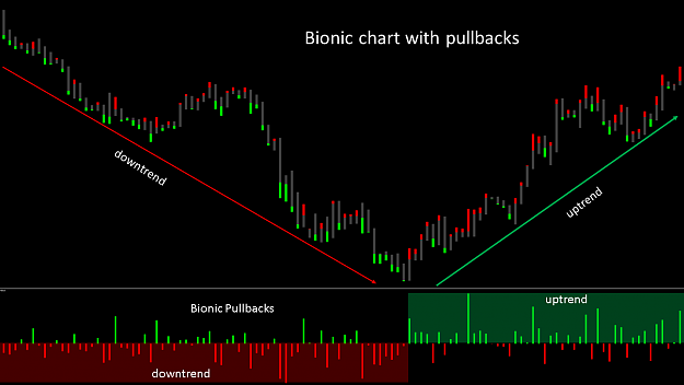
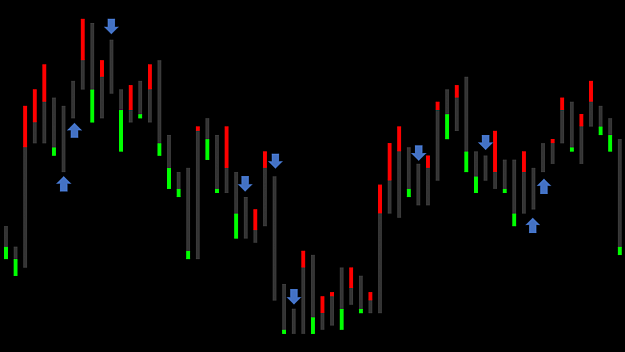
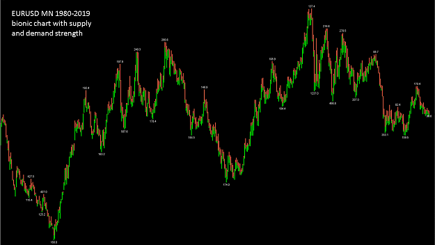
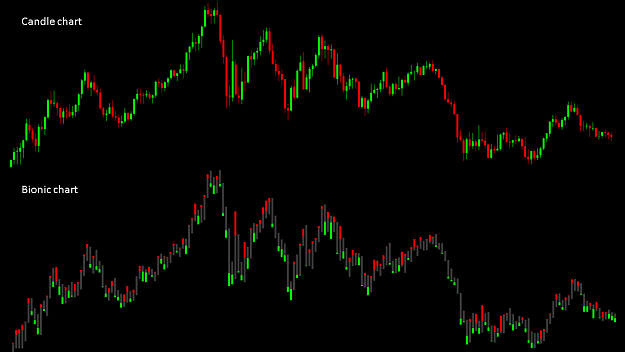
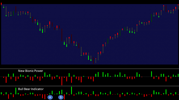
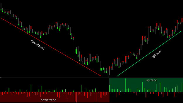
The development of the supply and demand indicator and the Bionic candle served to identify the strongest zones within a trend. Within a downtrend, here an example in H1, there are strong and weaker moves down. As soon as the course goes up again you can see that he overcomes the weak movements downwards, while he fails at the strong movements and is pushed down again. The goal is to filter out the strongest movements to identify future reversals. This was possible with the previous color setting of the Bionic candle, but not as clear.
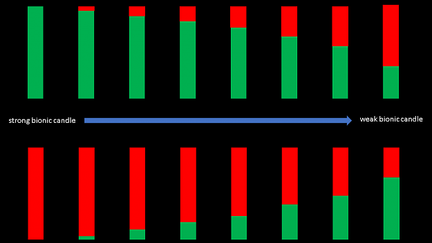
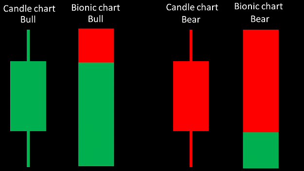
In my previous post I have written some information about this. A key advantage is that you only see the last decisive pullback within a candle. Thus, the strength of a candle can be seen at a glance. The larger the last pullback, the weaker the movement. However, the limitation of these movements is in the M1, since this is the smallest time unit. To bring the stops below 1pip, I have to be able to look closer into the candle. This is often only possible in a tickchart.
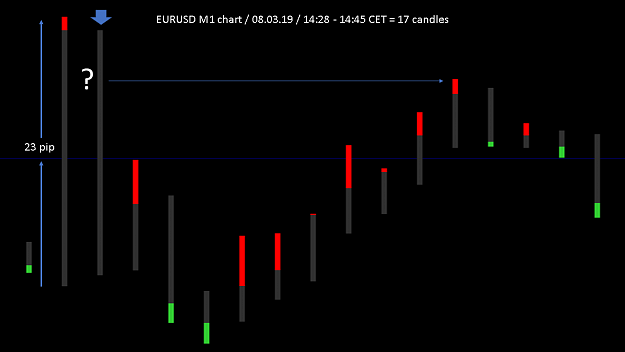
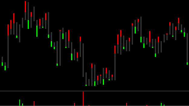
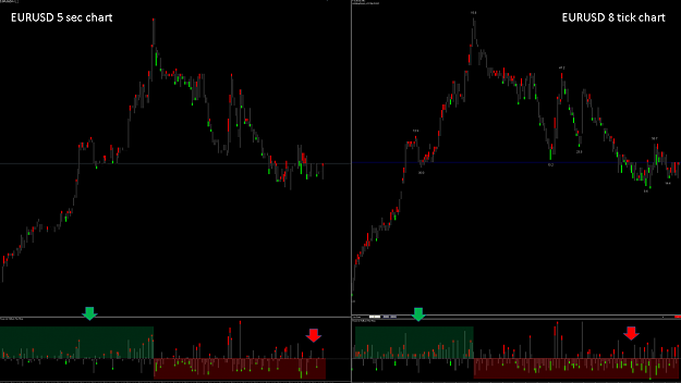
Let's look at a concrete example. On Friday the 08.03.19 between 14:28 to 14:45 CET there was suddenly a strong movement within 5 minutes at 23 pip and then a movement around 27 pip down. In the following 7 minutes the course went up again. In the past it was difficult for me to draw a resistance zone from this movement, because in this case I only had 17 candles and the candles were often not clear enough.
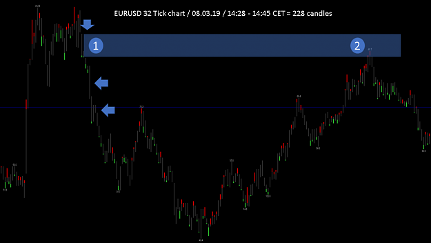
In the 32 Tickchart I received in the same time 228 information about the strength of the individual movements. That was an average of 13 candles per minute. This immediately enabled me to identify the strongest zones within these uncontrolled movements. You can see very well how the strongest movement at point 1 ensures that at point 2 the decisive downward trend is initiated. The two underlying candles also showed a strong movement and had an influence on the price performance. You can see that the course just before point 2 starts to weaken.
What does it mean to identify the strongest candle within a downward movement? This strongest candle means that most of the sales have occurred at this price level at this time. The likelihood is very high that when the price goes up again, it will be in this strong price level again to strong sales.
However, there is no guarantee for this because the strength of the lower resistance is crucial to the uptrend. And if the lower resistance is stronger than the upper resistance, the upper resistance zone is broken by the upward trend.
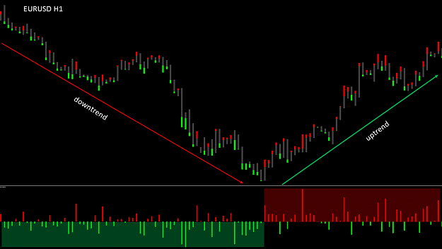
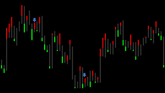
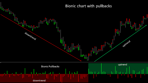
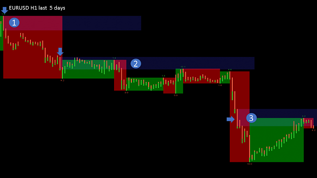
First let's look at a very interesting discovery. As a rough example, I'm using the EURUSD in H1 from Jul to Aug 2018. We see a downtrend and immediately thereafter an uptrend of 440 pip each.
In the downtrend we can see that the bullish pullbacks within the Bionic charts are much stronger than the bearish pullbacks. In the uptrend, the bearish pullbacks within the Bionic charts are much stronger than the bullish pullbacks. This is not about the number of pullbacks, but about the size.
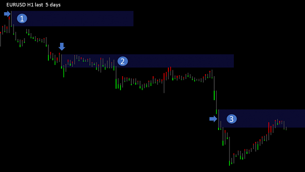
In the indicator I developed, you can see these pullbacks very nicely and you can see that in a downtrend bullish pullbacks are much stronger. When a downtrend is strong, the effort to turn it over is very high. As long as the bullish pullbacks are small within the downtrend, the downward trend is strong. As soon as the pullbacks get bigger, the trend weakens.
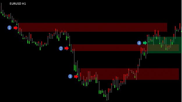
At points 1,2 and 3 we detect the strongest movements down and record our resistance zones there. At point 4 we identify the strongest upward movement and record our resistance zone there. They recognize how exactly the zones are to be identified.
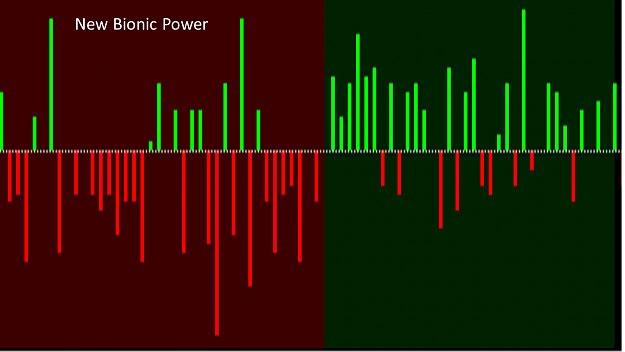
To make it easier for most, I switched the colors of the pullback indicator. So you can immediately tell if it is a strong uptrend or downtrend.
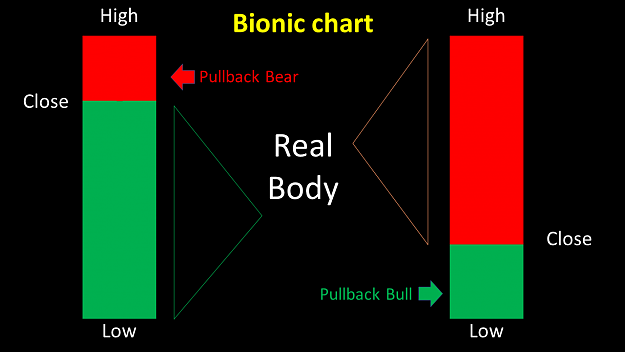
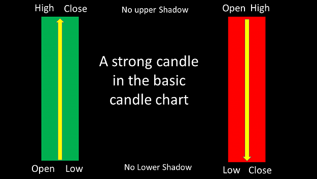
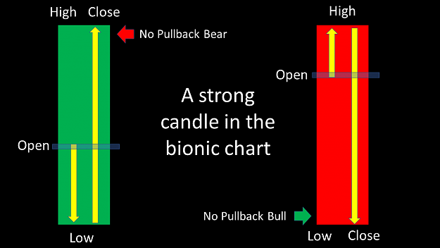
Please note that these calculations are the relevant pullback for me. Within most candles, there are two pullbacks, which are presented in the form of a shadow. The lower shadow of a bullish candle is not relevant for me, as the price went up significantly above the open afterwards. The upper shadow of a bearish candle is not relevant for me, as the price went down significantly over the open afterwards. The pullback in the Bionic chart is for me the last relavant price movement just before the Close. Of course, there are exceptions in some cases, but they were not taken into account.
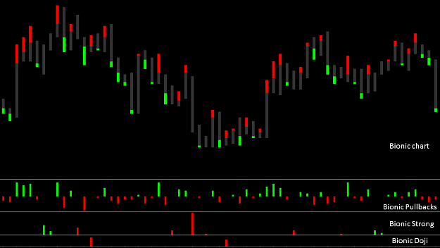
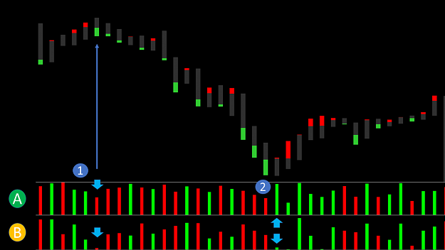
I have created the two important indicators for you here. The Bionic chart Historam pullback indicator, which on the chart instead of the normal candles, filters out only the pullbacks of a move. The Bionic Pullback Indicator below shows in the overview the strength of the respective trend.
However, you always have to keep an eye on all the movements in order to draw possible conclusions. As already mentioned, a time-based chart is clearly at a disadvantage compared to a tick chart. Although the indicators running in the tickchart, they still need to be adjusted.
I am convinced that in many situations you can now identify the trend reverses faster. But it is like all a matter of time and exercise. The small pullbacks seem to be a crucial key to success, but unfortunately there is no basic statement in forex, which always holds. That would speak against the principle of the stock market.
Conclusion:
Based on the findings so far, we will continue to optimize and expand these pullbacks in the future. It is crucial to get a deeper insight into the candle. This information must then be adapted to the particular situation in order to make possible derivations. I still think that the candle is absolutely enough to make a trading decision. For a rough overview, I also recommend using the supply and demand indicator. You will find detailed information and instructions here on the blog.
The way seems to be the right one, but we will significantly improve the calculations over the next few years to make even better decisions. Who manages to take big profits within the small movements, for the big trend consequences are no longer relevant. Then it does not matter if we are now in an uptrend towards 1.25 or even further down. Every trend moves up and down in wavy lines and we want to take those wavy lines with us. Very small stops with big lots means a small risk for me within a short time. The shorter I stay in the market, the lower the risk of being stopped by unforeseen movements.
This trading style involves a lot of time and experience. In recent years, I have noticed that it is easier for me to anticipate short-term movements more accurately than long-term movements. Therefore, I would prefer 10 to 15 trades in a day rather than a trade to hope the price moves in my direction. With this style of trading a long-term equilibrium can be traded profitably and low volatility phases. So there is no reason to look for rewarding trades in other unpredictable currency pairs. With 3,000 trades within one year, a high level of experience is also created at the same time. But this decision must be made at the end of each trader for himself.
I wish you now that these indicators help you a little bit to capture the market faster and to identify trend reversals even more precisely. I am happy about your experience.
A successful trading week
best regards
Hello dear subscribers,
Over the past few weeks, we've been busy setting up and optimizing the tick charts. That's why I posted fewer posts, as the time was huge. Nevertheless, we have come a step further in the findings.
Attached Image (click to enlarge)
The development of the supply and demand indicator and the Bionic candle served to identify the strongest zones within a trend. Within a downtrend, here an example in H1, there are strong and weaker moves down. As soon as the course goes up again you can see that he overcomes the weak movements downwards, while he fails at the strong movements and is pushed down again. The goal is to filter out the strongest movements to identify future reversals. This was possible with the previous color setting of the Bionic candle, but not as clear.
Attached Image (click to enlarge)
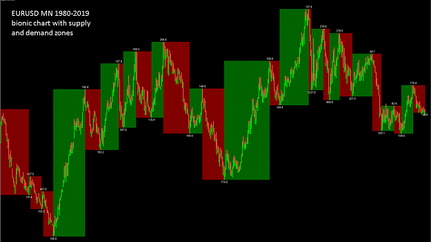
In my previous post I have written some information about this. A key advantage is that you only see the last decisive pullback within a candle. Thus, the strength of a candle can be seen at a glance. The larger the last pullback, the weaker the movement. However, the limitation of these movements is in the M1, since this is the smallest time unit. To bring the stops below 1pip, I have to be able to look closer into the candle. This is often only possible in a tickchart.
Attached Image (click to enlarge)
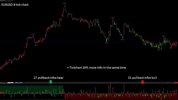
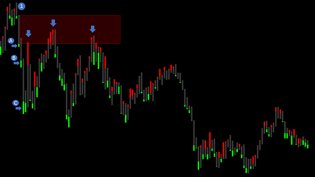
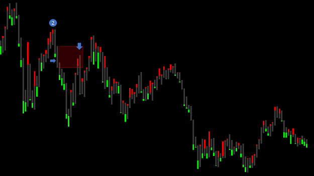
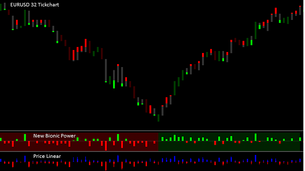
Let's look at a concrete example. On Friday the 08.03.19 between 14:28 to 14:45 CET there was suddenly a strong movement within 5 minutes at 23 pip and then a movement around 27 pip down. In the following 7 minutes the course went up again. In the past it was difficult for me to draw a resistance zone from this movement, because in this case I only had 17 candles and the candles were often not clear enough.
Attached Image (click to enlarge)
In the 32 Tickchart I received in the same time 228 information about the strength of the individual movements. That was an average of 13 candles per minute. This immediately enabled me to identify the strongest zones within these uncontrolled movements. You can see very well how the strongest movement at point 1 ensures that at point 2 the decisive downward trend is initiated. The two underlying candles also showed a strong movement and had an influence on the price performance. You can see that the course just before point 2 starts to weaken.
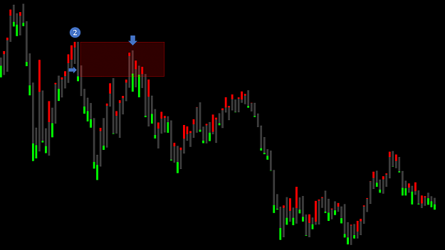
What does it mean to identify the strongest candle within a downward movement? This strongest candle means that most of the sales have occurred at this price level at this time. The likelihood is very high that when the price goes up again, it will be in this strong price level again to strong sales.
However, there is no guarantee for this because the strength of the lower resistance is crucial to the uptrend. And if the lower resistance is stronger than the upper resistance, the upper resistance zone is broken by the upward trend.
Attached Image (click to enlarge)
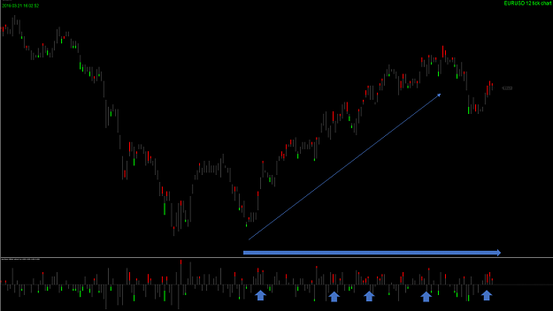
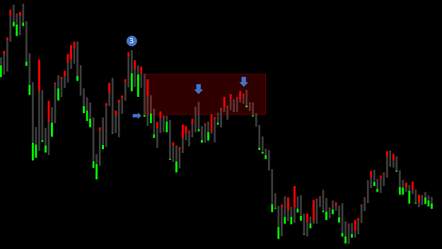
First let's look at a very interesting discovery. As a rough example, I'm using the EURUSD in H1 from Jul to Aug 2018. We see a downtrend and immediately thereafter an uptrend of 440 pip each.
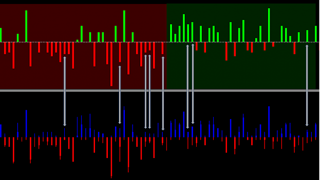
In the downtrend we can see that the bullish pullbacks within the Bionic charts are much stronger than the bearish pullbacks. In the uptrend, the bearish pullbacks within the Bionic charts are much stronger than the bullish pullbacks. This is not about the number of pullbacks, but about the size.
In the indicator I developed, you can see these pullbacks very nicely and you can see that in a downtrend bullish pullbacks are much stronger. When a downtrend is strong, the effort to turn it over is very high. As long as the bullish pullbacks are small within the downtrend, the downward trend is strong. As soon as the pullbacks get bigger, the trend weakens.
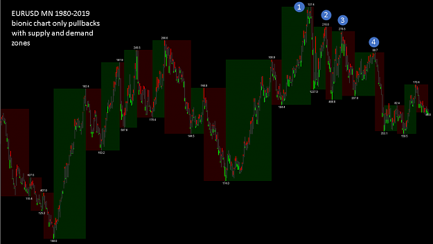
Attached Image (click to enlarge)
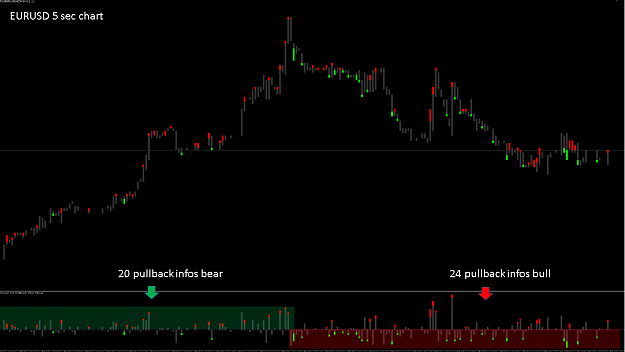
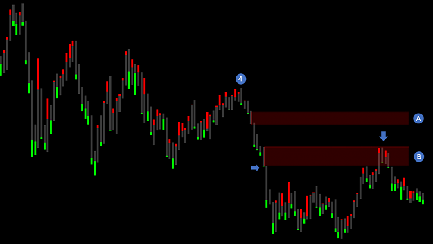
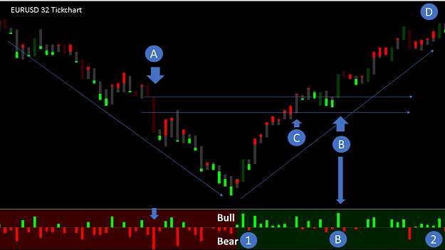
At points 1,2 and 3 we detect the strongest movements down and record our resistance zones there. At point 4 we identify the strongest upward movement and record our resistance zone there. They recognize how exactly the zones are to be identified.
Attached Image (click to enlarge)
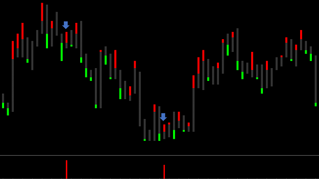
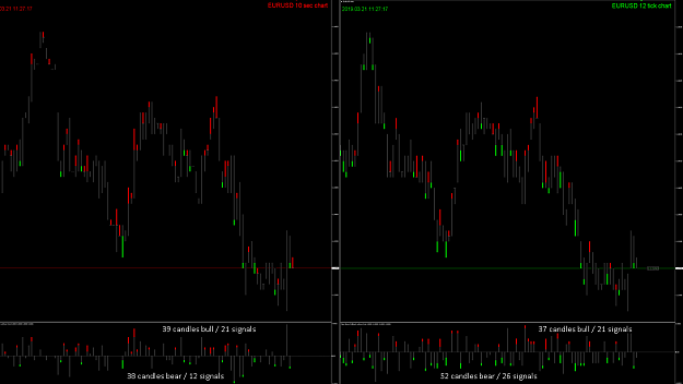
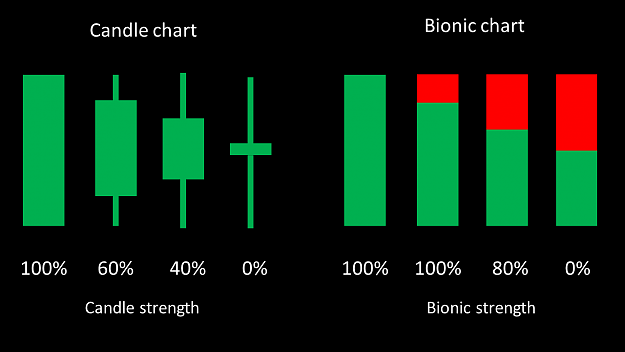
To make it easier for most, I switched the colors of the pullback indicator. So you can immediately tell if it is a strong uptrend or downtrend.
Attached Image (click to enlarge)
Please note that these calculations are the relevant pullback for me. Within most candles, there are two pullbacks, which are presented in the form of a shadow. The lower shadow of a bullish candle is not relevant for me, as the price went up significantly above the open afterwards. The upper shadow of a bearish candle is not relevant for me, as the price went down significantly over the open afterwards. The pullback in the Bionic chart is for me the last relavant price movement just before the Close. Of course, there are exceptions in some cases, but they were not taken into account.
Attached Image (click to enlarge)
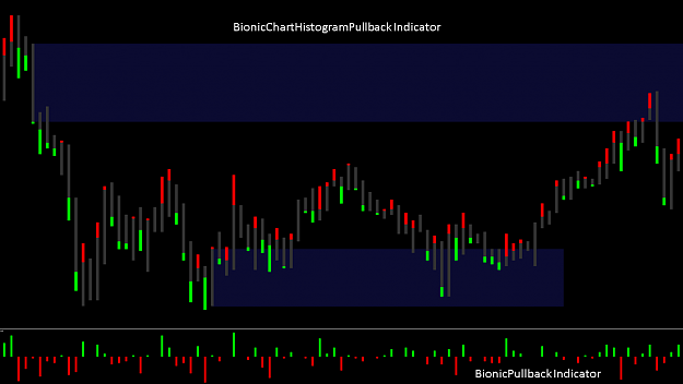
I have created the two important indicators for you here. The Bionic chart Historam pullback indicator, which on the chart instead of the normal candles, filters out only the pullbacks of a move. The Bionic Pullback Indicator below shows in the overview the strength of the respective trend.
However, you always have to keep an eye on all the movements in order to draw possible conclusions. As already mentioned, a time-based chart is clearly at a disadvantage compared to a tick chart. Although the indicators running in the tickchart, they still need to be adjusted.
I am convinced that in many situations you can now identify the trend reverses faster. But it is like all a matter of time and exercise. The small pullbacks seem to be a crucial key to success, but unfortunately there is no basic statement in forex, which always holds. That would speak against the principle of the stock market.
Conclusion:
Based on the findings so far, we will continue to optimize and expand these pullbacks in the future. It is crucial to get a deeper insight into the candle. This information must then be adapted to the particular situation in order to make possible derivations. I still think that the candle is absolutely enough to make a trading decision. For a rough overview, I also recommend using the supply and demand indicator. You will find detailed information and instructions here on the blog.
The way seems to be the right one, but we will significantly improve the calculations over the next few years to make even better decisions. Who manages to take big profits within the small movements, for the big trend consequences are no longer relevant. Then it does not matter if we are now in an uptrend towards 1.25 or even further down. Every trend moves up and down in wavy lines and we want to take those wavy lines with us. Very small stops with big lots means a small risk for me within a short time. The shorter I stay in the market, the lower the risk of being stopped by unforeseen movements.
This trading style involves a lot of time and experience. In recent years, I have noticed that it is easier for me to anticipate short-term movements more accurately than long-term movements. Therefore, I would prefer 10 to 15 trades in a day rather than a trade to hope the price moves in my direction. With this style of trading a long-term equilibrium can be traded profitably and low volatility phases. So there is no reason to look for rewarding trades in other unpredictable currency pairs. With 3,000 trades within one year, a high level of experience is also created at the same time. But this decision must be made at the end of each trader for himself.
I wish you now that these indicators help you a little bit to capture the market faster and to identify trend reversals even more precisely. I am happy about your experience.
A successful trading week
best regards
Attached File(s)
Forget:That does not work, amateurs build the ark, pros the Titanic!
5