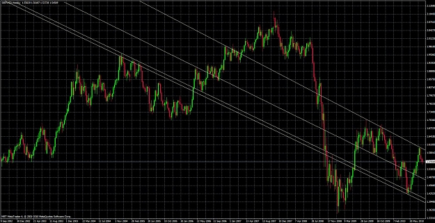
Ok, here's my first chart post. Trying to play devils advocate here, what's wrong with this alternative view of the same chart?