Hello again This is still interesting. Think i will go back and go over some of your thoughts, maybe tomorrow or next week. I will let you know if i think of something fun. Cheers anway!
Ignored
Hey, yaed! Thanks for visiting. It's been so long that I've been involved in ff, it's embarrassing.
Good wealth to you.
{quote} Hey, yaed! Thanks for visiting. It's been so long that I've been involved in ff, it's embarrassing. Good wealth to you.
Ignored
Ah, it is well to hear from you strange and wonderfull person. I was thinking on getting in touch with you again. I had a faint recollection of going to your journal and saying something, now that i see your username. And oh yes the reason. That i so wanted. Is: I have this idea that i think you could find interesting.
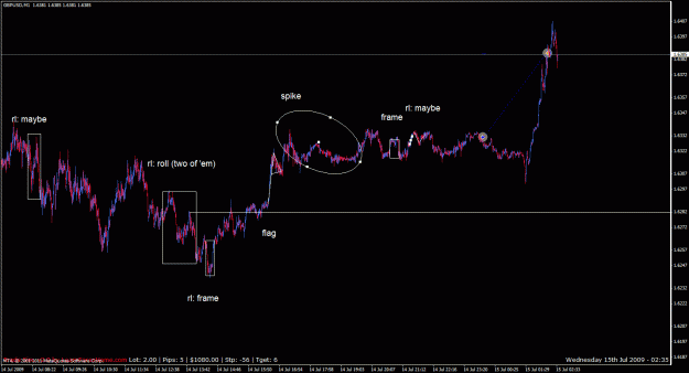
p1 new: (own lang, will produce sensibly) floaters such as rh,p.m.,and u, where u equals gc line (with circle u&d it; T) times ( (d(a)g-sa) divided by (S) body pattern (ex.: 1.a skewed, negative gut feeling about it 2.eclipsed with an overriding push away 3.a high counterbalance 4.projection of climbing upward 5.Confused version of hautiness/ridicule went with it) Beware toxic people, who get emotional support from attacking others' emotional stability when very close to them. They get a thrill, emotional support, and you get damaged, upset. Soon,...
hi ha-pattern,
thanks for your incredible work here with outstanding ideas.
Since long time I have tried to find an indicator or a script to show loagrithmic charts in mt4 because TL's are so much easier to use and much more accurate then in linear charts.
However it seems to me that you may have solved this problem ( with an indi or script ?? ) shown in your pic above form this thread.
I would be very appreciated if you could give me a short info regarding this .
Thanks for your time .
Greeds Zack
{quote} Ah, it is well to hear from you strange and wonderfull person. I was thinking on getting in touch with you again. I had a faint recollection of going to your journal and saying something, now that i see your username. And oh yes the reason. That i so wanted. Is: I have this idea that i think you could find interesting. http://www.forexfactory.com/showthre...71#post7692871 Post #41.
Ignored
Your indicator does clean the chart for some interesting chart pattern reading, yes --
Attached Image
Did the chart reverse after this? Just guessing. Or maybe part of an overall bigger pattern.
----------
Thanks for visiting, Zachary.
I want to find my path through getting at least a new way to look at the chart, is my direction.
I don't visit often; I like patterns, though, and will do something there at your suggestion.
{quote} Your indicator does clean the chart for some interesting chart pattern reading, yes -- {image} Did the chart reverse after this? Just guessing. Or maybe part of an overall bigger pattern. ---------- Thanks for visiting, Zachary. I want to find my path through getting at least a new way to look at the chart, is my direction. I don't visit often; I like patterns, though, and will do something there at your suggestion.
Ignored
Its not an indicator, i pinpointed where it would have been best to trade under the ideal circumstances. Its an excercise to try to sort of see those places as they are happening. It probably went down afterwards, yupp.
Joined Sep 2008
|
Status: hardcore chartist
|2,173 Posts
Alright, I got something, although probably lame in the future's retrospect.
I call it energy patterns, easiest recognized in the up and down and in and out of speech, minus its content.
A plain 50-50 split between content and energy pattern, speech gets.
Other object or activities would get a different split, as, say in the instance of one moving (an activity) one's body (an object) from one spot (an object) to another with interaction between objects along the way, content being more divided and isolated around each object and energy being more cohesive along the entire path of motion.
Then, at least apparently, a lower split, say 10-90 between content and energy pattern in most instances of travel along time would be had, and then say 75-25 split when interacting energy with the content at the stops.
I could use my own ptm (which is a written-down theory of mind which I made as objectively as I could since around the time I began to take charts (though not trading itself) more seriously ('04))
to make a scaffolding around such an energy pattern and content, but each person can use whatever.
The point is to involve oneself as plainly as can in the interpretation of oneself involved with the chart,
in an effort to trade easily since one captures and deals with all those emotions and such that, for me at least, get in the way.
The way I described it above, is awfully wide-open, so I'll check if I can narrow down something around the concept of energy patterns (and its split from content).
It turns out that my subconscious was thinking of something very simple and chart oriented:
Just add a dimension as an area the chart is in at the moment -- in, out and variations of these two -- , call the vertical a wall to get over and horizontal a floor/ceiling to get through, and keep my oft-used trendlines / trendline groupings (or spirals, too, I guess).
About as ordinary as one can get, oft-done and done better elsewhere.
The difference with energy patterns is that -- via a stable, standardized, written-down theory of mind -- one can insert relevent things in one's own life that may disturb ordinary logic/reason with a somewhat-balanced mind in drawing up, interpreting, and trading a next portion of, the chart.
So here's an example. I apparently had the noted somewhat-balanced mind, due to bouncing off people posting on my thread, which is always a pleasure, and me wanting for a good while to come up with some method I can trade (fake-trade, as usual) with, making the fake trades both a positive addition to a counter to a pleasantry and, in the second part, a conclusion to a desire. In then out; in the small (a k a "One step for..."), out the big, a new method.
Okay, here it is, the ordinary part -- Since, as noted I apparently had the noted somewhat-balanced mind, that's all I have right now (which is kind of humorous, it'll go soon enough) -- in charts below:
Attached Image (click to enlarge)
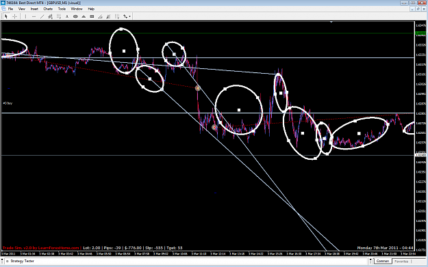
-- What I noticed in this chart, was straight-up and -down motions of the chart, as breaking through to a new chart area and perhaps staying there.
Attached Image (click to enlarge)
-- Then a trendline appeared, too 'there' to avoid.
Attached Image (click to enlarge)
--A vertical wall broke in the latter portion of this chart.
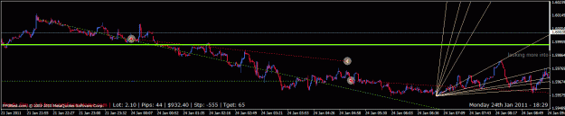
In the first portion of the chart above, a logarithmic spacing along the x, that is, time, axis, developed the chart in an upward direction, so I put a Gann Fan there and, after the vertical wall broke, figured price had a good, if halting, chance to go up, so I bought into a longer-hold trade in the next chart:
Attached Image (click to enlarge)
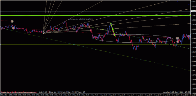
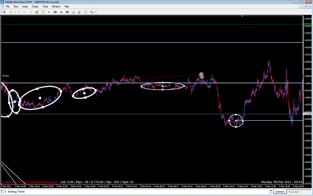
-- Among all the halting behavior, and after the chart brought into the fold the idea of longer-term behavior, AND after introducing a new and substantial place for a horizontal line, I looked at the area before the first chart above for a place where that horizontal line may have initiated, and I found it in the chart below:
Attached Image (click to enlarge)
---- Okay, that could barely even be called a method. It's subtle, at least. But I've always had trouble with certain areas hogging up the chart, and then price twisting and turning completely away from, or seemingly randomly involving itself with the area later on, when in real life, one returns again and again to the same space, and then, in time, leaves it forever --
Except in one's mind, I realize, when one DOES return to it seemingly read randomly within that old space, like using memory to reason something now.
[WARNING: I get deep into my own ptm, here.]
Okay, that makes some sense to me, since in my own ptm, memory runs from around the brain to through the middle of one's entire balance (and, on the other side of the brain (in my own ptm, of course),
an aligning of a few of several groupings of the stuff in that space) to the world's ground where one's feet go and the aligning of a few of several axal groups of the stuff in that space. So memory becomes a functional definition,
with this mind having a (energy- (with the brain's chemo-electric energy)) spatial bias to counter and deal in fact, balanced with the real world's energy bias.
[Okay, that's gone.]
Anyway, a chart works nicely into one's own theory of mind, even more so now.
Um, okay, I need to introduce a jarring factor, one that'd upset my trading and test assistance of the energy patterns method with my own ptm:
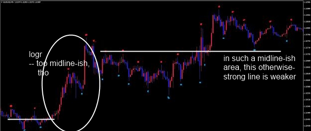
Attached Image (click to enlarge)
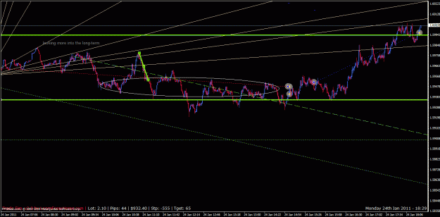
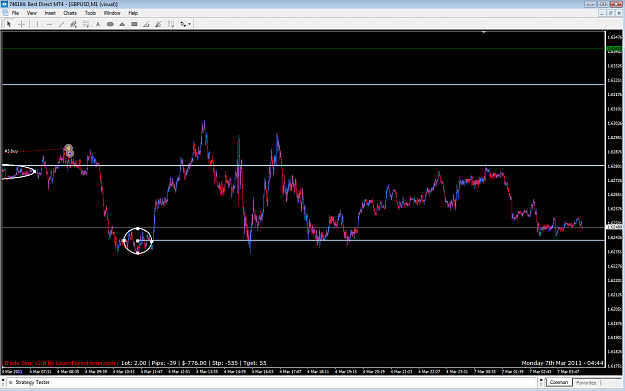
-- Here's a pattern that logr's out and then, on the other side of this up of an out, logr's in (that is, back into the last area/space). It formed a nice midline, which I drew a horizontal line from. Only thing I was worried about, was that the push up was TOO fast, and that price would forget to go back there for a good while. So, I held off on a trade for a while, letting any exuberance fade out for a return to that horizontal line.
Attached Image (click to enlarge)
Then I traded the rebound back up.
---- Okay, no irrational break here, either. I think my trading pattern was, instead, shifting when and where I could make and how long I could hold a trade, both along the time line. This makes my trading more adaptable, at the same time it could break down under the lesser adaptability of the charting method the trading is pinned upon. It didn't break down, this time, which is great.
Also, these last two charts were in fairly new price territory, so I didn't have to go through keeping some and erasing other drawing objects.
Joined Sep 2008
|
Status: hardcore chartist
|2,173 Posts
Hey, I'm enjoying this!
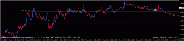
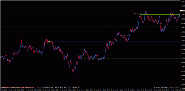
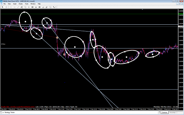
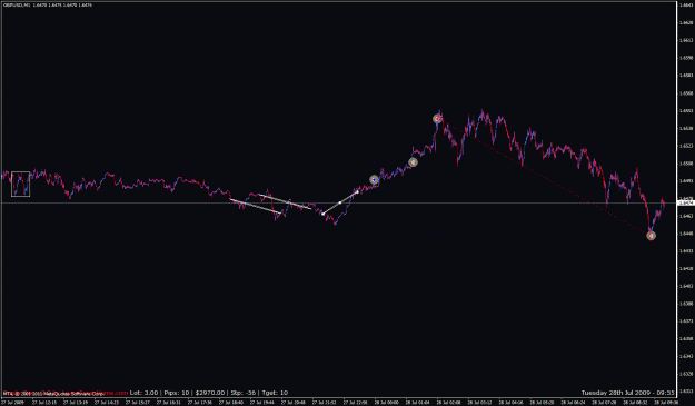
I looked for another trade, and got confused at what I had in front of me -- it was too small and insignificant -- then I got a clue, there was too much of a forward, as if from a vertical wall, so I checked back into the recent past and got a really good triangle. Comparing this to the current chart, which now seems to be holding an upper horizontal line, if , I just now noticed, a bit whippily (same behavior as the first clue's reaction to a wall), I figured that the triangle formed a horizontal resistance line, and thus that I could trade downward, and quite a bit at that, given the strength of that triangle -- and, I notice, even more so as a bounce away from the Gann Fan area. With all those midlines peppered throughout the chart from the last post's first chart to now, it's no wonder a return of some kind was imminent. And, hey, it's (currency) pairs trading.
Attached Image (click to enlarge)
In this second chart, I go out of the trade via the horizontal line made on the chart in the last post from the "pattern that logr's out and then, on the other side of this up of an out, logr's in" :
Attached Image (click to enlarge)
----- Well, okay, this was a nice experience. This drawing stuff IS valid, i.e., I found my own way in it. So was the seven (not having described them all) - trades series all being (practice-chart) winners.
I must be on a high.. One really doesn't, or I haven't observed in real life, such consistency while using my own ptm, enough to trade forward on it beyond ordinary habit survival dictates I must do. Maybe there's a possibility of improvement from using this energy patterns method in my own ptm, somehow.
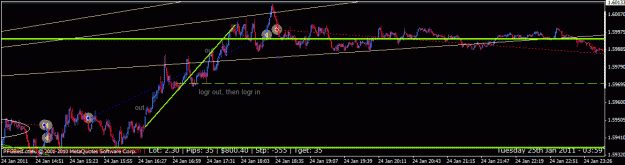
Whoo! I'm glad I stopped. This is what happened next, something a shoulda coulda woulda applies to , as my mind was too worked up from trading so much, and I woulda lost if I had gotten back in and tried to make a decision based on local-data lines:
Attached Image (click to enlarge)
: The REASON I didn't trade it, underneath, is that I've been recognizing my body's endurance / excitement limitations, especially in the past several weeks, and that helped me stop trading -- Here, in exactly the right place.
My trading lines did follow through, though, as the chart shows, so the chart method is still sound.
{quote} {image} hi ha-pattern, thanks for your incredible work here with outstanding ideas. Since long time I have tried to find an indicator or a script to show loagrithmic charts in mt4 because TL's are so much easier to use and much more accurate then in linear charts. However it seems to me that you may have solved this problem ( with an indi or script ?? ) shown in your pic above form this thread. I would be very appreciated if you could give me a short info regarding this . Thanks for your time . Greeds Zack
Ignored
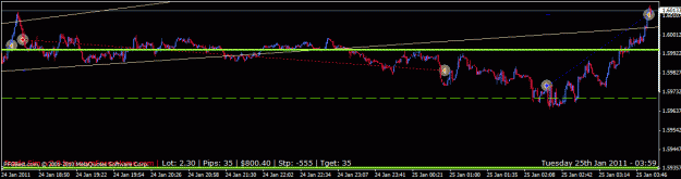
Hi, Zach:
Thanks again for stopping by.
If I drew that chart you show me, then it may have made sense in a very local way, but there is no sequential sense to it from what happened in past charts. Perhaps it'd be valid in a stop-gap way,
if one didn't have access to the past-charts data that'd relate to the area the chart you present.
I wouldn't trust that Gann Fan past one or two short-term trades.
Hi ha-pattern,
thanks a lot for your effort abd chart-explaining.It opens some new features trading with TL's .
But I think there could be some misunderstanding from what I trying to find and what you have discovered.
What I am trying to find is a converter from the MT-4 Linear Charts to Logarithmic Charts.
here is something that explains it from an other member:
Joined Aug 2007 | Status: History & Economic Cycles | 202 Posts
Quoting rudenstein
Why does the TL necessarily have to be shown in Log scale? In fact, the argument can be made that most charting programs display charts in linear form by default. And, the market did bounce off of "linear" support, so it does count.
Allow me to explain why Pros prefer log charts for long term (weekly/monthly) time frames. It is invaluable when determining a trend line over many years to remove the natural curve distortion. And is critical when using Fibonacci values in long time frames, otherwise the values are incredibly distorted using basic linear charting. Let me send you to charting 101:
Quote Log Charts vs. Linear Charts
Why does The Motley Fool prefer log charts over linear charts? Spend any time looking at charts of stock price movements at Fool.com and you'll be looking at logarithmic charts.
...Why is one kind of chart better than another? Well, imagine a company with a stock price increasing by 15% each year for 20 years. Think about how you'd normally draw a chart of its stock price. You'd probably use a linear chart, as that's what most of us learned to do in school. The graph would show a really curved line, though. It would look like the stock price grew slowly in the first years, and then zoomed up a lot in the last few years.
That's because in the first few years, the change in the stock's price might have been from $10 to $11.50, and later from $25 to $28.75, and later still from $75 to $86.25. So the absolute changes will look small at the beginning, and will look large later on. But it's really just been a steady 15% increase from year to year. (Remember, an investor should be just as happy with a total 50% return from $20 to $30 as from $100 to $150. Investment-wise, percentage-wise, it's the same thing.)
This is why a logarithmic chart is preferable in this situation. If a company is growing at a steady clip, you'll see a fairly straight, upward-sloping line on the graph, not a sharply curving line. If the company's growth is slowing, you'll see the upward slope taper off a bit. If the company keeps growing faster and faster, then you'll see an upward-sloping sharp curve. But this time the dramatic curve will represent dramatic growth.
http://www.fool.com/foolfaq/foolfaqcharts.htm
The example below shows Google shares represented by a log-scale chart. Looking at the Y-axis you can see the values seem to compress as they rise from 0 to 450. The trendline has been clearly drawn and has been broken at the start of the year. This indicates the stock is decelerating because the rate of percentage changes is falling.
The chart below is a normal or arithmetic-scale chart. Note the Y-axis values are equal distance apart. You can also see how the trendline appears much differently from the chart above. It is often necessary to keep re-drawing trendlines (as I have done) on artithmetic charts, which can make the bigger picture difficult to analyse.
Hi there ,
I have very special idea for everyone who blames MT4/MT5 for not drawing the right and correct trendlines with the Linear Charts whcih MT4/MT5 is using.
May any Coder could change this Period Converter from the normal MT4 -Arithmetic -Linear Charts to Logarithmic Chart Scale.
I think this is the only way to get Logarithmic Charts in MT4/MT5 for all technical Trendline-Lovers.
here is the indi and the source code:
//+------------------------------------ ------------------------------+
//| Period_Converter_Opt.mq4|
//| Copyright (c)2005, MetaQuotes Software Corp. |
//| http://www.metaquotes.net |
//| Ver.1.6 Modified by micclly|
//| Ver.1.5 Modified by fai |
//| Modified by wfy05@talkforex based on Period_Converter|
//| http://www.talkforex.com |
//+------------------------------------ ------------------------------+
#property copyright "[email protected]"
#property link "http://www.mql4.com/codebase/indicators/277/"
#property indicator_chart_window
#include <WinUser32.mqh>
/*
Readme:
I. Features:
This is an improved version of period converter for MT4 based on the
MT4's default period converter by metaquotes.
The default period converter script do not support real-time refreshing,
and consume lots of CPU (50%-9x%) making the whole system slow.
Also, the default one is a script which do not save when you exit MT4,
so you have to apply every converter script again after restarting, quite
annoying.
This one fixed all above problems:
1. Real-time updating or custom interval millisecond level updating.
2. Low CPU cost, average 5%-10% or less.
3. Works as an indicator, so can be saved and reloaded during restart.
4. There is no one converter per chart limitation as it is not script
any more, you can only use one window as source to generate as many
new timeframe chart as possible.
5. Auto updating if there is new history block loaded.
II. How to use:
Copy the mq4 file to your MT4 indicators folder (experts\indicators)
to install it as an indicator, NOT script. then in the custom indicator
list, attach period_converter_opt to the chart you want.
It support 4 parameters:
PeriodMultiplier: new period multiplier factor, default is 2
UpdateInterval: update interval in milliseconds,
zero means update real-time. default is zero.
Enabled: You can disable it without remove it with this option.
Other parameters are comments or for debugging, it is safe to ignore them.
Also Make sure you have Allow Dll imports option checked in common tab or
it won't work
After that, File->Open Offline to open the generated offline data. then
the offline data will be updated automatically.
As long as you keep the source chart open and the converter indicator
running, the generated chart including indicators inside will always
be updated. also you can close the generated chart and open again
later from File->Open Offline without problem.
If you want to quit MT4, you can leave those offline chart as other
normal online charts. when you start MT4 next time, those charts will
also be loaded and updated.
III. Notes:
1. Do NOT uncheck the "offline chart" option in offline chart common properties.
or after MT4 restart, it will treat that chart as online chart and request
the data from server, resulting empty chart window.
2. You can attach more than one converter to same window with different
PeriodMultiplier, e.g: you can attach 3 converter with
PeriodMultiplier = 2, 4, 10 to M1 to generate M2, M4, M10 at the same time.
It is even ok to use the M1 chart to generate Hourly chart like H2, which
only cost a few more CPU resource during initial conversion. but usually
most server don't have much data for those short period. resulting the
generated data isn't long enough for long period. so it is suggested
to use Hourly/Daily charts as source when needed.
3. The real-time updating mode updates quotes as fast as possible, but as
this is done via script, and MT will skip calling start() function when
your PC is busy and lots of quotes income. anyway, this seldom happen,
and you can at least get 10 updates each seconds which is much more
than enough.
4. The offline chart don't have a bid line showing in chart, but all data
in the chart including the indicators is still being updated,
so don't worry. you can show the bid line by unclick the "offline chart"
option in chart properties. but which don't helps much and if you forget
to check "offline chart" option before exit. it will cause errors and
become empty on next startup. you have to close the window and open
again from File->Open offline, which don't worth the trouble.
IV. History:
2014.03.10 1.6 Modified to support build 600 and later
2009.08.07 1.5 Added 3 options.(ShiftTiming,GMTShift,OmitD igit)
2005.12.24 1.4 faster to detect if data changed by removing float point
operations, added support to output CSV file in real time.
OutputCSVFile = 0 means no CSV.
OutputCSVFile = 1 means CSV + HST
OutputCSVFile = 2 CSV only, no HST .
(useful if you want to generate CSV for builtin periods)
CSV Filename will be the same as HST file except the extension.
added safe checking for PeriodMultiplier.
2005.12.04 1.3 Fixed missing data when there is large amount of data
loaded in several blocks, and support auto updating
when new history is loaded.
2005.11.29 1.2 Additional fix for missing data and server changing.
2005.11.29 1.1 Fixed missing partial data after restart.
Reinitialize after changing server or data corrupted.
2005.11.28 1.0 Initial release
*/
extern double Version = 1.6; // code version
extern string BuildInfo = "2014.03.10 by micclly";
extern int PeriodMultiplier = 1; // new period multiplier factor
extern int OutputCSVFile = 0; // also output CSV file?
extern int UpdateInterval = 0; // update interval in milliseconds, zero means update real-time.
extern bool Enabled = true;
extern bool Debug = false;
extern int ShiftTiming = 0;//0-3,Using H1Chart and PeriodMultiplier=4;
//if 1, ServerH4Chart = 00:00/04:00/08:00/12:00...
// =>OfflineH4Chart = 01:00/05:00/09:00/13:00...
extern int GMTShift = 0;// if 9, ServerTime = GMT+0 -> OfflineChartTime = GMT+9
extern int OmitDigit = 0;// if 1, 5Digits -> 4Digits
int FileHandle = -1;
int CSVHandle = -1;
int NewPeriod = 0;
string MySymbol = "";
int ShiftBase;
#define OUTPUT_HST_ONLY 0
#define OUTPUT_CSV_HST 1
#define OUTPUT_CSV_ONLY 2
#define CHART_CMD_UPDATE_DATA 33324
void DebugMsg(string msg)
{
if (Debug) Alert(msg);
}
LastBars = Bars;
LastVolume = Volume[0];
LastTime = Time[0];
LastClose = Close[0];
LastHigh = High[0];
LastLow = Low[0];
LastOpen = Open[0];
return (true);
}
return (false);
*/
/*
fast version without float point operation
*/
static int LastBars = 0, LastTime = 0, LastVolume = 0;
bool ret;
ret = false;
if (LastVolume != Volume[0]) {
LastVolume = Volume[0];
ret = true;
}
if (LastTime != Time[0]) {
LastTime = Time[0];
ret = true;
}
if (LastBars != Bars) {
LastBars = Bars;
ret = true;
}
return (ret);
}
int CheckNewData()
{
static string LastServer = "";
if (Bars < 2) {
//the data is not loaded yet.
DebugMsg("Data not loaded, only " + Bars + " Bars");
return (-1);
}
string serv = ServerAddress();
if (serv == "") {
//no server yet
DebugMsg("No server connected");
return (-1);
}
//server changed? check this and reinit to prevent wrong data while changing server.
if (LastServer != serv) {
DebugMsg("Server changed from " + LastServer + " to " + serv);
LastServer = serv;
reinit();
return (-1);
}
if (!IsDataChanged()) {
//return if no data changed to save resource
//DebugMsg("No data changed");
return (-1);
}
if (Time[Bars-1] != LastStartTime) {
DebugMsg("Start time changed, new history loaded or server changed");
reinit();
return (-1);
}
int i, cnt;
//try to find LastEndTime bar, which should be Time[0] or Time[1] usually,
//so the operation is fast
for (i = 0; i < Bars; i++) {
if (Time[i] <= LastEndTime) {
break;
}
}
if (i >= Bars || Time[i] != LastEndTime) {
DebugMsg("End time " + TimeToStr(LastEndTime) + " not found");
reinit();
return (-1);
}
cnt = Bars - i;
if (cnt != LastBarCount) {
DebugMsg("Data loaded, cnt is " + cnt + " LastBarCount is " + LastBarCount);
reinit();
return (-1);
}
//no new data loaded, return with LastEndTime position.
LastBarCount = Bars;
LastEndTime = Time[0];
return (i);
}
//+------------------------------------ ------------------------------+
//| program start function |
//+------------------------------------ ------------------------------+
int start()
{
static int last_time = 0;
if (!Enabled) return (0);
//always update or update only after certain interval
if (UpdateInterval != 0) {
int cur_time;
cur_time = GetTickCount();
if (MathAbs(cur_time - last_time) < UpdateInterval) {
return (0);
}
last_time = cur_time;
}
//if (Debug) PerfCheck(true);
int n = CheckNewData();
//if (Debug) PerfCheck(false);
if (n < 0) return (0);
//update history file with new data
UpdateHistoryFile(n);
//refresh chart window
UpdateChartWindow();
//if (Debug) PerfCheck(false);
return(0);
}
@ha-pattern:
I hope you are still interested in the Coding of Changing the Period-Converter from worthless Linear-Charts of MT4 to this huge improvement in having Logarithmic-Charts where the Trendlines are really applicable.Trust me it's worth the effort.
I would to do it for my own if I could programm.
Thanks for your attention.
Greeds Zack
@ha-pattern: I hope you are still interested in the Coding of Changing the Period-Converter from worthless Linear-Charts of MT4 to this huge improvement in having Logarithmic-Charts where the Trendlines are really applicable.Trust me it's worth the effort. I would to do it for my own if I could programm. Thanks for your attention. Greeds Zack
Ignored
Zachery,
your logarithmic-scale charts programming -- if I have this right -- seems interesting. Your last three posts seem more suited to begin a new thread in the programming section of forex factory, not in this decidedly non-programming journal of mine. The idea itself, maybe I and/or others can discuss here, but not all that programming. I admire ff programmers heartily -- who does not? -- and believe they could answer to any difficulties or solutions you have, if you bring it to them there.
The idea (which is usually about as far as I go, besides finding chart patterns) of mixing logarithmic charts with trendlines does sound interesting. I'd rather separate logarithmic motions in a 1:1 or at least a fixed chart, as log charts are used a whole lot in (US) stock trading charts, due to their different nature -- Pairs of two currencies, vs. the idea of a single stock against, say, the whole of the stock's competitors/group/market.
If you do come up with interesting log charts of currencies, though, and notice more than averaging separate logarithmic motions into a blur, that of a real identification of a larger logarithmic area, then pop by with a chart of that, if you like, whenever.
Anyway, good luck with your coding your idea.
By the way, that chart you introduced of mine in post 943 was not logarithmic, it's how the chart moves sometimes, so it's an example of a separate logarithmic motion.
Joined Sep 2008
|
Status: hardcore chartist
|2,173 Posts
Not a big deal -- I tied together the multiple two-variable axes in my own ptm, and they deviate more according exactly to the distance from the central y axis of the body. I used it twice to guide how I use trading chart studies, and the second time I circumvented a bad trade and instead made a good one. It's a bit fuzzy how this feature of my own ptm will go, but I have confidence it will improve my trading to match whatever charting ability I have.
Joined Sep 2008
|
Status: hardcore chartist
|2,173 Posts
Practiced again. (Big wup.) method --
Center up and down (imaginary) line, price balancing to left or right of it, exception making the trade. Severe straight trend to price, avoid trade.
Return to the mean approach, I guess. Demarcates basic shapes (triangle,circle,rectangle; occasionally, other (dot,line; fan,arcs,grid) along the way to focus evenly on price's details.
-- Not much different from the last method, except approach emphasis and failure. Intuitive, but probably similar to lots of other approaches, minus the imaginary vertical line to balance price flow off, and thus probable to build logically.
This is dull and repetitive stuff, me posting this; I'm still working on my own ptm, daily in fact, and yesterday did include where a trader goes, at least a vague sketch of what it may take for the level of competency a trader may need. Anyway, I did directness in the model this evening, and found a chart tends to average one's to-and-from focus in practice. It certainly doesn't in (the little) real trading (I did (and, even then, lost at)) !
Joined Sep 2008
|
Status: hardcore chartist
|2,173 Posts
Firstly, this post may annoy you, because it talks of nontrading stuff fairly heavily. It is a journal and tangentally close to the subject, at least.
I'm stuck. I keep redoing the first thinking model portion of my own ptm. A summary --
First, the parasympathetic sending the main chemicals. Expansions, descriptive definitions, and biological matches, of this. This is the top, the brain.
Opposite it, the hormonal -- I forget the name -- system together with the p(s) frame the body. I got a basic interaction with all its feeling and such. It's in the middle, to balance it all.
At the bottom, core movement and its guesswork is from gut to heart, to balance only the body at one's center of gravity and form actual motion.
But so what? I got a rough charting method, and then to use it, I gotta use this above, my own ptm. The problem is, I have trouble extending to other people. Oh, the model's made of reactions with other people or imagined therein, or I wouldn't even have a model. But that doesn't really help when I can't get a whole posse of 'em together to rebound off. So, the model's stuck being absolutely relative to, or rather a ratio between, people. And then it gets too cumbersome, What am I supposed to do, program it?!? It's just so tough and yet so useless, nitpicking here and there to describe what I'm doing to stop, much less guide, me into some kind of effectiveness.
Alright, here I am complaining, when it's my problem. Maybe it'll work out.
I do want to find a more-secure place for my charting method in my own ptm, because I believe in the pairs-rl charting method.
So whatever, for now.
Joined Sep 2008
|
Status: hardcore chartist
|2,173 Posts
Still practicing.
Method:
level one -- A point ("position"), line segment ("vector"), curve (?)
level two -- a filled shape -- you know, that plane thing, and made of level-one shapes
level three -- fractal -- It's supposed to be the same shape repeated on different sizes/scales
I used it in a first time and was able to capture -- No, aargh to my trading -- the waves in the charts,
at least in a carefully-interpreted set of notations.
It may not be much, but I found it interesting enough that I thought somebody may be able to get something from the pictures of it:
Still practicing. Method: level one -- A point ("position"), line segment ("vector"), curve (?) level two -- a filled shape -- you know, that plane thing, and made of level-one shapes level three -- fractal -- It's supposed to be the same shape repeated on different sizes/scales I used it in a first time and was able to capture -- No, aargh to my trading -- the waves in the charts, at least in a carefully-interpreted set of notations. It may not be much, but I found it interesting enough that I thought somebody may be able to get something from...
Ignored
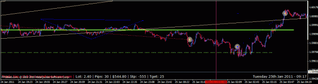
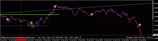
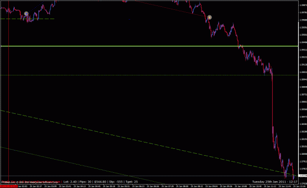
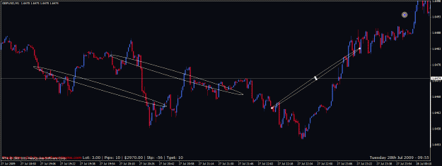
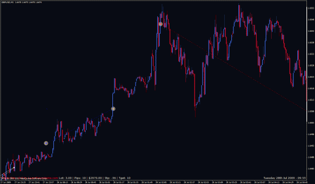
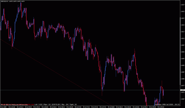
Okay, while that was a lousy draw-down in that last trade,
I went back and put a line in that I'd forgotten to sketch in, which supported the overall view I had.
Then after that, I saw a really strong straight line going up about 45 degrees up, and took it on, through my current trade,
for a trade you can see is decent enough to close for good profits:
Attached Image (click to enlarge)
Attached Image (click to enlarge)
Attached Image (click to enlarge)
Attached Image (click to enlarge)
--------------------------------------
Okay, well if I don't use it in charts -- which gets a good liking for the recent direction -- then I can use the method for feng shui! Or, something else.
Anyway, was reading up at wikipedia a bit on math, so there's a way to draw those chart shapes in.
Joined Sep 2008
|
Status: hardcore chartist
|2,173 Posts
I only practice trading, never trade; and, I've lost a lot of dough long ago.
Nevertheless, a few of my chart-pattern ideas may help someone make it instead of me (if it's clear enough of one to make out.)
That, and I enjoy practice trading, anyway.
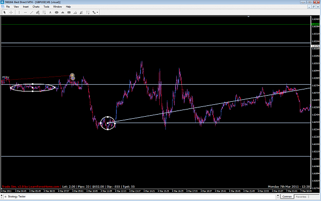
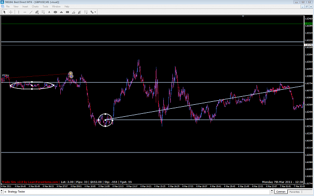
Story charting, or what I then called it, roller language -- at post# 18 of EUR/USD patterns -- still sticks in my mind, as it ties a symbol's story/ies in with the chart fairly well. This would automatically make it fairly difficult to explain, so I'm just going over it to help in my own mental model for dealing with my own life -- Not that I'd (continue to) bore you with that. Instead, I just want to throw out some charts with rl on it, while not feeling too committed to being exact with its original intent, to read a chart by the symbol involved's (almost? -) entire big-news history.
So here's a few (probably just for me, but whatever). What I'm after is to:
Attached Image (click to enlarge)
All five chart patterns are there and named, which is nice. I don't exactly specify their parameters. Nor do I show how to include the symbol's story and news with it, and instead use a random set of chart to use the patterns and not the story method on, since just revisiting pattern working, as in the last post or three.
Perhaps this post was just to occasionally keep up on a moderate skill of chart reading. I was hoping to get more out of the habit this time -- not this time, maybe can't.
Joined Sep 2008
|
Status: hardcore chartist
|2,173 Posts
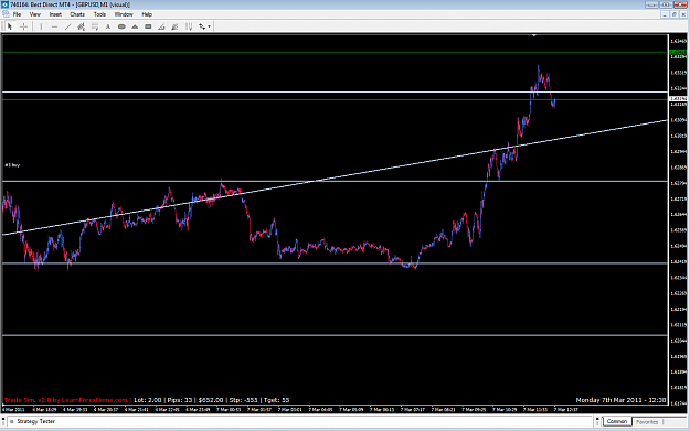
practice trading:
Matching look-like patterns close together and thus cancelling each other out. Flexibility in reading patterns in general, such as what the last post suggested, helps to do this.
I got a short trade, noticing that since there were already several pairs of look-like patterns, one more made sense. Then, when the chart went along much further than I thought, after that trade, I figured for a major drop going vertical versus the mainly-horizontal chart up to the end of that short trade. I got it, too.
The last chart below shows a shape that supported the overall opinion that lots of x-axis vs. y-axis chart could have, I now realize. At the time when I noticed it between the two trades above, it was more of an unconscious noticing of that early highlighted pattern.
Joined Sep 2008
|
Status: hardcore chartist
|2,173 Posts
While I do trade in a practice account, I want to try and set my trading method::
I'm thinking now to use a small grid with diagonal lines for where to undo that grid, and a curved boundary for where to focus attention so the grid's existence is justified. This mix sets where the price will come to and go from, but not be tradeable, only what will limit excessive loss from my (practice) account.
Trades will be determined through that of the last two posts: Roller language.
Lastly, using my worked-up version of mec (the cycle of market emotions), a well-known distribution of emotions along the charting of a trade. I've had this cycle at my profile for many years.