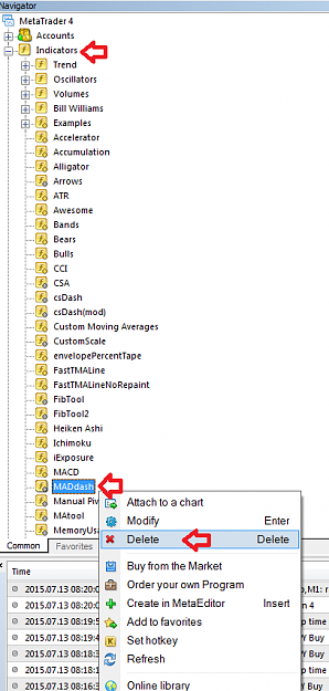
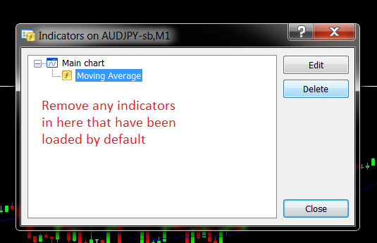
Disliked{quote} Hi honestknave, This is what I am thinking about colours in the dash on the right. we can pick out strength weakness by colours towards the top of the chart. Did this with paint so might not be very clear. The Blues, Greens etc. could be slightly different shades so as to be able to recognize different pairs across the columns. You could have the XXXUSD pairs shaded darker, so can pick out USD strength even though it is the second instrument in the pair. Similarly, XXXJPY & so on. {image}Ignored
Disliked{quote} Hi honestknave, Regarding the image in your post 352, which I quote above... I love this arrangement! For me, this is by far easier to see, and find the pair I want in the list of 28. Having 28 separate colors just muddies the water for me. It is clear that each person using your excellent dashboard will have their preference... so why not give it to them. I suspect all you would need to do is insert the extra block of code for displaying the colors as in post 352, along with retaining the existing one for 28 colors. Then add a flag to the...Ignored
Disliked{quote} hey Shabs, I am happy with this colour because if it goes per pair I can see quickly were the pair is in the other time frames. It is anyway sorted the strongest is up.Ignored