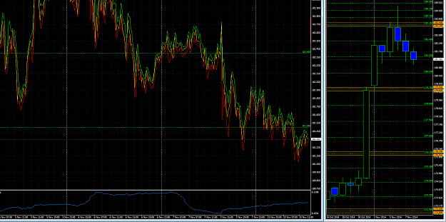
M15 Chart (left)
yellow = Close price of M15 period
green = highest price of M15 period (MA (1) @ high)
red = lowest price of M15 period (MA (1) @ low)
Stick to recent highs and lows.
Just a thought for those who wanna escape the candlestick-analysis-paralysis-madness.
Attached Image (click to enlarge)