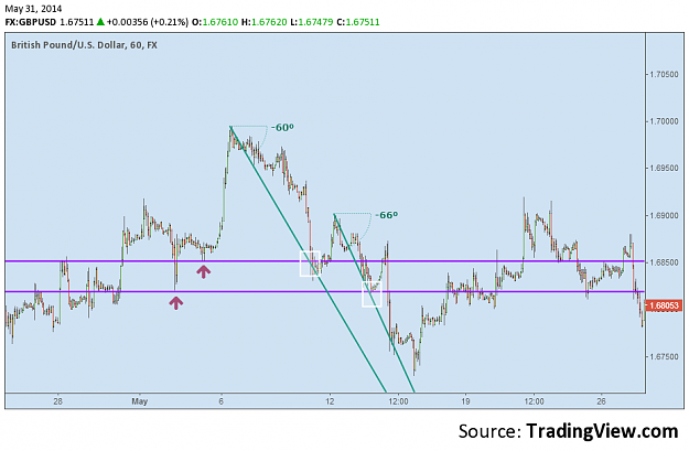
One thing to keep in mind is that a 2d price chart is a 3d representation of a zero dimensional "object" which is price. Set aside visual concepts of 2d and 3d. That's different.
Let's digress for a moment.
Price is a point. A point exists in the zeroth dimension. If we add the X axis, which is a line or multiple states of price, we now have an infinite amount of price points up and down the X axis. 2 dimensions. We then add the Y axis line and we have time... the 3rd dimension. So a price chart measures price in 2 dimensions but we map out multiple states of price across both price and time.. therefore we are seeing price across 3 dimensions. Another way to think of it is something that shows the current temperature is observing temperature in the zeroth dimension which is one dimension. Watching the mercury in the thermometer would be observing temperature in the 1st dimension or 2 dimensions. The zeroth + the 1st. Plotting the temperature on a graph chart would be 3 dimensions.
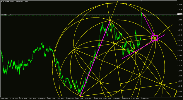
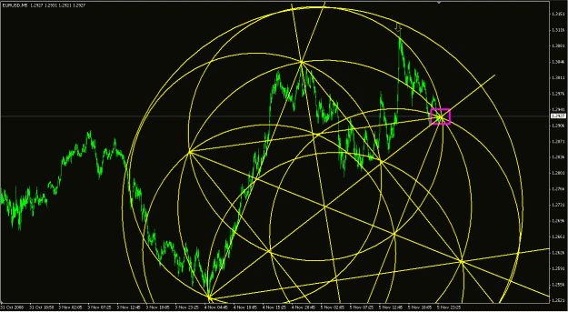
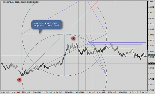
I'm gonna jump way ahead here, but my wavy line forecast in my old journal is an attempt at mapping out a possible 4th dimension for a price point. I won't go into the math behind it.. it's simply stupid anyway.. but basically doesn't price contain an infinite amount of information with the numbers itself? And I don't mean the infinite amount of price points along a price line. I mean a single price. A single number which is made up of digits and relationships between those digits. It goes back to something I saw in that video series mentioned above. Particularly this one:
With that in mind, the challenge is then to map out a higher dimension.
Visually, there's nothing 3d or 4d, but mathematically it's 4d or higher. The end result on a 2d dimensional plane is a wavy line.
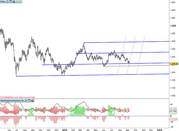
Before:
http://content.screencast.com/users/...2012-11-28.gif
After:
http://content.screencast.com/users/...2012-11-28.gif
Let's digress for a moment.
Price is a point. A point exists in the zeroth dimension. If we add the X axis, which is a line or multiple states of price, we now have an infinite amount of price points up and down the X axis. 2 dimensions. We then add the Y axis line and we have time... the 3rd dimension. So a price chart measures price in 2 dimensions but we map out multiple states of price across both price and time.. therefore we are seeing price across 3 dimensions. Another way to think of it is something that shows the current temperature is observing temperature in the zeroth dimension which is one dimension. Watching the mercury in the thermometer would be observing temperature in the 1st dimension or 2 dimensions. The zeroth + the 1st. Plotting the temperature on a graph chart would be 3 dimensions.
I'm gonna jump way ahead here, but my wavy line forecast in my old journal is an attempt at mapping out a possible 4th dimension for a price point. I won't go into the math behind it.. it's simply stupid anyway.. but basically doesn't price contain an infinite amount of information with the numbers itself? And I don't mean the infinite amount of price points along a price line. I mean a single price. A single number which is made up of digits and relationships between those digits. It goes back to something I saw in that video series mentioned above. Particularly this one:
Inserted Video
With that in mind, the challenge is then to map out a higher dimension.
Inserted Video
Visually, there's nothing 3d or 4d, but mathematically it's 4d or higher. The end result on a 2d dimensional plane is a wavy line.
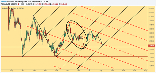
Before:
http://content.screencast.com/users/...2012-11-28.gif
After:
http://content.screencast.com/users/...2012-11-28.gif
1