Hi Guys,
Firstly, my gratitude to all the contributors thus far, but special thanks to Crodzilla/Tomcat/MLaden for their indicator.
After reading the thread and currently re-reading it, something occurred to me in swapping between timeframes.
I was comparing its projections against the Similarity Principle that Eurusdd had originally provided templates for.
Anyways, on EURUSD and GBPUSD I noticed that the Crodzilla v7 indicator tended to create lines that was inverse to the trend. The stronger the trend, the more lines appear in lower timeframes.
Let's look at EURUSD:
Monthly: 0 above, 4 below
Weekly: 1 above, 7 below
Daily: 8 above, 16 below
4H: 10 above, 42 below
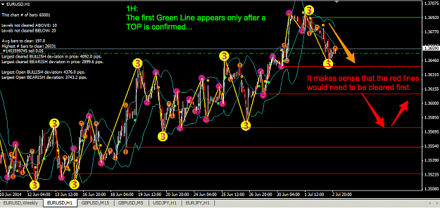
1H: 10 above, 20 below
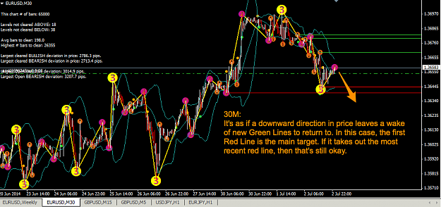
30M: 9 above, 19 below
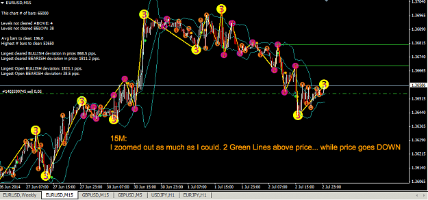
15M: 4 above, 38 below
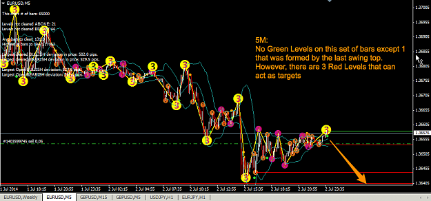
5M: 16 above, 44 below
This was taken at 9:30pm GMT (daylight saving).
Monthly, it's arguable that the trend is sideways and the current leg is up. Using a Similarity bollinger concept, price has pierced the upper channel and could therefore be a top. The Delicate Levels are therefore logically below current price.
Weekly, from the recent high (1.39927) to last swing low (1.20418) there are 7 Delicate Levels. If the recent swing top confirms 1.39927, then there are 7 Delicate Levels below that would attract price towards them.
Daily, there are 2 Delicate Levels (Top = 1.39920 and Bottom = 1.35114). Current price (1.36575) is more than likely headed towards the bottom Delicate Level.
If I the go from 5M upwards, I notice that it is not until 30M that I get 9 Green Top Delicate Levels most of them originating in the Last Two Days only. It's as if the Top Levels appear as a marker that price is swinging DOWN and therefore creating higher levels to return to but from the bottom.
My thinking therefore, is that Delicate Levels need to be reviewed across all timeframes at once to see how the clusters are developing.
If they are Green (Top) and price is below the levels, then PRICE WILL CONTINUE TO GO DOWN until a sufficient set of Green Delicate Levels begins to attract price.
If they are Red (Bottom) and price is above the levels, then PRICE WILL CONTINUE TO GO UP until a sufficient set of Red Delicate Levels begins to attract price.
This way, you get the rubber-band oscillation effect that I think Eurusdd is trying to get at.
Just my 2 cents. Would be interested to know people's views if my thoughts are valid.
Many thanks!
EDIT:
I've just realised that I had the setting, ShowHistory set to FALSE.
Setting it back to True displays all the levels that had been reached. I shall study this further as on first impressions, I don't think it changes the above analysis.
Firstly, my gratitude to all the contributors thus far, but special thanks to Crodzilla/Tomcat/MLaden for their indicator.
After reading the thread and currently re-reading it, something occurred to me in swapping between timeframes.
I was comparing its projections against the Similarity Principle that Eurusdd had originally provided templates for.
Anyways, on EURUSD and GBPUSD I noticed that the Crodzilla v7 indicator tended to create lines that was inverse to the trend. The stronger the trend, the more lines appear in lower timeframes.
Let's look at EURUSD:
Monthly: 0 above, 4 below
Weekly: 1 above, 7 below
Daily: 8 above, 16 below
4H: 10 above, 42 below
1H: 10 above, 20 below
30M: 9 above, 19 below
15M: 4 above, 38 below
5M: 16 above, 44 below
This was taken at 9:30pm GMT (daylight saving).
Monthly, it's arguable that the trend is sideways and the current leg is up. Using a Similarity bollinger concept, price has pierced the upper channel and could therefore be a top. The Delicate Levels are therefore logically below current price.
Weekly, from the recent high (1.39927) to last swing low (1.20418) there are 7 Delicate Levels. If the recent swing top confirms 1.39927, then there are 7 Delicate Levels below that would attract price towards them.
Daily, there are 2 Delicate Levels (Top = 1.39920 and Bottom = 1.35114). Current price (1.36575) is more than likely headed towards the bottom Delicate Level.
If I the go from 5M upwards, I notice that it is not until 30M that I get 9 Green Top Delicate Levels most of them originating in the Last Two Days only. It's as if the Top Levels appear as a marker that price is swinging DOWN and therefore creating higher levels to return to but from the bottom.
My thinking therefore, is that Delicate Levels need to be reviewed across all timeframes at once to see how the clusters are developing.
If they are Green (Top) and price is below the levels, then PRICE WILL CONTINUE TO GO DOWN until a sufficient set of Green Delicate Levels begins to attract price.
If they are Red (Bottom) and price is above the levels, then PRICE WILL CONTINUE TO GO UP until a sufficient set of Red Delicate Levels begins to attract price.
This way, you get the rubber-band oscillation effect that I think Eurusdd is trying to get at.
Just my 2 cents. Would be interested to know people's views if my thoughts are valid.
Many thanks!
EDIT:
I've just realised that I had the setting, ShowHistory set to FALSE.
Setting it back to True displays all the levels that had been reached. I shall study this further as on first impressions, I don't think it changes the above analysis.
Attached Image(s) (click to enlarge)
A pip is only worth it if you know how much you risked to earn it
