![]() ►Financial Markets Observatory Lab.◀
►Financial Markets Observatory Lab.◀![]()
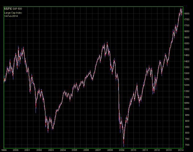
Some notes/charts about the qualitative-visual correlation between the U.S. corporate profit data vs. curve evolution of Dow Jones Composite Average Index.
Aim of the post.
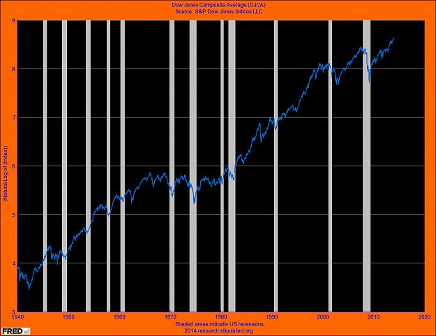
In this post there is an attempt of correlation (qualitative only) between the data obtained from the corporate profits and the curve of Dow Jones Composite Average Index in the period 1970-2013.
The data of corporate profits are provided in ratio-format (see notes below the text).
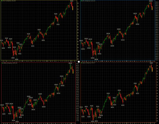
General stocks-benchmarks usefull for this post.
► main U.S. stocks-benchmarks (charts & notes: QQQ; ONEQ; DIA; OEF; SPY);
► global U.S. stocks-benchmarks (charts & notes: EUSA; ITOT; IWB; IWV; IYY; THRK);
► Global World stocks-benchmarks (charts & notes: ACWI; DGT; IOO; NYSE W.L.I.; ONEF; VT).
Previous posts.
❖
Main graphical elements.
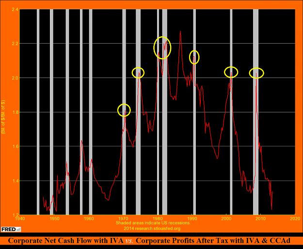
The ratio between the ''Corporate Net Cash Flow with IVA'' vs. ''Corporate Profits After Tax with IVA and Capital Consumption Adjustment (CCAd) shows an interesting qualitative correlation.
The tops of this ratio (yellow circles) are coincidents with the DJ-C.A.I. bottoms in 6 out of 7 cases from 1970.
The bottom of 1987 is a little after the top of ratio-indicator. Now the level of ratio-indicator shows values about in-line with its historical lows.
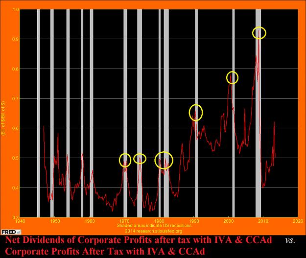
The raio between ''Net Dividends of Corporate Profits after tax with IVA & CCAd'' vs. ''Corporate Profits After Tax with IVA & CCAd'' shows a similar pattern (yellow circles), with a good coincidences of its tops vs. DJ-C.A.I. bottoms in ''70, ''80 and in the recession of 2008-2009, but an important anticipatory behaviour in ''90 and ''2000-2002 crisis. Now the level of ratio-indicator shows values not stressed but with an important top-spike in 2013.
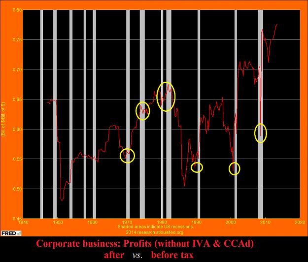
The raio between Corporate Profits without IVA & CCAd ''after tax vs. before tax'', do not shows a regular pattern of behaviour vs. DJ-C.A.I. key-levels in ''70, ''80.
Considerations.
The components of the first two ratio-indicators are positively related to the curve behaviour of DJ-C.A.I. post-1970, and
it is desirable to further study of this correlation.
Chart sources.
❖ St.LouisFED.
Sorry for my bad English. I hope that this post is at least minimally useful.
Tuned on main trend, but follows short-medium term signs from underlying prices, for a correct & real-time set-up.
It is very important do not anticipate the main trend of the underlying financial instruments.
☻/♪ ❖ EARTH.pk, Alert 2.O !!! ❖
/▌
/|
I.M.O. by Sa!Vi ►►♥
K€$ADDhAPhA'pe'KAMPA': Bunda-Bunda €MP¥R€ ❣!!!❣
NOTES on ratio-indicators
The curves of the ratio-indicators are obtained by placing the first term (dividend) in the numerator.
A decrease of both components can still determine an increase or less of the prices of the indicator obtained, because of the variations of the components may have different speeds or slopes.
A decrease indicates a loss of strength of the numerator vs. second component; an increase indicates an increase in strength of the numerator vs. second component.
It is much more useful to look at and analyze the general trend of the curve and the comparison with the previous lows / tops, instead of dwelling on the scale of absolute values (prices).
Attached Image(s) (click to enlarge)