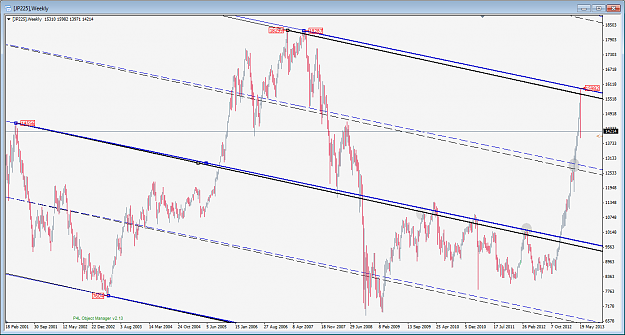
I normally don't chart the Nikkei 225, but after the crash, I was curious to see if any PF's lined up, and indeed, there is.
The black Andrews fork uses the most extreme pivots, which is what I prefer in most cases, but on occasion, it can be better to move a pivot to capture the extreme width of the PA, even if the pivot(s) themselves are not the most extreme in price.
The blue Andrews is one such example. The pt3 (or C) has been moved to a later, but slightly lower, high. Looking forward from there, it can be observed that the blue fork has a bit better resonance at the ML and quartiles compared to the black fork. So -- in perfect hindsight -- one would have had some objective reasons to pay attention to the blue fork over the black one.
The chart makes it look like the hit to the blue UML was perfect. Up close, however, the price intercept at the UML was 15947, but price overshot a little up to 15982 (+35). That's just ~0.6% of the fork vertical pitch (which I define as from the ML to UML). Anything within 1% is excellent, IMO.
P.S. This free demo feed of "JP225" is rounded to the nearest dollar. I can't vouch for the accuracy of it at all. The same lines drawn on a more accurate chart might be better or worse, so feel free to double-check it if you're interested. I can't even say the 1st pivot was the best choice because I don't have data <2001. Also note, I don't have Daily data going back that far, but if I did, I would check how accurate was the hit on that as well (preferably with GMT+2 and GMT-5 data feeds, which are 5bars/week and 6bars/week, resp.)
Attached Image (click to enlarge)