After doing some research, I found this description that I copied from another thread.
"the range is the high minus the low of a particular bar (the "size" of the bar)
the average range is the average size of each bar being evaluated.
the average true range is the just the average range plus it takes gaps into consideration. (ie if the market opens up on a gap, it adss the gap to the range, so the range would be high minus the close of last bar.) because forex doesnt open and close everyday, there are few gaps, so the average range will be pretty much the same as the average true range.
so if you are looking at hourly bars, and the ATR(14) is reading out 0.0032, that means that over the past 14 bars, the average size of each bar is 32 pips."
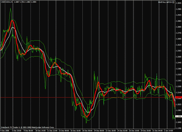
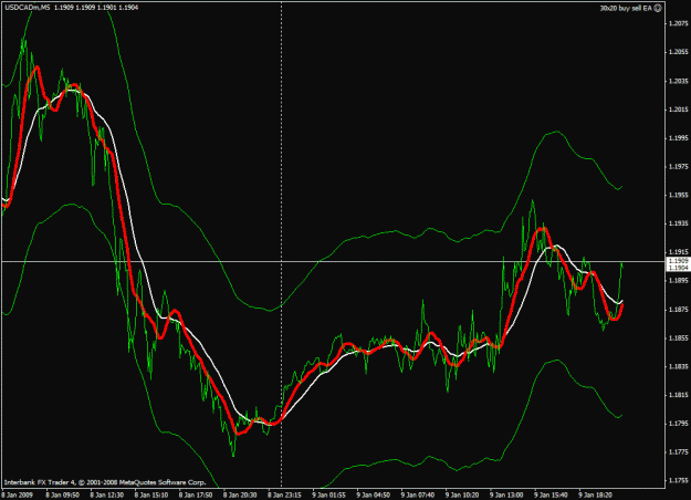
This gives a wavier line on the chart as shown in the pictures. The white line is the 40MA, and the red line is the ATR 13 period overlayed onto it for a 0ne hour chart, and a 5 minute chart.
They look pretty close to me. I don't really know what advantage there would be in using one over the other. Wouldn't it all work out about the same over the long haul?
Is is correct to assume that your EA makes a first entry when the pair moves 80 pips away from the ATR? Can a template be made from this so we can see where the trades would be made? I like the template nanningbob has using the 40 MA as I can play with the entries, and even move the first line closer or further away from the center line and get a visual of where each trade would be made.
"the range is the high minus the low of a particular bar (the "size" of the bar)
the average range is the average size of each bar being evaluated.
the average true range is the just the average range plus it takes gaps into consideration. (ie if the market opens up on a gap, it adss the gap to the range, so the range would be high minus the close of last bar.) because forex doesnt open and close everyday, there are few gaps, so the average range will be pretty much the same as the average true range.
so if you are looking at hourly bars, and the ATR(14) is reading out 0.0032, that means that over the past 14 bars, the average size of each bar is 32 pips."
This gives a wavier line on the chart as shown in the pictures. The white line is the 40MA, and the red line is the ATR 13 period overlayed onto it for a 0ne hour chart, and a 5 minute chart.
They look pretty close to me. I don't really know what advantage there would be in using one over the other. Wouldn't it all work out about the same over the long haul?
Is is correct to assume that your EA makes a first entry when the pair moves 80 pips away from the ATR? Can a template be made from this so we can see where the trades would be made? I like the template nanningbob has using the 40 MA as I can play with the entries, and even move the first line closer or further away from the center line and get a visual of where each trade would be made.
Attached Image(s) (click to enlarge)