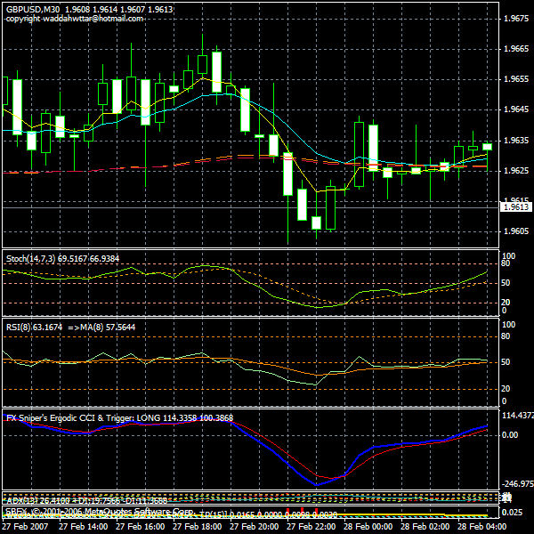
This is a good signal indicator for the Bagovino system. An alarm will sound and a message will display when the buy or exit conditions are met. The author of the indicator wrote the followinig about how to use the indicator:
1) The yellow line is used to define when the price movement starts and when it ends. The movement starts when the yellow line crosses above the dotted line,. and continues as long as it remains above the dotted line. The movement ends when the yellow line again crosses below the dotted line.
2) The green histogram: has three uses: First, it identifies the beginning of an upward price movement(bullish move) Second, it identifies the time to buy, when the green histogram bar rises above the yellow line. Third, it defines the time to exit, when the a green histogram bar again withdraws below the yellow line.
3)The red histogram: has three uses: First, it identifies the beginniing of a downward price movement (bearish move). Second, it defines the time to sell, when the red histogram bar crosses above the yellow line. Third, it defiines the time to exit, when the red histogram bar withdraws back below the yellow line.
I hope that you will like the indicator I added some properties so the indicator that will make it more sensitive and will allow it to be used with all currency pairs:
-Sensitivity property - Dead-Zone-Pip property, which defines when to stay out of the market. (the zone below the dotted line).
- Bollinger-Band Period property which determines the sensitivity of the yellow line.
- Band-Division property helpful value for the movement of the yellow line.
- Going Long: green histogram bars.
- Going Short: red histogram bars
- Price movement: show or hide the yellow line.
- Dead-Zone definition: show or hide the dead zone (doted line).
Price Movement indicator: The indicator depends on two things to show the data and the lines in the chart:
1) The distance between the upper and lower Bollinger bands corresponds with the volatility of the market.
2) The difference between the present value of the macd and the last value, with one tick for the same candle This difference is represented by the green and the red histogram bars.
Attached Image

Attached File(s)