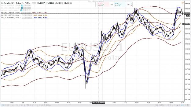
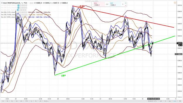
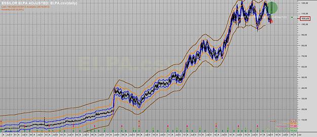
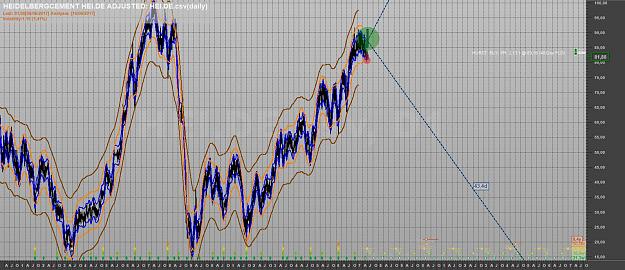
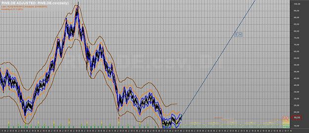
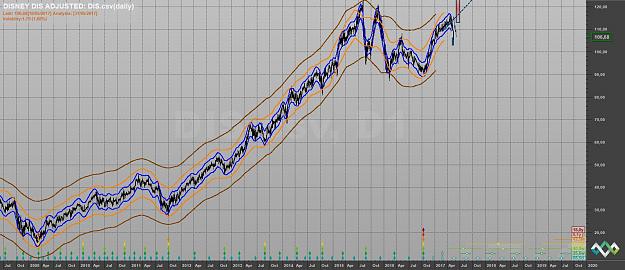
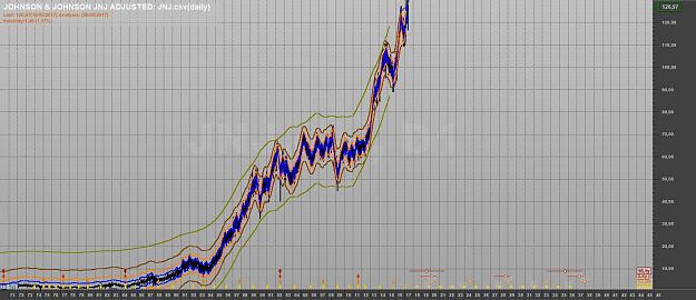
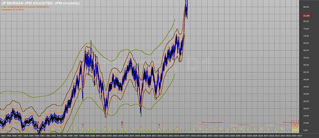
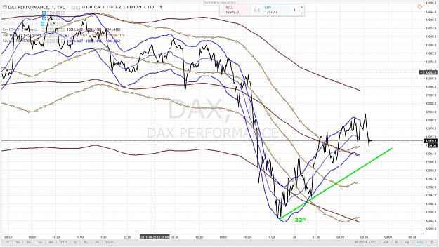
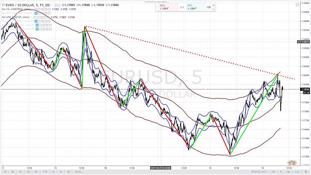
The charts hereunder show that with 3 Enveloppes of 32, 128 and 256 Time Units (whatever Time unit you use from 1 minute to 1 month, quarter etc) you can describe the fluctuation of a financial support.
using such charts you can get many useful informations
The aim of an Enveloppe is to show the Contact Points (the touching or Crossing) of the price movement with the Enveloppe Borders.
These Contact Points allow you to draw Valid Trend Lines of the same Degree / Order.
The depth of each Enveloppe shows you the maximum move you can statistically hope within an Enveloppe. From that you can calculate the related probabilistic Risk reward ratio even if you enter lately.
You also see and evaluate (more or less ) the Underlying Trend
The Enveloppes allow you to visualize Waves of the same Degree / Order and then Cycles because 1 Cycle = 2 Waves.
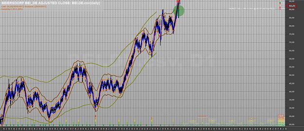
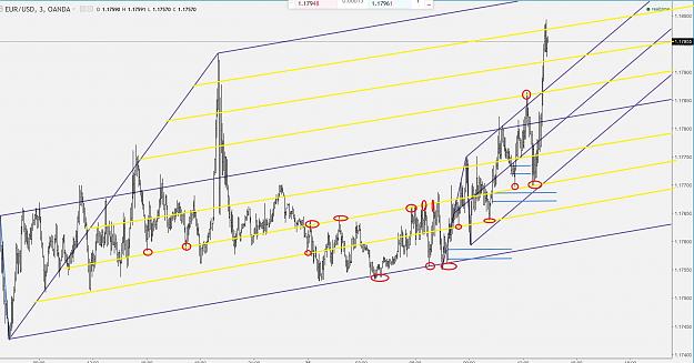
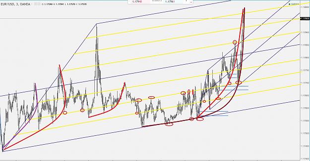
these charts are in 5 minutes. Duration is 5 trading days.
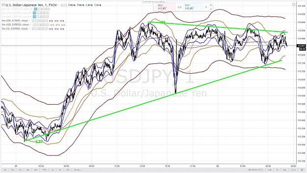
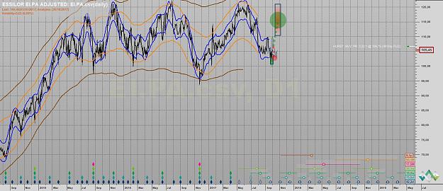
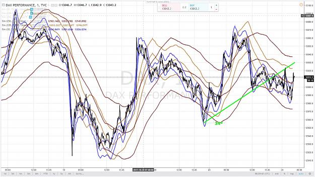
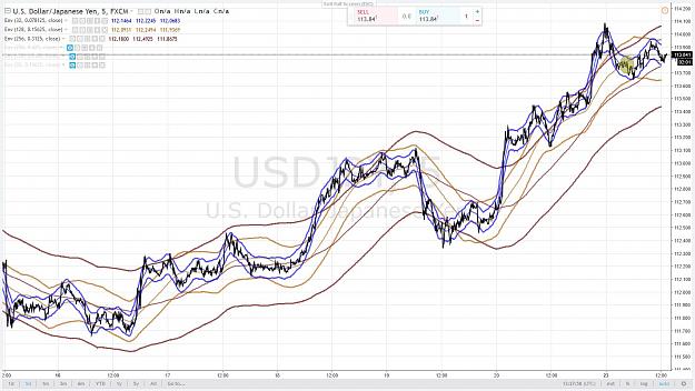
using such charts you can get many useful informations
The aim of an Enveloppe is to show the Contact Points (the touching or Crossing) of the price movement with the Enveloppe Borders.
These Contact Points allow you to draw Valid Trend Lines of the same Degree / Order.
The depth of each Enveloppe shows you the maximum move you can statistically hope within an Enveloppe. From that you can calculate the related probabilistic Risk reward ratio even if you enter lately.
You also see and evaluate (more or less ) the Underlying Trend
The Enveloppes allow you to visualize Waves of the same Degree / Order and then Cycles because 1 Cycle = 2 Waves.
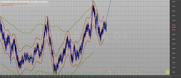
these charts are in 5 minutes. Duration is 5 trading days.
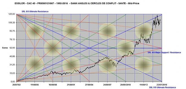
Attached Image(s) (click to enlarge)
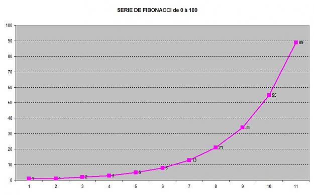
3