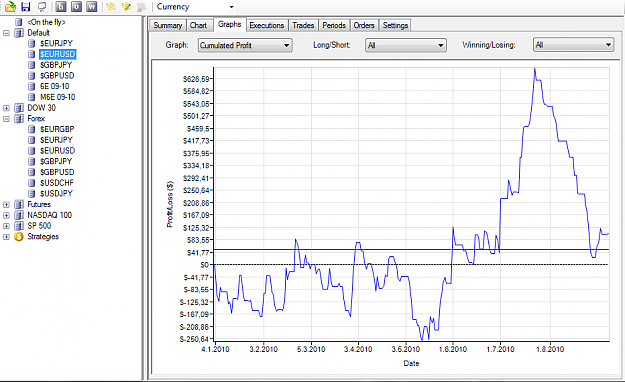
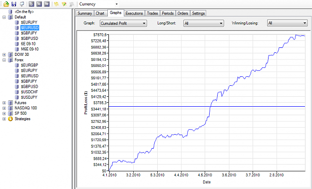
Heres something interesting. This is one of my simple "stop and reverse" strategy.
In the normal timeframe charts (seems most traders are using), you get crap results and when not using "normal" charts you get way better results.
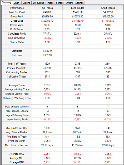
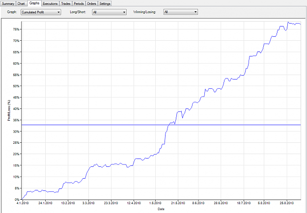
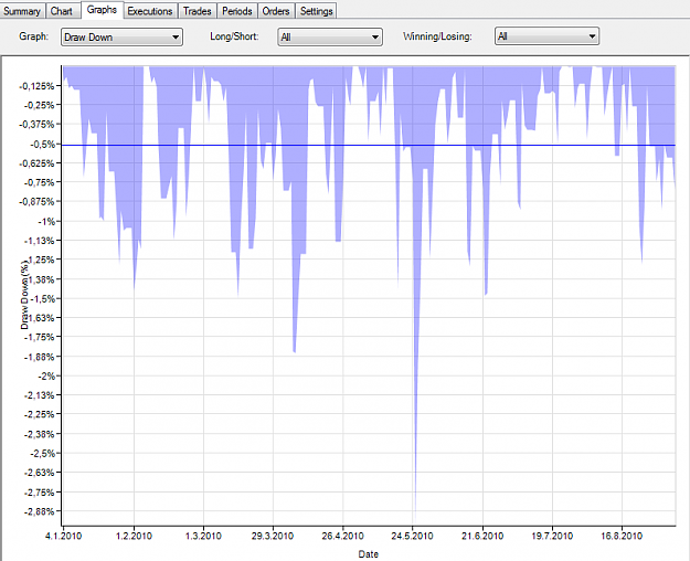
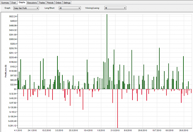
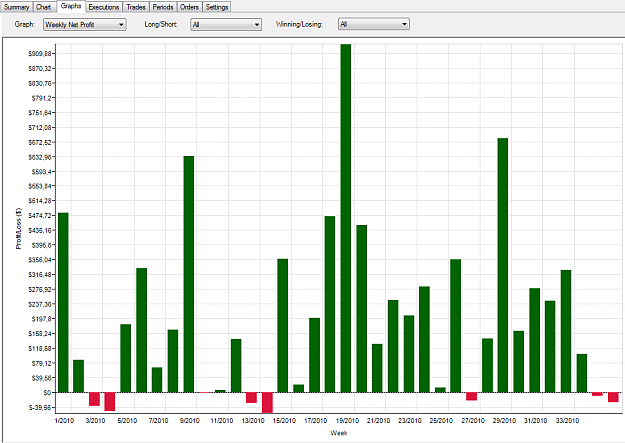
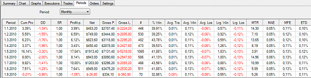
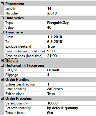
I dont think this is curve fitted, It have ran it on a same values on differend pairs, and it seems to have positive profit curve on all of them. It seems to be a winning strategy at least in the simulator(Ninjatrader). Also slippage of 4 points are calculated on every trade to make it more realistic. Comissions are not calculated but that doesnt make that big of a deal. Each trade is one mini lot. Currently forward testing this on a live demo account.
Guess which one of these backtest results are based on the charts that 99% or traders are using?
In the normal timeframe charts (seems most traders are using), you get crap results and when not using "normal" charts you get way better results.
I dont think this is curve fitted, It have ran it on a same values on differend pairs, and it seems to have positive profit curve on all of them. It seems to be a winning strategy at least in the simulator(Ninjatrader). Also slippage of 4 points are calculated on every trade to make it more realistic. Comissions are not calculated but that doesnt make that big of a deal. Each trade is one mini lot. Currently forward testing this on a live demo account.
Guess which one of these backtest results are based on the charts that 99% or traders are using?
Attached Image(s) (click to enlarge)