Everybody knows what MacD is right?
But have you ever thought about what the zero line is?
Once you KNOW what the zero line actually is, then MacD takes on a whole new meaning and becomes a powerful indicator.
Have you ever wondered why the MacD is showing Up, Moving from well below the zero line upwards towards the zero line but still the price is dropping?
Some say it is divergence and it indicates ... blah blah blah.
But what this actually means is, lets find a way of saying something that sounds valid because surely it WILL go up since MacD shows up...?
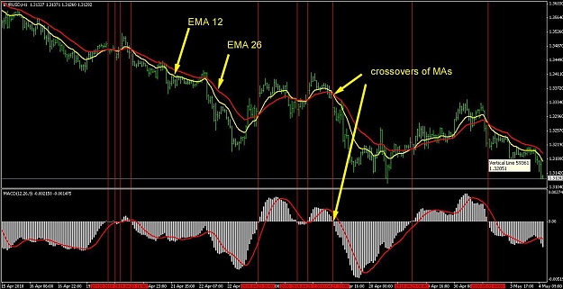
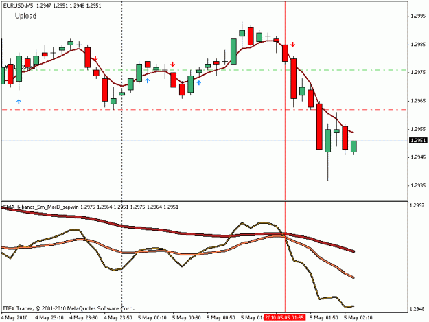
As you can see in this picture, The price is heading south while MacD (the standard one in the indicators tab just slightly better colour settings) set to 12,26,9 . Also the zero Line is a thick blue line.
http://img228.imageshack.us/img228/658/macd1.png
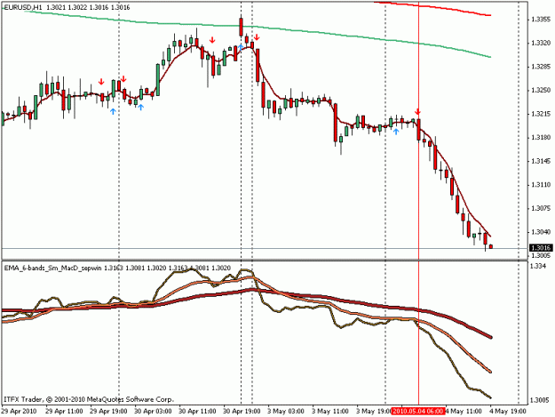
Now the following picture Has some EMA's on it.
EMA 47 (12+26+9)
EMA 14 (26-12)
EMA 2 (12-9)/2
http://img32.imageshack.us/img32/4092/macd2.png
Not an exact replica of the MacD, but very close no?
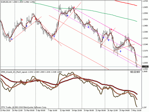
Just to fully embed this concept in your mind, the next pic has the same value EMA's in a separate window.
So Now we have a slanted MacD that doesn't give the false impression of moving up, when the zero line is not actually a horizontal line but is an EMA.
Yet since we see it as a straight line in the MacD, our natural tendency is to perceive that anything that is below it that moves up is actually moving up.
http://img168.imageshack.us/img168/3003/macd3.png
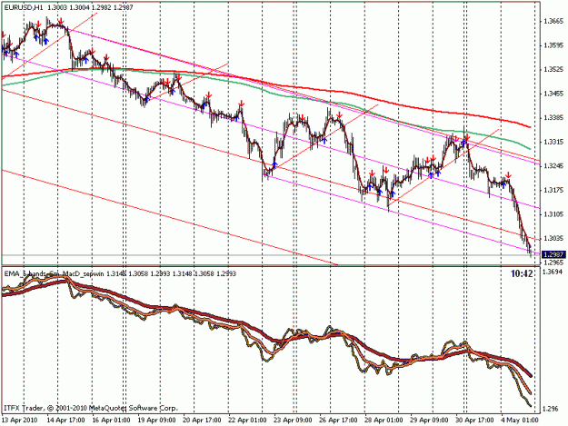
By zooming out to max it becomes very simple to fully perceive the right way of what MacD shows us.
The orange line in the MacD appears below as a non contradictory downward trend. The vertical white lines are the crossover points on the MacD and also on the EMA version of the same Macd. So by seeing the trend, one need not panic and close the short trade just because the MacD is heading north. It can simply be seen that each touch of the 'zero' line is still lower than the previous touch.
http://img227.imageshack.us/img227/4109/macd4.png
But have you ever thought about what the zero line is?
Once you KNOW what the zero line actually is, then MacD takes on a whole new meaning and becomes a powerful indicator.
Have you ever wondered why the MacD is showing Up, Moving from well below the zero line upwards towards the zero line but still the price is dropping?
Some say it is divergence and it indicates ... blah blah blah.
But what this actually means is, lets find a way of saying something that sounds valid because surely it WILL go up since MacD shows up...?
As you can see in this picture, The price is heading south while MacD (the standard one in the indicators tab just slightly better colour settings) set to 12,26,9 . Also the zero Line is a thick blue line.
http://img228.imageshack.us/img228/658/macd1.png
Now the following picture Has some EMA's on it.
EMA 47 (12+26+9)
EMA 14 (26-12)
EMA 2 (12-9)/2
http://img32.imageshack.us/img32/4092/macd2.png
Not an exact replica of the MacD, but very close no?
Just to fully embed this concept in your mind, the next pic has the same value EMA's in a separate window.
So Now we have a slanted MacD that doesn't give the false impression of moving up, when the zero line is not actually a horizontal line but is an EMA.
Yet since we see it as a straight line in the MacD, our natural tendency is to perceive that anything that is below it that moves up is actually moving up.
http://img168.imageshack.us/img168/3003/macd3.png
By zooming out to max it becomes very simple to fully perceive the right way of what MacD shows us.
The orange line in the MacD appears below as a non contradictory downward trend. The vertical white lines are the crossover points on the MacD and also on the EMA version of the same Macd. So by seeing the trend, one need not panic and close the short trade just because the MacD is heading north. It can simply be seen that each touch of the 'zero' line is still lower than the previous touch.
http://img227.imageshack.us/img227/4109/macd4.png