I am hoping I can improve the use of currency strength indicators, but before I proceed I would like to know if what I'm proposing is even possible and if so, how practical/easy to implement.
The typical strength indicators will give some representation of how much a currency has moved compared to all other currencies it's matched with, and of course this let's you see if typically the USD is strong when compared to other currencies. These indicators will let you identify a strong currency and a weak one, and then you can select the corresponding pair to trade with a slightly better edge. I'm not saying anything new here.
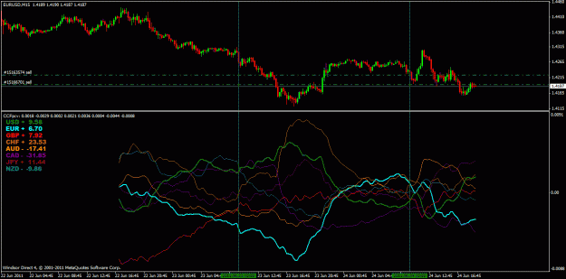
However I don't think they give the whole picture and I would definitely like to easily extract more information from them. For me, knowing which currency has been strongest and which has been weakest is not the best information. In the image below during point "0", you can see that the currency represented by the orange line is the strongest and the green line is the weakest. Regular use of such an indicator would suggest you trade the pair which contains those 2 currencies and trade in the direction of strong against weak. But my experience says that just because one is strong and the other weak (in the past) doesn't mean the pair is more likely to carry on moving in that direction. The pair at this stage could in fact be completely range bound with no obvious direction. So trading the strongest against the weakest in this sense is not providing any real edge.
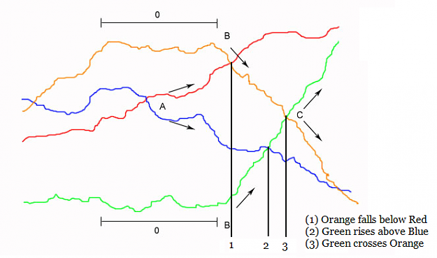
What I do find does provide an edge is trading the most rapidly strengthening currency against the most rapidly weakening currency. From point "A" you can see two currencies starting to diverge away from each other, and these moments do genuinely offer an edge (from my own personal experience at least). Now in the case of point "A" it is very easy to see the divergence, the rapidly strengthening currency is above the rapidly weakening and they are moving in opposite directions, so the corresponding pair is easy to trade.
But.....at point "B" you have 2 currencies which begin rapidly strengthening and weakening. The moves are far more dramatic than anything else on the chart and trading this pair would be great. The problem is the rapidly weakening currency (orange) is still "stronger" according to the chart than the rapidly strengthening currency (blue). By the time the two lines have crossed and point "C" and their "strength" values have flipped as to which is stronger or weaker than the other, we may have missed most of the move.
What I would like to do is identify which currency is strengthening or weakening most rapidly, regardless of what it's actual "strength" value may be. So in the chart image I've posted, at point "B" the green line is still the weakest on the chart, and the orange line is the strongest. But orange is weakening the most rapidly and green is strengthening most rapidly, and this can give some excellent moves to catch. I'm far more interested in which currencies are gaining or losing strength the fastest as opposed to what their strength value is.
And so with a long explanation out of the way, is it possible to grab the data on a tick by tick basis from metatrader for example, and feed it directly in to an Excel spread sheet or indicator of some description, which would then print out a bar chart or arrow or similar, identifying which currency is moving the fastest and in which direction?
There is a commercial indicator on the market which does something similar to what I am after, but it requires you to manually input values in to a spread sheet. I would want the spread sheet or indicator updated automatically directly from the metatrader charts. I am not looking for someone to build this for me, only want to know if what I am proposing is technically possible.
I am very grateful to any technically skilled person who can understand the explanation I have given here, and answer me as to what can be achieved.
The typical strength indicators will give some representation of how much a currency has moved compared to all other currencies it's matched with, and of course this let's you see if typically the USD is strong when compared to other currencies. These indicators will let you identify a strong currency and a weak one, and then you can select the corresponding pair to trade with a slightly better edge. I'm not saying anything new here.
However I don't think they give the whole picture and I would definitely like to easily extract more information from them. For me, knowing which currency has been strongest and which has been weakest is not the best information. In the image below during point "0", you can see that the currency represented by the orange line is the strongest and the green line is the weakest. Regular use of such an indicator would suggest you trade the pair which contains those 2 currencies and trade in the direction of strong against weak. But my experience says that just because one is strong and the other weak (in the past) doesn't mean the pair is more likely to carry on moving in that direction. The pair at this stage could in fact be completely range bound with no obvious direction. So trading the strongest against the weakest in this sense is not providing any real edge.
What I do find does provide an edge is trading the most rapidly strengthening currency against the most rapidly weakening currency. From point "A" you can see two currencies starting to diverge away from each other, and these moments do genuinely offer an edge (from my own personal experience at least). Now in the case of point "A" it is very easy to see the divergence, the rapidly strengthening currency is above the rapidly weakening and they are moving in opposite directions, so the corresponding pair is easy to trade.
But.....at point "B" you have 2 currencies which begin rapidly strengthening and weakening. The moves are far more dramatic than anything else on the chart and trading this pair would be great. The problem is the rapidly weakening currency (orange) is still "stronger" according to the chart than the rapidly strengthening currency (blue). By the time the two lines have crossed and point "C" and their "strength" values have flipped as to which is stronger or weaker than the other, we may have missed most of the move.
What I would like to do is identify which currency is strengthening or weakening most rapidly, regardless of what it's actual "strength" value may be. So in the chart image I've posted, at point "B" the green line is still the weakest on the chart, and the orange line is the strongest. But orange is weakening the most rapidly and green is strengthening most rapidly, and this can give some excellent moves to catch. I'm far more interested in which currencies are gaining or losing strength the fastest as opposed to what their strength value is.
And so with a long explanation out of the way, is it possible to grab the data on a tick by tick basis from metatrader for example, and feed it directly in to an Excel spread sheet or indicator of some description, which would then print out a bar chart or arrow or similar, identifying which currency is moving the fastest and in which direction?
There is a commercial indicator on the market which does something similar to what I am after, but it requires you to manually input values in to a spread sheet. I would want the spread sheet or indicator updated automatically directly from the metatrader charts. I am not looking for someone to build this for me, only want to know if what I am proposing is technically possible.
I am very grateful to any technically skilled person who can understand the explanation I have given here, and answer me as to what can be achieved.
Attached Image