...and the other thing I wanted to dissect is this whole concept of timeframes.
Here's my take on it, please feel free to shoot my logic to pieces:
1. There's no such 'thing' as a four-hour candle. the market doesn't halt, make a note and then restart every four hours. Likewise one hour or 15min candles.
2. The OHLC of a '4hr candle' on my EST broker platform is totally different to the OHLC of a '4hr candle' on someone else's GMT broker platform, which generates different candlestick formations one broker to the next. A strong reversal on one is an indecisive reversal on another.
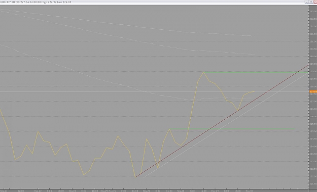
If what we're trying to determine is market sentiment and subsequent price action "in the moment", wouldn't it be better to watch a line chart? I have one up right now and the close values connected as a line seem to tell a much clearer story. They seem to respect logical levels much more closely (see attached) than do the porcupine quills of candle wicks. Opinions?
If we want to go totally naked and see the market as continuum, then aren't the candles themselves working against us by representing the flow as a broken, segmented series of (pseudo) 'events'? I don't want get all esoteric, but the question keeps poking me in the forehead.
I have a trading buddy out in Dallas (I'm a Brit in LA) and he uses a GMT-based broker. Mine's on EST. It's nearly impossible for us to discuss specific market/candle structures 'cos he's seeing something completely different to me on a candle-by-candle play out.
If there's an impulsive move followed by a retracement and a continuation, that is a continuum that is most clearly depicted on a 5min chart. It's summarised on a 4hr chart. But re-revealed by looking at a '4hr' line chart.
Just need to talk about this with anyone who'll humor me...
Here's my take on it, please feel free to shoot my logic to pieces:
1. There's no such 'thing' as a four-hour candle. the market doesn't halt, make a note and then restart every four hours. Likewise one hour or 15min candles.
2. The OHLC of a '4hr candle' on my EST broker platform is totally different to the OHLC of a '4hr candle' on someone else's GMT broker platform, which generates different candlestick formations one broker to the next. A strong reversal on one is an indecisive reversal on another.
If what we're trying to determine is market sentiment and subsequent price action "in the moment", wouldn't it be better to watch a line chart? I have one up right now and the close values connected as a line seem to tell a much clearer story. They seem to respect logical levels much more closely (see attached) than do the porcupine quills of candle wicks. Opinions?
If we want to go totally naked and see the market as continuum, then aren't the candles themselves working against us by representing the flow as a broken, segmented series of (pseudo) 'events'? I don't want get all esoteric, but the question keeps poking me in the forehead.
I have a trading buddy out in Dallas (I'm a Brit in LA) and he uses a GMT-based broker. Mine's on EST. It's nearly impossible for us to discuss specific market/candle structures 'cos he's seeing something completely different to me on a candle-by-candle play out.
If there's an impulsive move followed by a retracement and a continuation, that is a continuum that is most clearly depicted on a 5min chart. It's summarised on a 4hr chart. But re-revealed by looking at a '4hr' line chart.
Just need to talk about this with anyone who'll humor me...
Attached Image (click to enlarge)