I am starting this thread to see how other people look at the behaviour on their charts.
I know some people like to use indicators and thrust them thats fine
But you ever asked what you have on your chart? why it works?
I bet there a lot of traders just randomly pick something, and they think i can make a lot of money with this, then they have a couple of losing trades they add something more or change the whole (strategy or system).
They keep going over and over in this circle.
Oke i am making this thread i use mainly in my trading support and ressistance with some other tools.
But the thing i want to discus is why does it work from my oppinion.
Also i hope to give people with them that when they put something on there chart, they gonna ask themself why would this work?
This are my observations i hope to hear other there opinions also.
Now it’s time to discuss one explanation why support and resistance work.
based on mine observations. They are of course psychological barriers, and not physical barriers, and they show how the psychology of the market dominates price movements. Consider the thinking patterns of three different trader groups, one which has bought the instrument, or gone long, and is hoping for an increase in price; one which has bet in the other direction and gone short on the Instrument; and a third group standing on the side-lines, which hasn't taken action yet as they are not sure which way to trade.
Say the Instrument price is rising off a support level. The thought patterns of the three groups would each be different, and run something like this:
The first would be congratulating themselves that they had bought the Instrument and it was going up. They wish they had bought more, and might do if the price comes back down to the support level.
The second group are thinking that they weren’t very wise to go short. They will hold on for the moment, hoping the price will drop back down so they can close the position, called “buying to cover”, without losing too much money.
The third group are seeing the price rise, and thinking that it’s too late to buy now. Perhaps if the price comes back down to where it was they should buy some .
As you can see, although they all have a different way of looking at the situation, each of the groups wants to buy some if the price comes back down to the support level. The demand for this instrument will force the falling price to go back up, proving the support level.
But if the price does happen to go down through the support level and continue falling, suddenly the three groups are presented with a different situation. If the support fails, and the price goes down, then the thinking will be like this:
The first group will be desperately holding on to their position, hoping that the value will recover so that they can sell and minimize their losses.
It is the second group’s turn to congratulate themselves, as their short position is now making money. They wish they had shorted more , and if the price comes back up perhaps they will short (sell) more.
The third group have still not acted, and now think they have missed out on the opportunity to short it. They resolve to do that, if the price comes back up to where it was.
Everything is now turned around. All three groups are looking to sell Instrument if the price comes back up to the support level. An excess of supply will push the price back down, which means the old support level has now become a resistance level. It’s simple human psychology, not magic, that makes support and resistance work like they do.
The classic support and resistance levels are at particular prices, that is they are horizontal lines. But it is also possible to analyse charts and draw angled lines which followed the trend of the price, and these can act as support or resistance for the price movement. Not surprisingly, these are called trendlines.
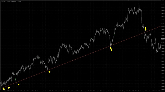
An uptrend line is a straight line sloping upwards, which is drawn to touch successive low points in an uptrend. The more low points you can connect with a straight line, the more sure you can be that you have a boundary line. You can start drawing the line with just two low points, but you really need at least a third low point touching it to confirm it is valid.
Chart is on the bottom of the page.
You can see there are several low points that come down to touch the line, and then go back up again, showing it is acting as a support. This chart also illustrates how a support can become a resistance, over on the right-hand side where the price, having dropped below the support line, does not go back up through it.
The significance of the trendline increases if it has been shown to be strong, by being repeatedly touched and rebounded from, and by being in existence for a long time. If it is well-established, there is much more meaning if the line is eventually broken. It would usually make you seriously consider closing any long positions you are holding.
Even with a trending chart, you will not always be able to draw a valid trendline, as the prices may fluctuate too much. But if you can, one basic use is to take the touching of the line as the signal to buy into the uptrend, as the price should only go up from there and not retrace.
You can also trade on downtrends, and constructing a trendline for one of these is a similar process. The line will connect successively lower high points on the chart, and if the price touches an established downtrend line, this can be a good time to take out a short position.
As an extension of the idea of the trendline, it is also possible to draw a “channel line”, which is a line parallel to the trendline on the other side of the price action. The price will tend to oscillate between the two lines, even as it carries on rising or falling in the trend. Again, not all price charts will allow you to draw this, and you’re most like to see it when there is a well-established and steady trend to the price. It can provide an early warning of a change of trend, as if the price fails to reach the channel line before reversing, this is a sign of weakness.
There are some other lines and constructions that you can draw on price charts to set likely reversal levels, but these are the main ones that i think in my oppinion are the 1s who are used the most.
I hope to hear opinions from people why they think something they use works and how they describe it.
I know some people like to use indicators and thrust them thats fine
But you ever asked what you have on your chart? why it works?
I bet there a lot of traders just randomly pick something, and they think i can make a lot of money with this, then they have a couple of losing trades they add something more or change the whole (strategy or system).
They keep going over and over in this circle.
Oke i am making this thread i use mainly in my trading support and ressistance with some other tools.
But the thing i want to discus is why does it work from my oppinion.
Also i hope to give people with them that when they put something on there chart, they gonna ask themself why would this work?
This are my observations i hope to hear other there opinions also.
Now it’s time to discuss one explanation why support and resistance work.
based on mine observations. They are of course psychological barriers, and not physical barriers, and they show how the psychology of the market dominates price movements. Consider the thinking patterns of three different trader groups, one which has bought the instrument, or gone long, and is hoping for an increase in price; one which has bet in the other direction and gone short on the Instrument; and a third group standing on the side-lines, which hasn't taken action yet as they are not sure which way to trade.
Say the Instrument price is rising off a support level. The thought patterns of the three groups would each be different, and run something like this:
The first would be congratulating themselves that they had bought the Instrument and it was going up. They wish they had bought more, and might do if the price comes back down to the support level.
The second group are thinking that they weren’t very wise to go short. They will hold on for the moment, hoping the price will drop back down so they can close the position, called “buying to cover”, without losing too much money.
The third group are seeing the price rise, and thinking that it’s too late to buy now. Perhaps if the price comes back down to where it was they should buy some .
As you can see, although they all have a different way of looking at the situation, each of the groups wants to buy some if the price comes back down to the support level. The demand for this instrument will force the falling price to go back up, proving the support level.
But if the price does happen to go down through the support level and continue falling, suddenly the three groups are presented with a different situation. If the support fails, and the price goes down, then the thinking will be like this:
The first group will be desperately holding on to their position, hoping that the value will recover so that they can sell and minimize their losses.
It is the second group’s turn to congratulate themselves, as their short position is now making money. They wish they had shorted more , and if the price comes back up perhaps they will short (sell) more.
The third group have still not acted, and now think they have missed out on the opportunity to short it. They resolve to do that, if the price comes back up to where it was.
Everything is now turned around. All three groups are looking to sell Instrument if the price comes back up to the support level. An excess of supply will push the price back down, which means the old support level has now become a resistance level. It’s simple human psychology, not magic, that makes support and resistance work like they do.
The classic support and resistance levels are at particular prices, that is they are horizontal lines. But it is also possible to analyse charts and draw angled lines which followed the trend of the price, and these can act as support or resistance for the price movement. Not surprisingly, these are called trendlines.
An uptrend line is a straight line sloping upwards, which is drawn to touch successive low points in an uptrend. The more low points you can connect with a straight line, the more sure you can be that you have a boundary line. You can start drawing the line with just two low points, but you really need at least a third low point touching it to confirm it is valid.
Chart is on the bottom of the page.
You can see there are several low points that come down to touch the line, and then go back up again, showing it is acting as a support. This chart also illustrates how a support can become a resistance, over on the right-hand side where the price, having dropped below the support line, does not go back up through it.
The significance of the trendline increases if it has been shown to be strong, by being repeatedly touched and rebounded from, and by being in existence for a long time. If it is well-established, there is much more meaning if the line is eventually broken. It would usually make you seriously consider closing any long positions you are holding.
Even with a trending chart, you will not always be able to draw a valid trendline, as the prices may fluctuate too much. But if you can, one basic use is to take the touching of the line as the signal to buy into the uptrend, as the price should only go up from there and not retrace.
You can also trade on downtrends, and constructing a trendline for one of these is a similar process. The line will connect successively lower high points on the chart, and if the price touches an established downtrend line, this can be a good time to take out a short position.
As an extension of the idea of the trendline, it is also possible to draw a “channel line”, which is a line parallel to the trendline on the other side of the price action. The price will tend to oscillate between the two lines, even as it carries on rising or falling in the trend. Again, not all price charts will allow you to draw this, and you’re most like to see it when there is a well-established and steady trend to the price. It can provide an early warning of a change of trend, as if the price fails to reach the channel line before reversing, this is a sign of weakness.
There are some other lines and constructions that you can draw on price charts to set likely reversal levels, but these are the main ones that i think in my oppinion are the 1s who are used the most.
I hope to hear opinions from people why they think something they use works and how they describe it.
Attached Image (click to enlarge)