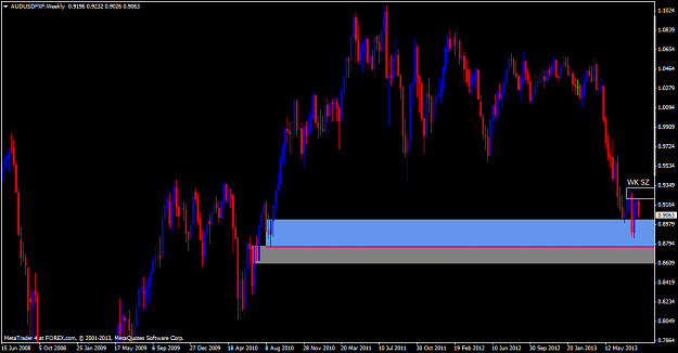
Regarding your latest webinar and on the AUD/USD of the weekly chart, I notice your demand zone is highlighted in grey and why is it not the blue area as this is the zone that violated previous supply? You also mentioned about the weekly supply zone ...