- Search Forex Factory
- 110 Results (7 Threads , 103 Replies )
-
 7bit replied Dec 29, 2011
This pattern extends to at least 1290 (161%, my usual target for these kinds of patterns) and when doing the 200% extension (happens quite often) it would reach as low as 1140! My bet is: Gold will reach 1140. image
Bearish Gold thread / Bubble implode thread
- 7bit replied Sep 26, 2011
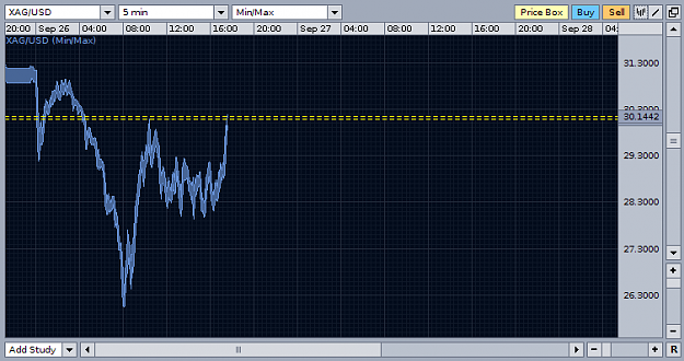
Its funny how the M5 chart is mirroring the daily chart: image
XAU/USD & XAG/USD - Gold & Silver Traders Thread
- 7bit replied Sep 23, 2011
This chart is from 2 weeks ago. Frustrated "investors" have put me on ignore in this thread for posting opinions like this. This means that I am right. We have now reached the dotted median line which is also previous support, expect some support ...
XAU/USD & XAG/USD - Gold & Silver Traders Thread

- 7bit replied Sep 15, 2011
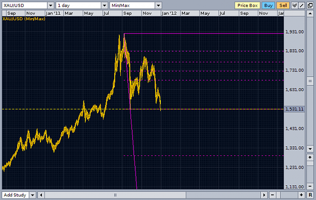
Descending triangle — The right half of this chart looks like a descending triangle to me. Due to its size it has the potential to send us to 1700, maybe already this week. image
Bearish Gold thread / Bubble implode thread
- 7bit replied Sep 11, 2011
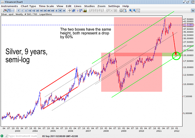
I am going to short silver now, and I hope it all plays out like below: image
XAU/USD & XAG/USD - Gold & Silver Traders Thread
- 7bit replied Sep 11, 2011
I spent the Sunday meditating over the possible moves that are in *immediate* reach on the silver chart. Especially in the light of a suddenly exploding US dollar (Liquidity crisis, carry unwinding, bubble bursting everywhere, etc). Plotting the ...
Bearish Gold thread / Bubble implode thread

- 7bit replied Aug 29, 2011
Ok, I will break the silence: image
XAU/USD & XAG/USD - Gold & Silver Traders Thread
- 7bit replied Aug 20, 2011
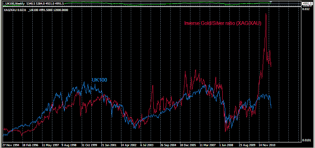
something seems wrong in the markets — The gold/silver ratio is currently around 43. I am watching this since a while now and still not totally sure what to think about this. Look at this chart: image The general theme seems to be that when ...
XAU/USD & XAG/USD - Gold & Silver Traders Thread
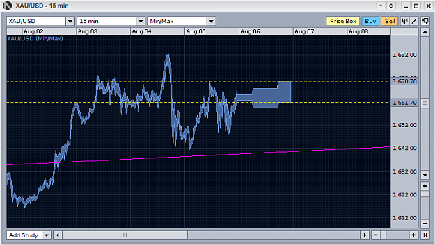
- 7bit replied Aug 6, 2011
Oanda is showing movements during the weekend, this does NOT happen very often (almost never). Gold seems up and EURUSD too.
EURUSD

- 7bit replied Aug 6, 2011
Oanda Gold is rising already, you normally don't see it moving very often during the weekend, normally bombs (or similar) have to explode to see any movements during that time. Euro is rising too btw. image
XAU/USD Spot Gold
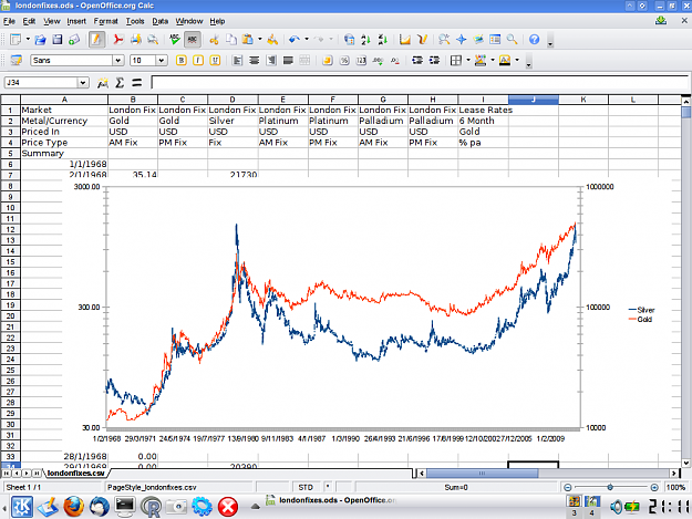
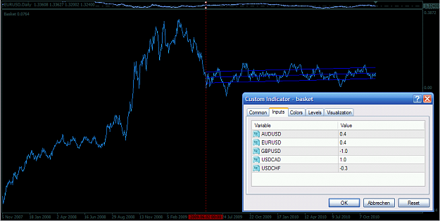
- 7bit replied May 10, 2011
I have overlayed them above each other image
XAU/USD & XAG/USD - Gold & Silver Traders Thread
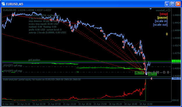
- 7bit replied Apr 18, 2011
Timing the exit is a skill :-) image
Trading the anti-grid with the snowball EA
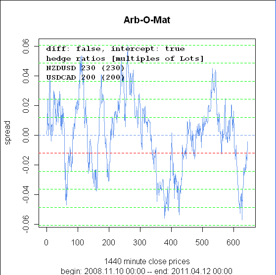
- 7bit replied Apr 12, 2011
This one has developed quite well so far :-) image
Synthetic hedges, cointegration, mean reversion and similar stuff
- 7bit replied Mar 3, 2011
This one looks interesting (the lines are 0.5 stddev, I just started running a grid strategy on it (buy on each level when it goes down, sell on each level when it goes up), wish me luck): image
Synthetic hedges, cointegration, mean reversion and similar stuff

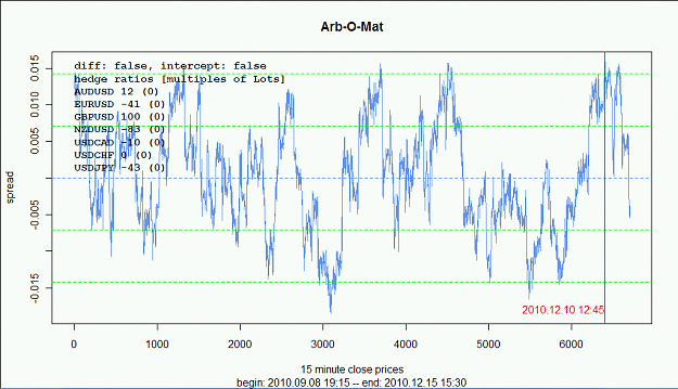
- 7bit replied Dec 15, 2010
sold at the red line near 2*sd and just closed it with a nice profit :-) The spread curve might fail many sorts of statistical tests, but this does not mean it is not tradeable (people successfully trade all kinds of instruments for which no models ...
Synthetic hedges, cointegration, mean reversion and similar stuff
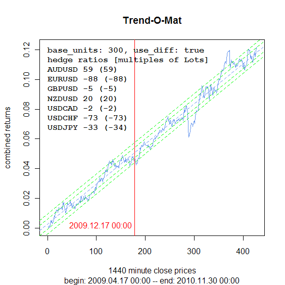
- 7bit replied Nov 30, 2010
Like in many other strategies too the longer timeframes always seem to be more rewarding / easier to trade. I am currently riding the last upswing on this chart since a few days :-) image
Synthetic hedges, cointegration, mean reversion and similar stuff
- 7bit replied Nov 28, 2010
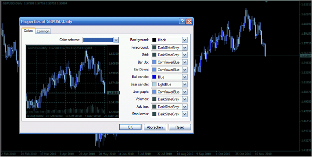
This is without any doubt the best possible color scheme: image
Who's Got the Best Chart Colour Scheme
- 7bit replied Nov 27, 2010
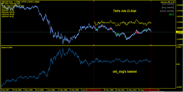
image this can end without a warning! Be careful!
Old Dog's Taming of the Beast?
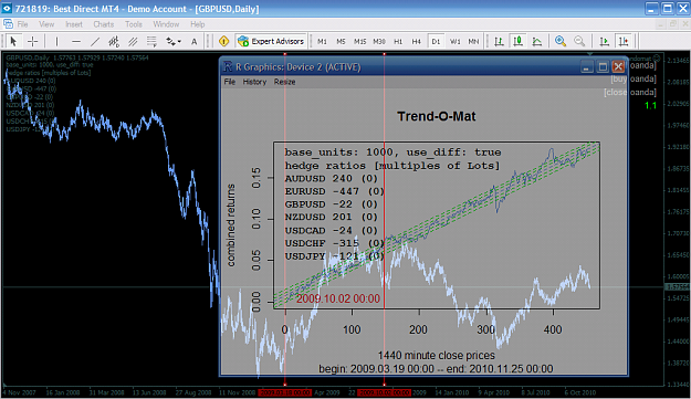
- 7bit replied Nov 25, 2010
The two red lines ("back" and "now") mark the period during which the regression is done and anything after it is how it would have continued with the same ratios. I have moved the windows over each other so that the lines are congruent. image On ...
Synthetic hedges, cointegration, mean reversion and similar stuff