- Search Forex Factory
- 367 Results
-
 snarlyjack replied Mar 7, 2015
Next, My favorite 2 charts are the Daily charts & 4 hour charts. First of all, the Daily chart is the most accurate long term chart we have. Trades can take some time to develop. But if your a long term trader it is a awesome way to trade. The 4 ...
Trading Made Simple
- snarlyjack replied Mar 6, 2015
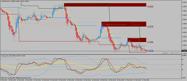
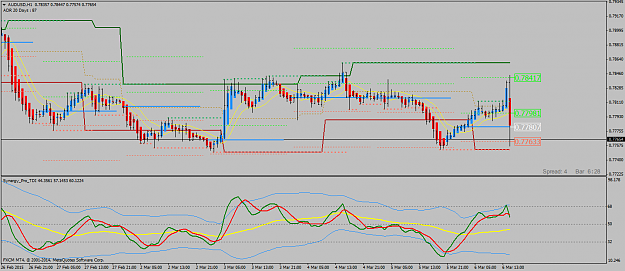
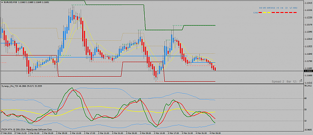
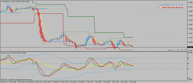
Erebus, It looks like the aud/usd 30 minute chart, price hit your level exactly, then on the new 30 minute bar it turned up. See level & Tdi...very interesting... sj
Trading Made Simple
- snarlyjack replied Mar 6, 2015
Likica, Price seems to be holding exactly on Erebus Daily open line v ADR levels. Which is good to know. The settings seem to be right on... sj
Trading Made Simple
- snarlyjack replied Mar 6, 2015
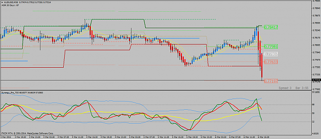
Erebus, I just took this trade on the aud/usd 30 minute chart. Price hit your level exactly as I liquidated out... Thanks sj
Trading Made Simple
- snarlyjack replied Mar 6, 2015
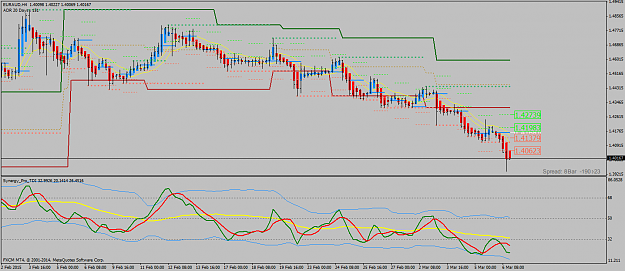
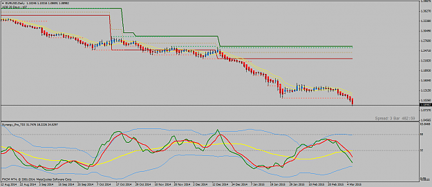
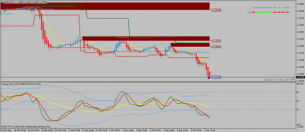
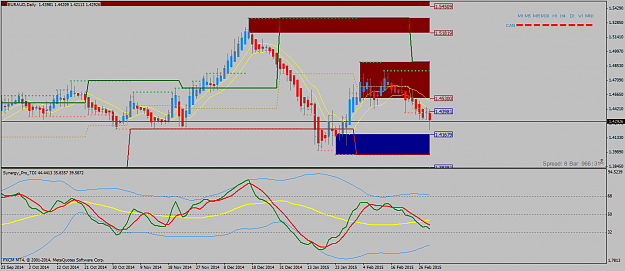
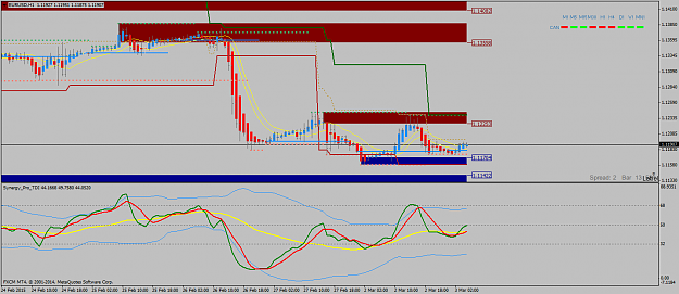
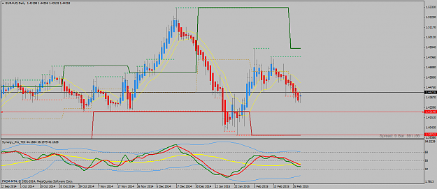
Here is a picture of the eur/usd daily chart. (1.08982 it is getting close to parity) sj
Trading Made Simple
- snarlyjack replied Mar 6, 2015
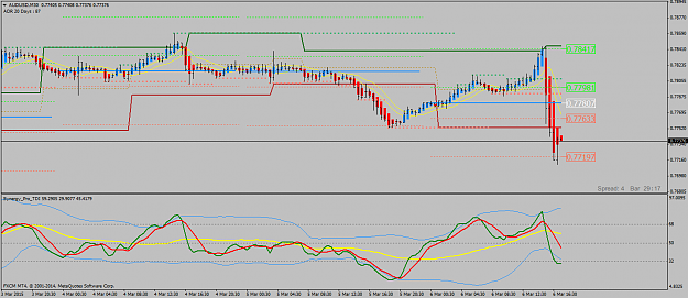
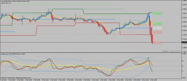
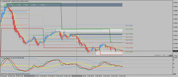
Good morning everyone, (N/Y session). Here is a picture of the aud/usd right after NFP (non farm payroll). sj
Trading Made Simple
- snarlyjack replied Mar 4, 2015
IonTrading; Your chart should look very close to this chart. sj
Trading Made Simple
- snarlyjack replied Mar 4, 2015
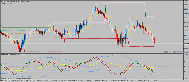
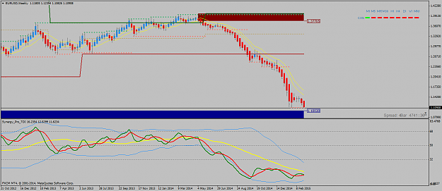
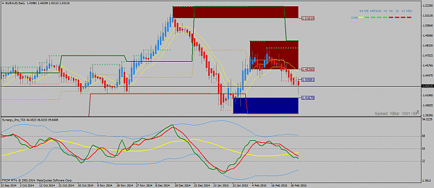
Here is a weekly chart of the eur/usd. For all the new traders out their...I just wanted to say the move from 6-1-2014 until now 3-1-2015 (9 months) was pretty fun & super profitable. From 1.36070 to 1.10888. And that is just 1 pair... sj
Trading Made Simple
- snarlyjack replied Mar 4, 2015
This eur/usd picture is what Eelfranz taught us minus the s/r lines. Use the pac instead of the 5 ema shift 3. Follow the tdi cross.
Trading Made Simple
- snarlyjack replied Mar 3, 2015
Erebus; Nice meeting you! Look at this example of the eur/usd. The apb's dropped out of the pac (entry). Set your stop above the pac (stop was never hit). Watch the movement of the Tdi. Price popped back into the pac (optional liquidate sign). Price ...
Trading Made Simple
- snarlyjack replied Mar 3, 2015
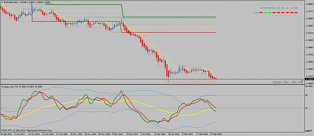
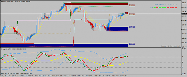
Birdnest, On the Daily chart, they are looking pretty bearish to me. Watch the Tdi... sj
Trading Made Simple
- snarlyjack replied Mar 3, 2015
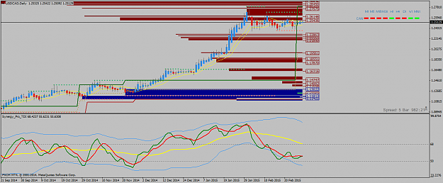
Haydo, Trading takes time to learn. You might as well enjoy the process & learn some new things...I learn something new everyday. Their are some amazing traders in here! The usd/cad looks tight to me on the daily...check out my chart. sj
Trading Made Simple
- snarlyjack replied Mar 3, 2015
Horus, This is one of those charts where I go hmmm... Are you looking to go short? It is kinda in "no-man's land". Right in the middle...Let the Tdi be your guide! sj
Trading Made Simple
- snarlyjack replied Mar 3, 2015
Haydo, It's looking good...and your doing good! Welcome to Tms by the way... Enjoy the learning process...their is no rush! sj
Trading Made Simple
- snarlyjack replied Mar 2, 2015
Mokuro, The "Pac" is the price action channel (yellow channel). Your chart is looking better & cleaner. Use these indicators. Less is more! Take a look at my chart. I hope I helped you... sj
Trading Made Simple
- snarlyjack replied Mar 2, 2015
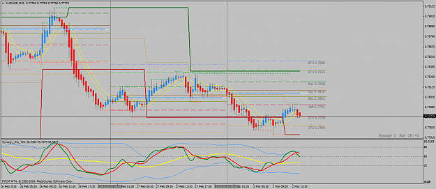
Getting back to our training chart, the aud/usd 30 minute chart. It was bouncing all day on the "Dots" short take profit 2 line. 4 times, price bounced on the line...easy profits...no big deal! sj
Trading Made Simple
- snarlyjack replied Mar 2, 2015
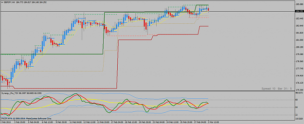
Given, When I look at the daily & 4 hour charts & go hmmm...Looks to me that the daily could roll over & the 4 hour is starting to roll over. Put your stop just above the pac & let it roll. sj
Trading Made Simple
- snarlyjack replied Mar 2, 2015
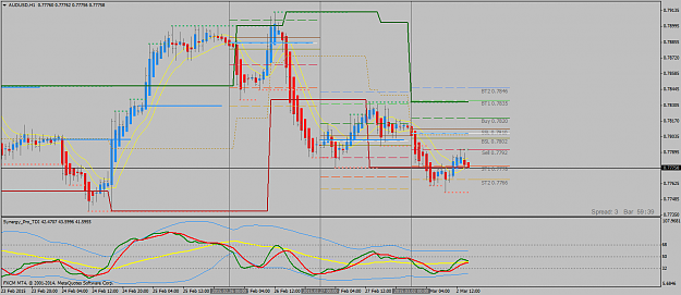
Training Chart. Let's watch the aud/usd, 30 minute & 1 hour charts today to see what happens. I put on the "dots indicator" to get some levels. Look at s/r levels & the tdi. Check everything out... sj
Trading Made Simple
- snarlyjack replied Mar 2, 2015
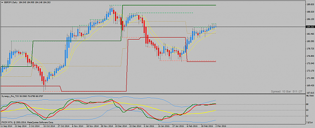
Haydo, According to the daily & weekly, long term it is in a down trend...short term it looks like it could make a counter trend move... sj
Trading Made Simple
- snarlyjack replied Feb 27, 2015
Ballistical, One of the things I did that really helped me was to "frame" the market. It helped me when I put in s/r lines & the daily open lines. Compare your chart to my chart... I hope I helped you! sj
Trading Made Simple