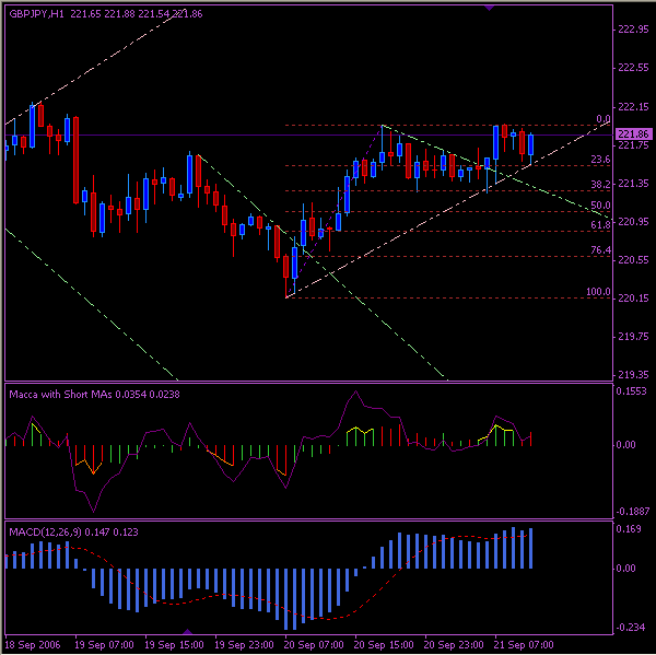
Hello, thought I would start this thread to get some different views on chart layouts and color combinations.
My charts at the moment have a light pink background. I find white to white and black to dark but everything else in the middle looks like crap.
I just want something nice to look at that is clear, so I feel more professional.
Do you have any opinions on this?
My charts at the moment have a light pink background. I find white to white and black to dark but everything else in the middle looks like crap.
I just want something nice to look at that is clear, so I feel more professional.
Do you have any opinions on this?

